· reference
Font trademarks and design patents
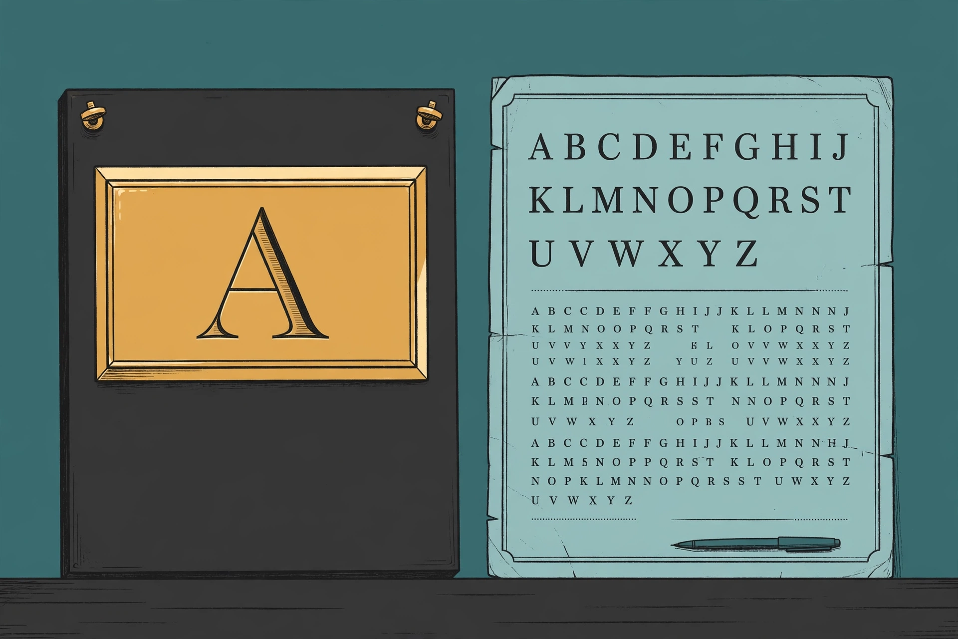
Our copyright explainer covered the famous split: in the United States the design of a typeface is not protected, and the font file is. Two other federal rights complete the picture, and between them they explain most of what looks strange about the font business: why the same design sells under five different names, and how the shapes themselves were protected for a century before anyone had heard of a font file. One right guards the name. The other guards the shapes, briefly, and has to be asked for in advance.
Trademark: the name, and only the name
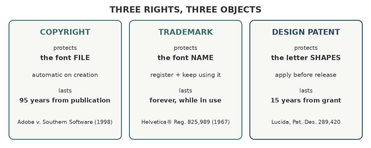
A trademark identifies who a product comes from. A typeface name does exactly that, so typeface names are registered as trademarks like any brand: Times Roman is US registration 417,439, granted in 1945; Helvetica is registration 825,989, granted in 1967; Lucida is registration 1,652,934, held by its designers Bigelow & Holmes. Ownership does not always sit where you would expect. Times was designed for the London Times by the English Monotype Corporation, but the American trademark was registered by its rival Linotype’s corporate family, which is why the naming of Times descendants stayed tangled for decades.
What a registration buys is the name, full stop. It does not reach the letters. Anyone may sell a design that looks exactly like Helvetica; they simply may not call it Helvetica. The whole clone economy described in our Weatherly Systems post runs inside that sentence.
Because the name is the asset, the naming of clones became an art form. The old comp.fonts FAQ catalogued the pseudonyms with a connoisseur’s eye: Times Roman traveled as English Times, London, Press Roman, and the frankly evasive Tms Rmn; Helvetica traveled as Helios, Geneva, Megaron, and Triumvirate. The FAQ’s verdict on the craft is worth keeping: resemblance without infringement is a fine distinction. The good pseudonym tells the buyer exactly what the design is while staying legally clear of the mark, which is why so many clone names are geographic hints (Geneva and Swiss point at Switzerland, Helvetica’s home) or near-anagrams. Every working foundry still plays this game today.
Why the shapes themselves cannot be trademarked
Could a company skip the name and trademark the look of the letters? No, for two reinforcing reasons. First, a trademark has to function as a badge of origin, and a typeface design is not a badge on the product; it is the product. Second, trademark rights can last forever with use and renewal, and the courts will not let a perpetual right swallow a working tool. Letterforms are functional in the plainest sense: people use them to read. Protecting a style as trade dress would hand its owner a permanent monopoly over a piece of the writing system itself, which is precisely the outcome the design/file split in copyright law exists to avoid.
One exception deserves a line, because it confuses people. A particular logo typeset in a font can be registered as a trademark: think of a famous script wordmark. The registration protects that logo, that fixed arrangement used as a brand. It does not protect the alphabet the logo was drawn from, and font licenses commonly forbid trying to register the typeface design itself as part of a trademark filing.
Design patents: the shapes, protected properly
The instrument that does protect letter shapes is the design patent, and type is woven into its history. The first design patent the United States ever granted, Design Patent No. 1 in 1842, was for a typeface, George Bruce’s. For the next century, American typefounders patented their designs as a matter of course. Ludvig Ipsen’s 1903 patent, assigned to American Type Founders, shows the form: the entire claim is the drawing, an alphabet, a lowercase, figures, and three symbols.
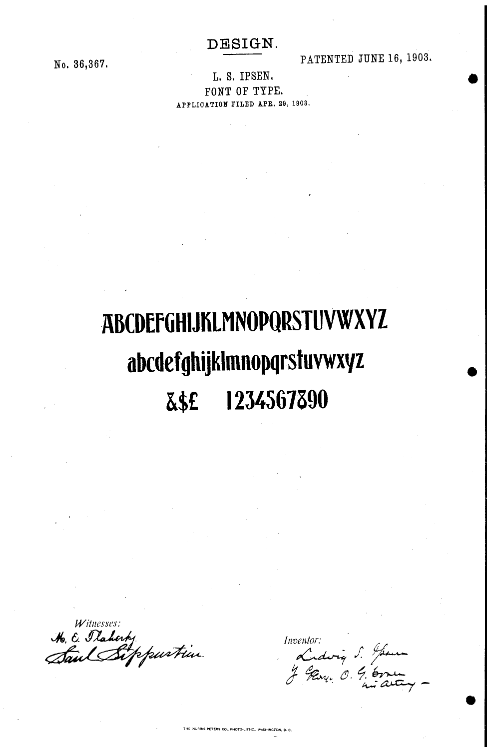
A design patent works like this. The designer files drawings of the letterforms; if the design is new and not obvious, the patent grants for 15 years from issue (14 for older grants). During the term, making or selling a substantially similar design infringes, however it was produced: tracing does not save you, which makes the design patent the one US right that reaches the shapes themselves. When the term ends, the design is free for everyone, forever.
The system never entirely died. Charles Bigelow and Kris Holmes patented Lucida’s designs in the 1980s, and the fact travels inside the font files to this day: the copyright string of Lucida Sans Unicode, as shipped by Microsoft, reads “Pat. Des. 289,420” among its notices. And in Adobe v. Southern Software, Adobe pleaded design patent claims alongside its winning copyright claims. Judge Whyte left those claims unresolved at summary judgment, finding a genuine factual dispute, a sign of how much harder patents are to wield than the copyright in the copied file: they must be obtained before the copying, design by design, at real cost, for a 15-year term that the metal-type business model could justify and the digital one rarely can.
The practical stack
Put the three rights together and the modern font business makes sense. Copyright, automatic and long, guards the file, which is why piracy law is file law. Trademark, renewable forever, guards the name, which is why the name is the part of a font you will see defended in letters and listings long after the design has been cloned a dozen times. The design patent, brief and expensive, guards the shapes, and mostly sleeps, a 19th-century tool that still works exactly as drawn in 1903: file the alphabet, get your fifteen years.
Two enforcement stories on this site show the stack in action: Metallica’s trademark letter over a font category, where the name was the only right in reach, and the Dr. Seuss notices, where the copyright in the underlying artwork did the work a trademark could not.
When you name a font of your own, you are stepping into the middle right. The check that matters is not whether your design resembles another (designs may resemble), but whether your name collides with a registered mark or a name already in commerce, exactly or by resemblance. That is a searchable question, and it is why naming, in type, has always been a legal act disguised as a creative one. Our Font Name Checker runs the first pass on that question: give it a candidate name and it checks it against the font names already in use, flagging exact collisions and close resemblances before they become your problem.