· copyright, trademark, reference, history
Dr. Seuss font: the lettering and the lookalikes
Not affiliated with or endorsed by Dr. Seuss Enterprises. This article is editorial commentary on intellectual property enforcement in the font world. Federal trademark law excludes news reporting and commentary from dilution claims (15 U.S.C. § 1125(c)(3)), and naming a mark to write about its owner is nominative fair use; brief quotations published for criticism and comment are fair use (17 U.S.C. § 107). No Dr. Seuss artwork or font files appear in this article.
There is no official Dr. Seuss font. The lettering readers mean is Theodor Geisel’s hand-drawn artwork from the books themselves, and the fonts behind the searches are fan lookalikes. The legal line runs between bare letter shapes, which copyright leaves free, and artwork copied out of the books, which it protects.
The lettering: a drawing, not a typeface
The book that made the lettering famous. Its copyright runs through 2052.
The Beginner Book whose cover treatment the fan fonts copy. Protected through 2055.
Audrey Geisel founds Dr. Seuss Enterprises in San Diego to run the rights and the licensing.
The Ninth Circuit enjoins a Simpson parody told in Seuss's manner: satire, not parody, no fair use.
DMCA letters land on a free font website: one over a font's name, one over two fonts' lettering.
The estate wins the copyright claim on all four factors. Its trademark claim over title, typeface, and style is dismissed.
Theodor Geisel wrote and illustrated his books himself, and the title lettering on their covers is his drawing, not a typeface anyone set. A reader can recognize a Seuss book from its letterforms alone. The estate treats the signature accordingly: the drawn form of the words DR. SEUSS is a registered trademark (Reg. No. 5,131,951).
Geisel died in 1991, but the terms have decades to run. Books published before 1978 are protected for 95 years from publication, so The Cat in the Hat (1957) is covered through 2052 and Green Eggs and Ham (1960) through 2055; the later books run 70 years past his death, through 2061.
The rights sit with Dr. Seuss Enterprises, founded in 1993 by his widow, Audrey Geisel, based in San Diego and owned by a foundation. It is a licensing business first: the books have sold more than 650 million copies, Seuss was the top licensed book brand of 2017, and Forbes put its earnings at $33 million in 2020.
What are people actually searching for?
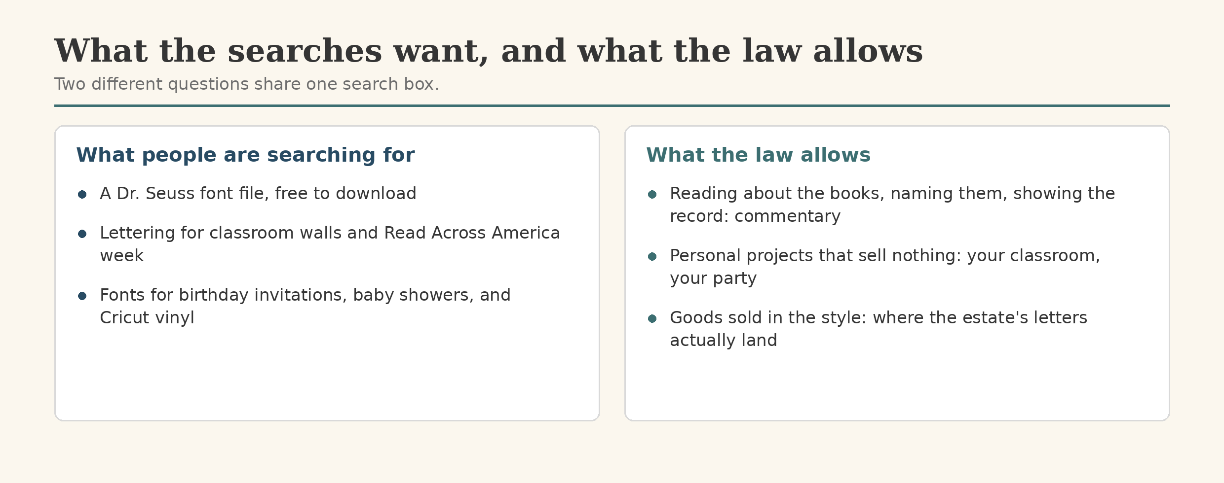
The biggest single term is “grinch font,” about 2,900 United States searches a month; “dr seuss font” draws about 1,900, and the whole cluster runs to roughly 5,400 (Semrush, October 2026). Every term is rated easy, and none carries any advertising price. The searchers are not design studios.
They are teachers and parents. The roundups answering these searches frame them around Dr. Seuss’s birthday and Read Across America week, classroom decoration, birthday party invitations, and baby showers. Tutorials show the fonts at work: iron-on vinyl lettering for baby bodysuits, cut on a Cricut, and home decor in vinyl.
The pages that rank are download pages and text-generator mills. This page is neither. There is no official font file to hand over; the lettering was never a product. What a page can honestly give is the map: the lettering, the lookalikes, and where the law’s lines sit.
The lookalike fonts
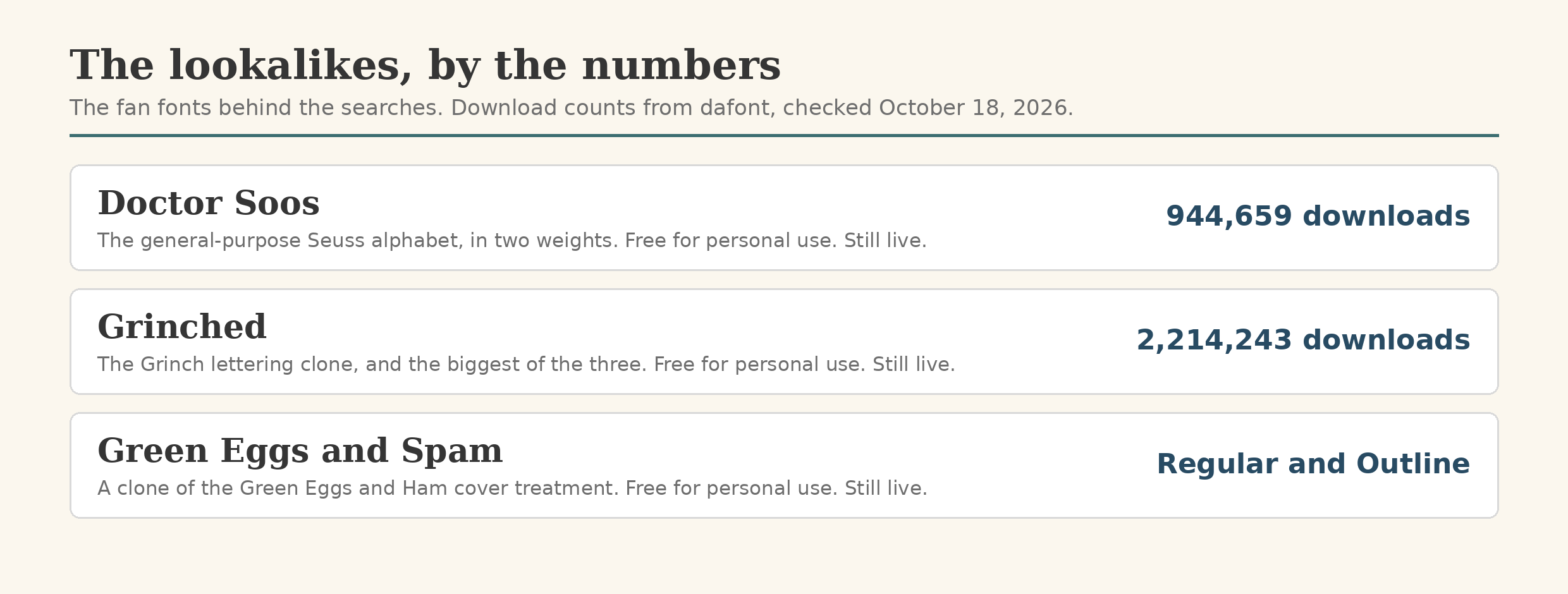
Three fan fonts do most of the work behind those searches. Doctor Soos is the general Seuss alphabet, in two weights; its dafont page records over 944,000 downloads. Grinched clones the lettering of How the Grinch Stole Christmas and is the biggest of the three, at over 2.2 million downloads. Green Eggs and Spam takes the cover treatment of Green Eggs and Ham in Regular and Outline weights. All three are labeled free for personal use.
All three are still there, as of October 2026. Research for this article found no documented takedown, lawsuit, or trademark board action against any Seuss-named font or font category. The public enforcement record runs against books, plays, photographers, and marketplace sellers. Against fonts, the visible record is private letters, two of which reached a single free font website in 2013.
What is actually allowed?
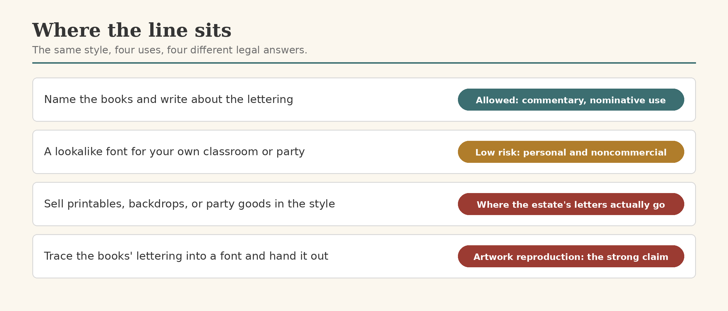
United States copyright does not protect typeface designs: the Copyright Office’s rules (37 C.F.R. § 202.1) exclude “typeface as typeface,” along with names, titles, and short phrases. An alphabet drawn in a similar spirit, as shapes, sits on the free side of that line.
But Seuss lettering is not only shapes: it is artwork, the hand-drawn title treatments inside specific copyrighted books, and glyphs reproducing that artwork are reproductions. The Ninth Circuit made the point in 1997, in Dr. Seuss Enterprises v. Penguin Books: the thing copied was “the Cat’s image,” which the court called the “highly expressive core” of the work. Penguin’s book retold the Simpson murder trial in Seuss’s manner: satire, not parody, the court held, and no fair use shelter.
A book’s title cannot be copyrighted, but a famous one becomes a trademark for merchandise. GREEN EGGS AND HAM is a registered mark (Reg. No. 5,461,651) covering, among other goods, downloadable children’s software. Naming the books in an article like this is nominative reference. Using their names and lettering as labels for goods is the exposed posture.
ComicMix (2020): a Star Trek mash-up of Oh, the Places You’ll Go! lost on copyright on all four fair use factors, a non-transformative commercial work usurping the original’s market, while the estate’s trademark claims over “the title, the typeface, and the style” were dismissed under the Rogers test. And a use aimed at Seuss itself can win: Who’s Holiday!, an adult play about Cindy-Lou Who, was held a fair use parody in 2017 and affirmed in 2018.
Personal use of the lookalike fonts is where nearly all the searchers live, and it is not where the estate spends its letters. Its documented enforcement lands on commerce: a 2019 cease and desist to a photographer selling Grinch-themed shoots, letters to photographers recurring in later holiday seasons, and marketplace listings shut down. Sell the style, and the shelter ends. None of this is legal advice, only a map.
When the notices land on a font website
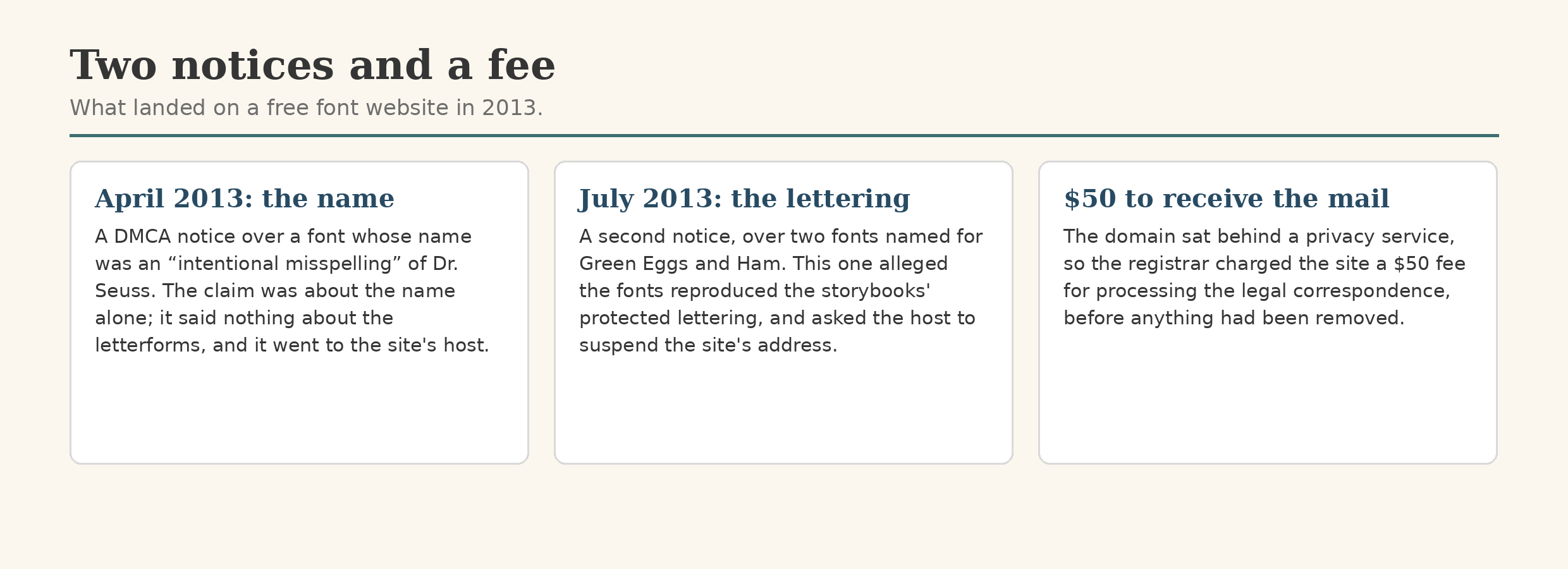
In the spring and summer of 2013, a free font website received two DMCA notices from the estate’s lawyers. Both went not to the site but to its hosting provider, into the abuse queue, each certified under penalty of perjury.
The first, in April, was about a name. Its whole claim fit in one clause: the name of a font on the site was an “intentional misspelling” of the name Dr. Seuss. It alleged nothing about the font’s letterforms. A name is not a copyrighted work, and the DMCA is a copyright statute with no trademark lane, so as copyright paper it was close to empty. The site forwarded the complaint to the designer, whose answer was a rename: his Green Eggs pair could simply be called Green Eggs Bold and Green Eggs Light. He doubted the copyright could be enforced on that. On the bare name he was half right, but a rename does not answer a claim about letterforms, and that claim arrived in July.
The second notice targeted the same designer’s Green Eggs pair, and this one alleged that the fonts included protected lettering from the storybooks themselves: the artwork theory. It also asked the host to suspend the site’s address and not reconnect it until a counter-notice had been forwarded to the estate’s lawyers. A proper notice obliges a host to remove the identified material expeditiously. Suspending a whole site’s address is leverage, not procedure.
The episode had a cover charge. The site’s domain sat behind a privacy service, and the service billed the owner a $50 fee for processing the legal correspondence, non-refundable, threatening to cancel the privacy service if he disputed it.
The site answered by asking for the specifics: the trademark numbers, the copyrights, the patents. What came back was a worldwide trademark list for a single book title, Green Eggs and Ham, plus two United States copyright numbers: the 1960 book’s original registration and its renewal.
The story has a present tense, checked in October 2026. The two Green Eggs fonts are gone from the site, and so is the bold font page the April notice named. But a Doctor Soos family is still listed on the same site, and the designer’s copy on dafont was never touched. The letters removed the files they named. The fonts themselves kept circulating.
How is this different from the Metallica case?
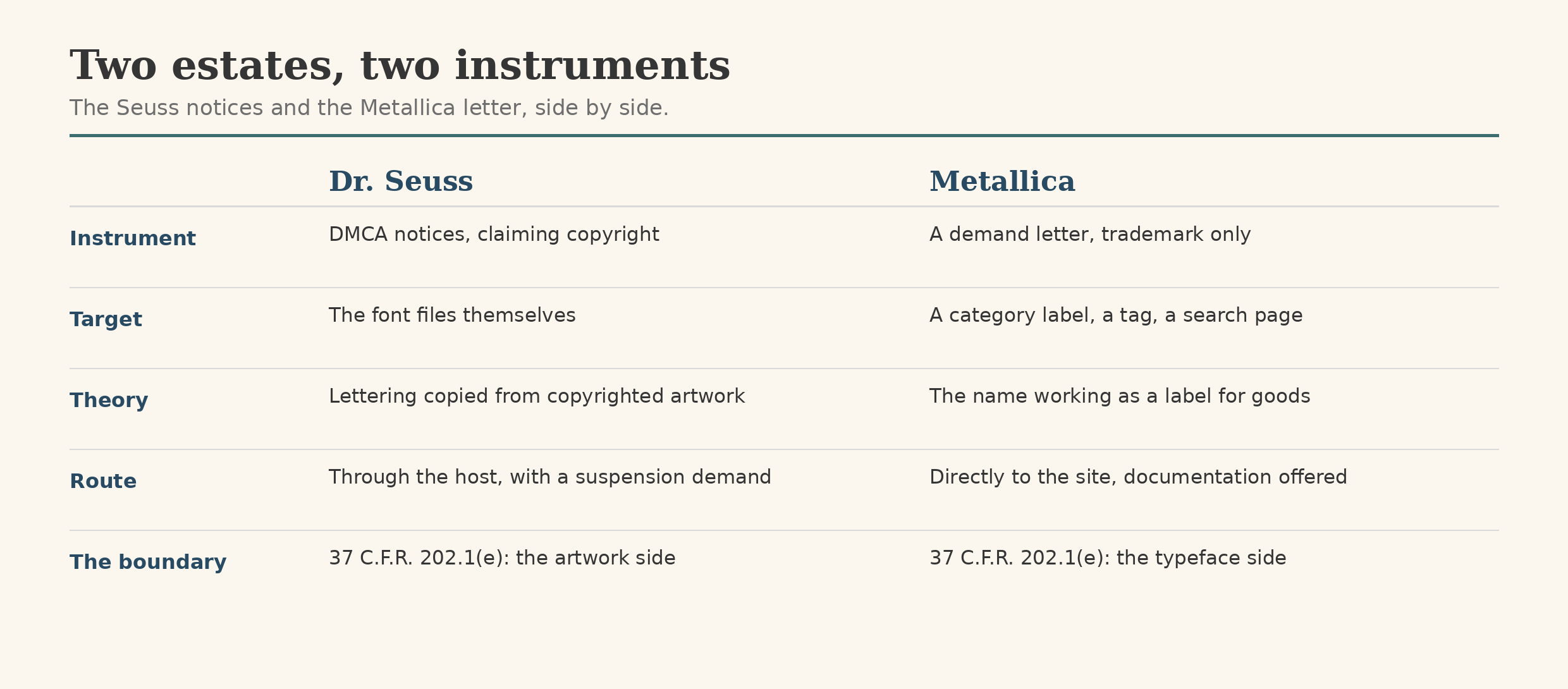
Readers of the Metallica article will feel the rhyme: a famous name, fan fonts, a free font website. The instruments could hardly differ more.
Metallica’s was a trademark letter, sent directly to the site, aimed at labels: a category page, a tag, a search page. It expressly disclaimed copyright, because band lettering, as typeface, has none to claim. The Seuss notices were copyright claims under the DMCA, routed through the host with a demand to suspend the site’s address, aimed at the font files themselves, because book lettering, as artwork, sits inside a copyright.
Underneath both sits the same regulation, 37 C.F.R. § 202.1(e), which puts “typeface as typeface” outside copyright. The Metallica lettering fell on the typeface side of that line. The Seuss lettering fell on the artwork side. Same boundary, opposite results. The difference is not the fame of the names; it is what the fans were copying.
Documented, not distributed
font.io’s rule for material like this is the museum rule. A museum can hang the evidence in an exhibition; it does not sell copies in the gift shop. So this site records the Seuss lookalikes in full: the fonts, the download counts, the notices, the cases. It reproduces no Seuss artwork and distributes no font files. For the wider framework, see our guides to font copyright law and font trademarks and design patents.