· trademark, reference, history
Metallica font: the lettering and the law
Not affiliated with or endorsed by Metallica. This article is editorial commentary on trademark enforcement in the font world. Federal trademark law excludes news reporting and commentary from dilution claims (15 U.S.C. § 1125(c)(3)), and naming a mark to write about its owner is nominative fair use; brief quotations published for criticism and comment are fair use (17 U.S.C. § 107). No Metallica recordings, artwork, or font files appear in this article.
There is no official Metallica font. The band’s logo is lettering James Hetfield drew by hand before the first album, never released as a typeface. The font behind almost every “Metallica font” search is Pastor of Muppets, a fan work by Ray Larabie. Whether using that style is legal depends on one question: is anything being sold?
The lettering: one drawing, forty years of work
James Hetfield's hand-sketched lettering: a wordmark whose first and last letters stretch long and sharp.
A leaner variant of the logo carries the band's albums from 1996 to 2003.
For Death Magnetic the classic form returns, professionally rebuilt, with a full typographic style around it.
David Turner and Jamie McCathie build the era's design on yellow and black, the M carried through everything.
The classic Metallica logo is not typeset. It is a drawing: a wordmark whose first and last letters stretch out long and sharp, sketched by James Hetfield and carried on most of the band’s releases since. It dates from the first album era, the years of the 1983 debut Kill ’Em All.
A leaner, streamlined variant ran from 1996 to 2003, and the classic form then returned. In 2008 the design firm Turner Duckworth reworked the lettering for Death Magnetic; Hetfield explained the hire: “This time, we wanted to work with professionals who understand iconography.” For 72 Seasons in 2023, David Turner and Jamie McCathie built the era’s look on yellow and black, with the letter M everywhere.
The name and the lettering are registered trademarks, held by the band’s own partnership, Metallica, a California general partnership. A hand drawing from the band’s first years now sits inside a legal apparatus.
What are people actually searching for?
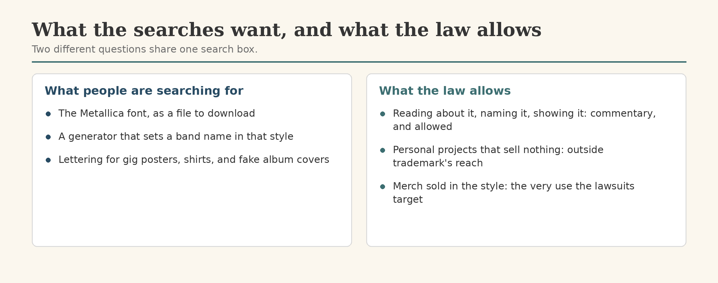
A few thousand people a month, in the United States alone, go looking for this font (Semrush, October 2026: “metallica font,” about 2,400 a month; “metallica font generator,” about 720). Most are not type designers. They are people making things: a gig poster, a fake album cover, a shirt idea, their own band’s name in lettering that reads instantly as heavy metal.
The pages that rank mostly promise one of two things, a download or a generator. This page offers neither: there is no official font file to hand over, because the lettering was never a font. And the unofficial one ended with its designer pulling it from circulation. What a page can honestly give is the map: the lettering, the fan font, and where the law’s lines sit.
The fan font: Pastor of Muppets
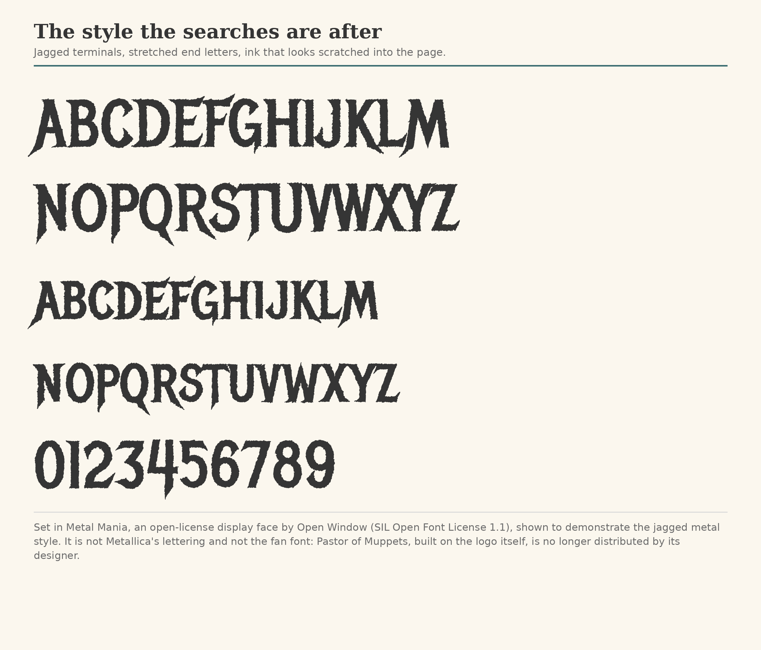
The font behind the searches is Pastor of Muppets, a complete typeface built on the Metallica logo lettering by Ray Larabie of Typodermic Fonts. The name riffs on the band’s song “Master of Puppets.” Turning a band logo into a working alphabet was typical Larabie work: take the lettering people recognize, build the missing letters, give the result away.
Metallica’s attorneys sent a cease and desist letter over it, for taking letter designs from the band’s wordmark. His answer was the one type designers have given since the 1970s: United States law cannot claim copyright over character designs. He complied with the letter anyway. He also noted, ruefully, that the “Muppets” half of the name could have drawn a trademark challenge.
Then practice took over. The font had spread too widely to withdraw; copies sat on font sites worldwide, and Metallica never pressed further. Larabie says in his autobiography he wants nothing more to do with it and would never release it again; his foundry no longer distributes it. Its old dafont page returns a 404 (checked October 18, 2026), an observation, not a removal announcement.
One wrinkle mattered. His free fonts circulated under a readme making them free for commercial use while forbidding anyone to sell the fonts themselves. That license covered his work, never the band’s trademark, where the real exposure sat.
What is actually allowed?
Start with copyright, the smaller half of the answer. United States copyright does not protect typeface designs: the Copyright Office regulation lists “typeface as typeface” among things that cannot be registered (Eltra v. Ringer, 1978). What copyright protects is the font file, the software: in 1992 the Copyright Office allowed scalable font programs to register as computer programs, a protection confirmed in Adobe v. Southern Software. Copying famous lettering’s shapes is therefore not copyright infringement. Copying and handing out someone’s protected font file is a different question.
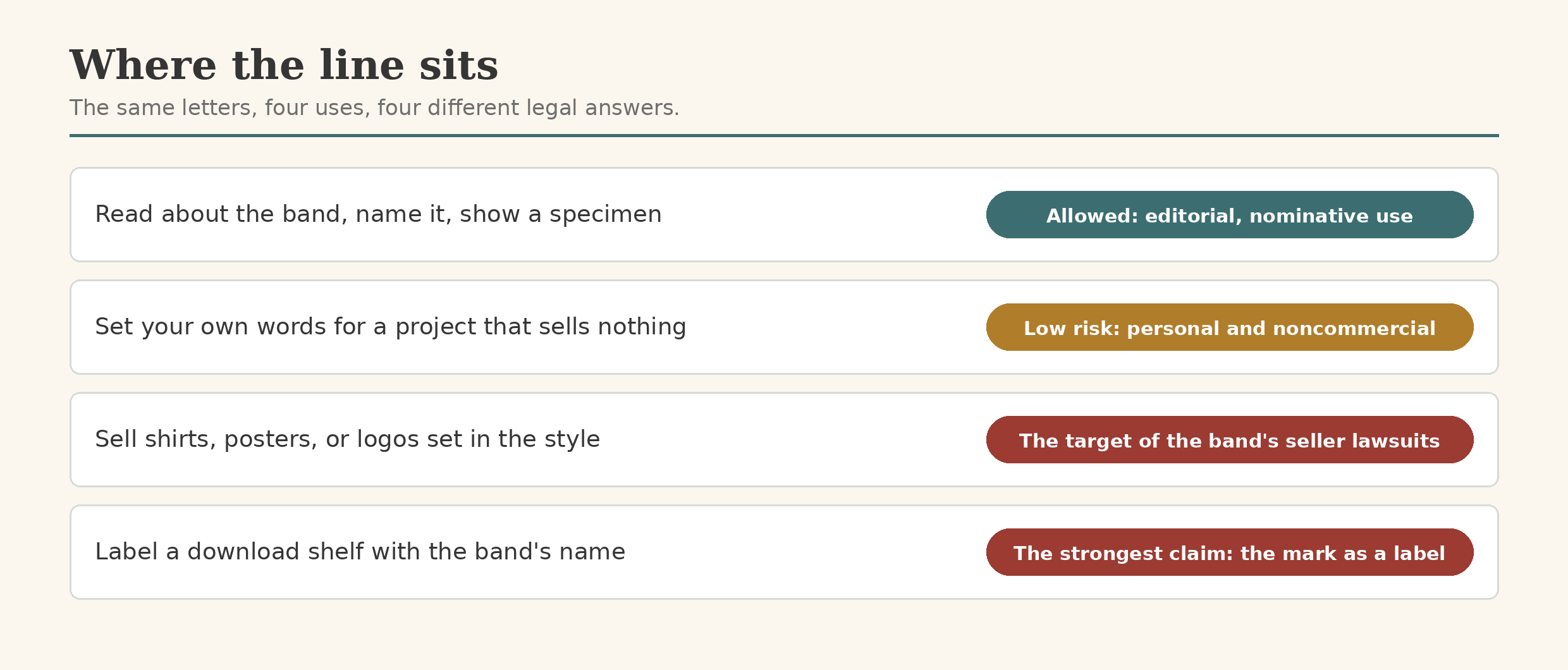
Trademark is where the teeth are, and trademark law is mostly about commerce and confusion. Using a famous band’s name and logo to sell goods, or to make buyers think the band endorsed a product, is what the law reaches. The band’s current enforcement shows it: federal “Schedule A” lawsuits against unidentified online sellers on marketplaces like Amazon, SHEIN, Walmart, and Wish, accused of selling counterfeit goods under the registered marks.
Against that, three shelters cover most honest uses. Naming the band to write about the band is nominative use, the doctrine covering use of a mark to identify its owner; this article does that, in plain text. Federal law separately excludes news reporting and commentary, and any noncommercial use, from dilution claims (15 U.S.C. § 1125(c)(3)). Purely personal use, a poster nobody sells, sits outside the commerce trademark law polices. The band’s history rhymes: fans have long been allowed to tape concerts and trade recordings; the policing targets selling, and the stated principle since Napster is control, not money.
None of this is legal advice, only a map. Sell the style, though, and the shelter ends: that is the use the lawsuits are built for.
When the letter lands on a font website
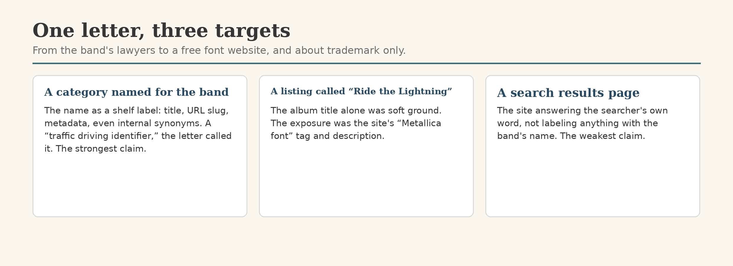
The letter went not to a designer but to a free font website, from the band’s lawyers, and it was a trademark letter only, as it said itself, expressly not a copyright complaint. It cited two federal registrations by number, the stylized METALLICA (Reg. No. 7,252,327, from 2023) and the word mark (Reg. No. 2,213,592, from 1998). It named three targets: a search results page for the band’s name, a category page named for the band, and a listing called “Ride the Lightning,” after the 1984 album, described and tagged on the site as a “Metallica font.”
The demands were equally specific. Kill the category: its title, its URL slug, its metadata, even its internal synonyms. Strip the name as a tag and keyword from unrelated listings and from categorization indexing. Rename the listing and remove its references to the band. And going forward, block the name, and the band’s album and song titles, as category labels and restricted keywords. The category, in the letter’s own phrase, was a “traffic driving identifier.”
The three targets were not equally strong. The category was strongest: the band’s name as a label on a commercial download site is source-identifying use, where editorial defenses run out after the Supreme Court’s 2023 Jack Daniel’s decision. The search page was the weakest: a results page answers the searcher’s own word, and its own narrower demand, on indexing used to categorize, conceded the difference. The listing sat between: a bare title is soft ground, since titles are not copyrightable and “ride the lightning” was an idiom before it was an album; the exposure was the descriptor, “Metallica font,” telling visitors whose font this supposedly was.
The story has a present tense. The listing has since been renamed “Ride the Lightning (Fan-Created),” its page scrubbed of the band’s name. The rest of the letter’s fate is not public. The lesson travels: labels and distribution are commerce; history and commentary are not, and the law can tell them apart.
Documented, not distributed
font.io’s rule for material like this is the museum rule. A museum can hang a bootleg concert poster in an exhibition: it is evidence, and showing it is commentary. What it does not do is sell copies in the gift shop. So this site records Pastor of Muppets, and fonts like it, in full: the design, the designer, the legal history, the style shown in specimens. And it distributes nothing. For the wider framework, see our guides to font trademarks and design patents and font copyright law. The companion case sits on the other side of the boundary: in the Dr. Seuss article, the letters arrived as copyright notices against the font files themselves.