· Updated · metrics
Font metrics: the numbers that describe a typeface
Set two fonts at exactly the same size, side by side, and they refuse to match. One looks bigger. One looks darker. One feels calm and the other feels like it is showing off, and neither the point size nor the names on the menu (“Regular”, “Book”, “Medium”) will tell you why. Type designers have always known the reasons; they just lived as judgment in the eye rather than numbers on a page. Digital type changed that. A font file is geometry, and geometry can be measured.
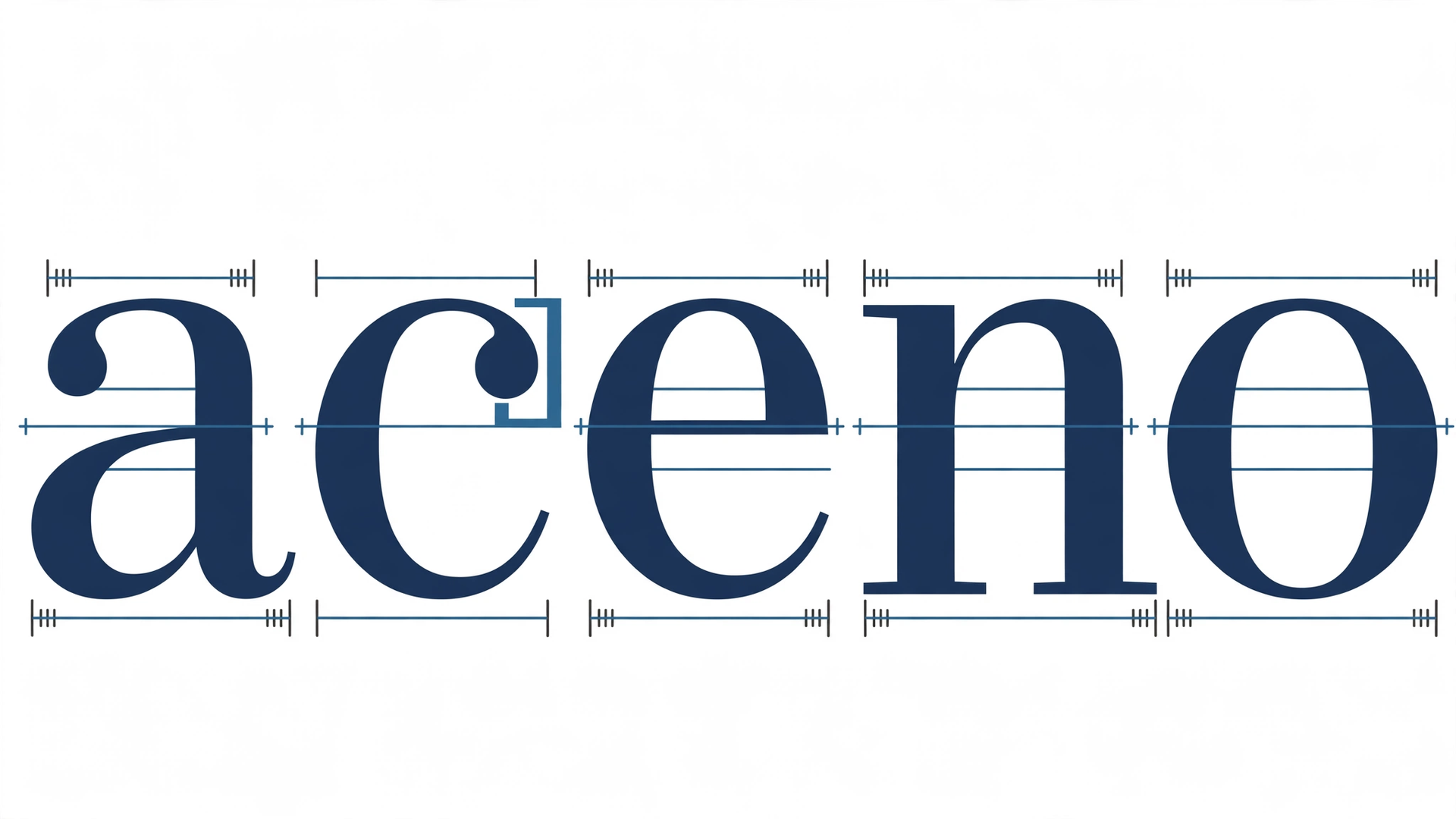
font.io measures every font in the catalog on the same set of properties, taken straight from the letterforms themselves: weight, width, slant, contrast, and x-height, joined by two structural readings, serif and stress, and by aperture, how open the letters stay. Two further numbers, cap height and ascender height, complete the vertical picture. Together they explain most of why two fonts at 16 pixels look like different sizes, different darknesses, and different personalities. Each reading has its own mark, shown beside its section below; the same marks label the rounds in the Higher or Lower game. Here is one lowercase n redrawn five ways, once for each of the five shape measurements the animation cycles through. The values in the animation are illustrative, drawn to show the idea; the sections below carry the real numbers.
Weight: how thick the strokes are
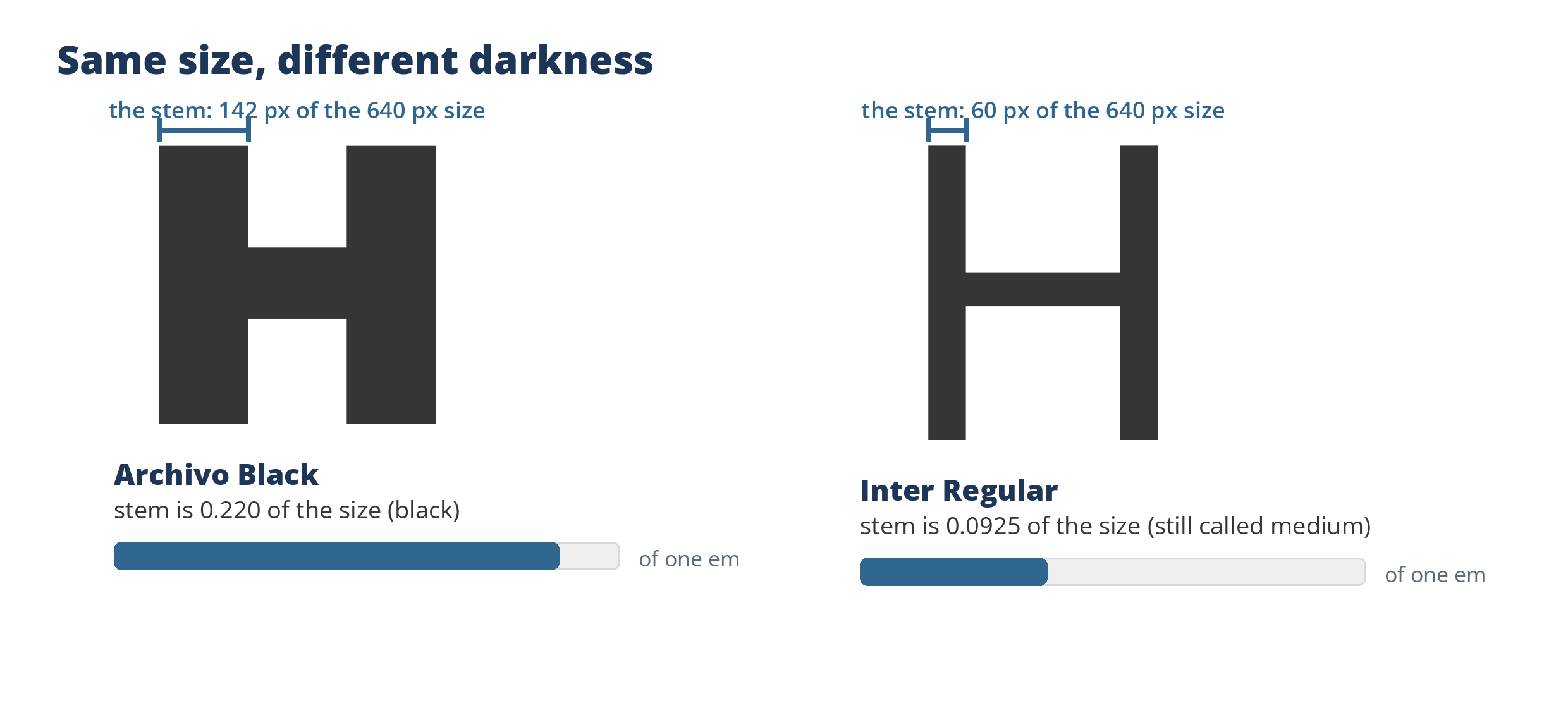
The same letter at the same size. The brackets mark the stems the measurement reads: 142 pixels of the 640 pixel size against 60.
Weight is the thickness of a letter’s main upright stroke, expressed as a share of the font’s size. It is the number behind the darkness of a page: raise the weight and the whole text block deepens in color, lower it and the page turns airy and gray. We read it off the capital H, slicing across its stem at three heights and taking the middle value, because a font’s own label cannot be trusted to tell the truth about its outlines. Archivo Black’s stem measures 0.220 of its size, firmly black. Inter Regular’s measures 0.0925, which our scale still calls medium. Between and beyond them sit the buckets we sort by: thin, light, regular, medium, bold, black.
Why it matters when you choose type: weight is hierarchy you can feel. A headline font earns its presence mostly through weight, and body text lives or dies by it, since strokes that are too thin dissolve on screens and strokes that are too heavy clog at small sizes. The full measurement, including what happens with hollow and inline faces, is in Weight: how thick the main stem is.
Width: how much room the letters take
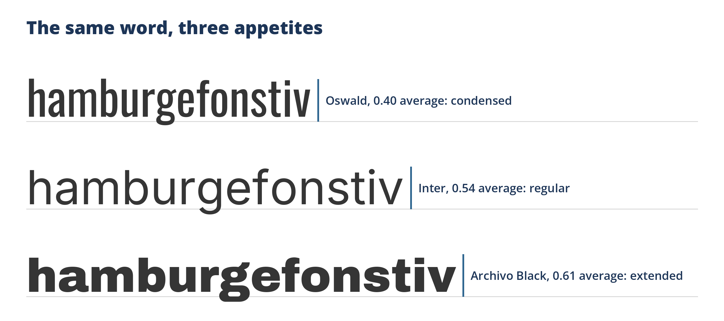
The same specimen word at a single size, in three fonts. The tick is where each font runs out of word.
Width is the average horizontal room the lowercase letters occupy, again as a share of the font’s size, averaged over the whole alphabet so one wide or narrow letter cannot decide the verdict. We sort it into condensed, regular, and extended. Oswald averages 0.40, condensed, the narrow, economical grotesque. Inter averages 0.54, regular. Archivo Black averages 0.61, extended, which is part of why it eats a headline line so quickly.
Why it matters: width is the layout budget. A condensed face fits more words on a poster, a book spine, a table column, or a phone screen; an extended face gives a short headline presence and air. Two fonts with the same weight and x-height can still differ wildly in how much of the page they consume, and width is the number that predicts it. Details: Width: how much room the letters take.
Slant: how far the letters lean
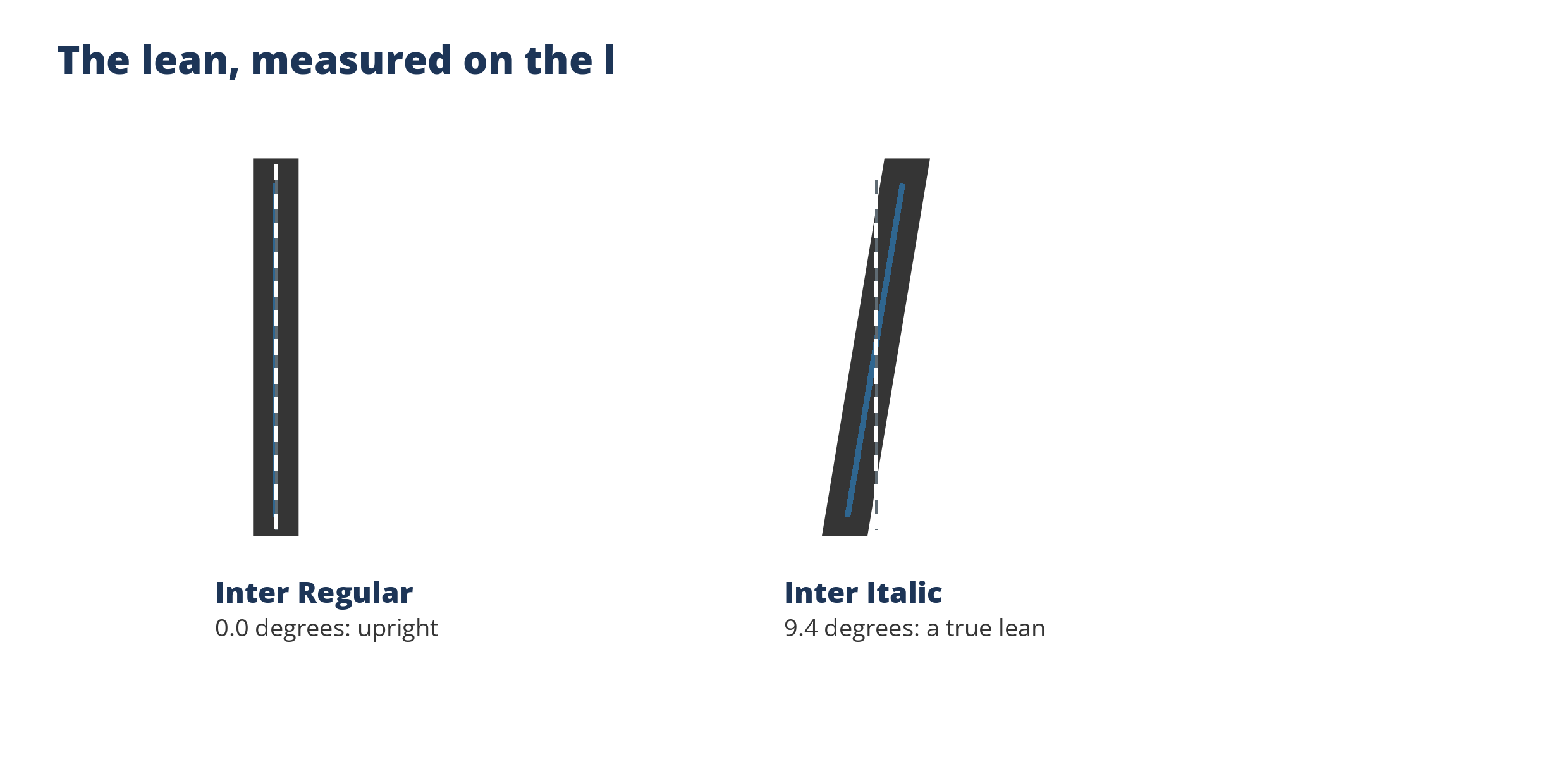
The slate line is fitted through the stem centers, the way the measurement reads the lean.
Slant is the lean of the letters in degrees from vertical, read from the lowercase l: we find the center of its stem at five heights, fit a line through the centers, and measure the line’s angle. Near zero is upright. A rightward lean is italic, and a leftward lean, rare and usually deliberate, is a backslant. Inter Italic’s l leans 9.4 degrees. Inter Regular’s stands at 0.0.
Why it matters: slant is emphasis and motion. It is also the honest way to describe what separates an italic from an upright, with a caveat the number itself teaches: a true italic is not just a leaning roman, it is usually redrawn with different letterforms. Slant measures the lean, which is the part you can see at a glance and the part that decides whether text feels static or hurried. Details: Slant: how far the letters lean.
Contrast: the thickest stroke against the thinnest
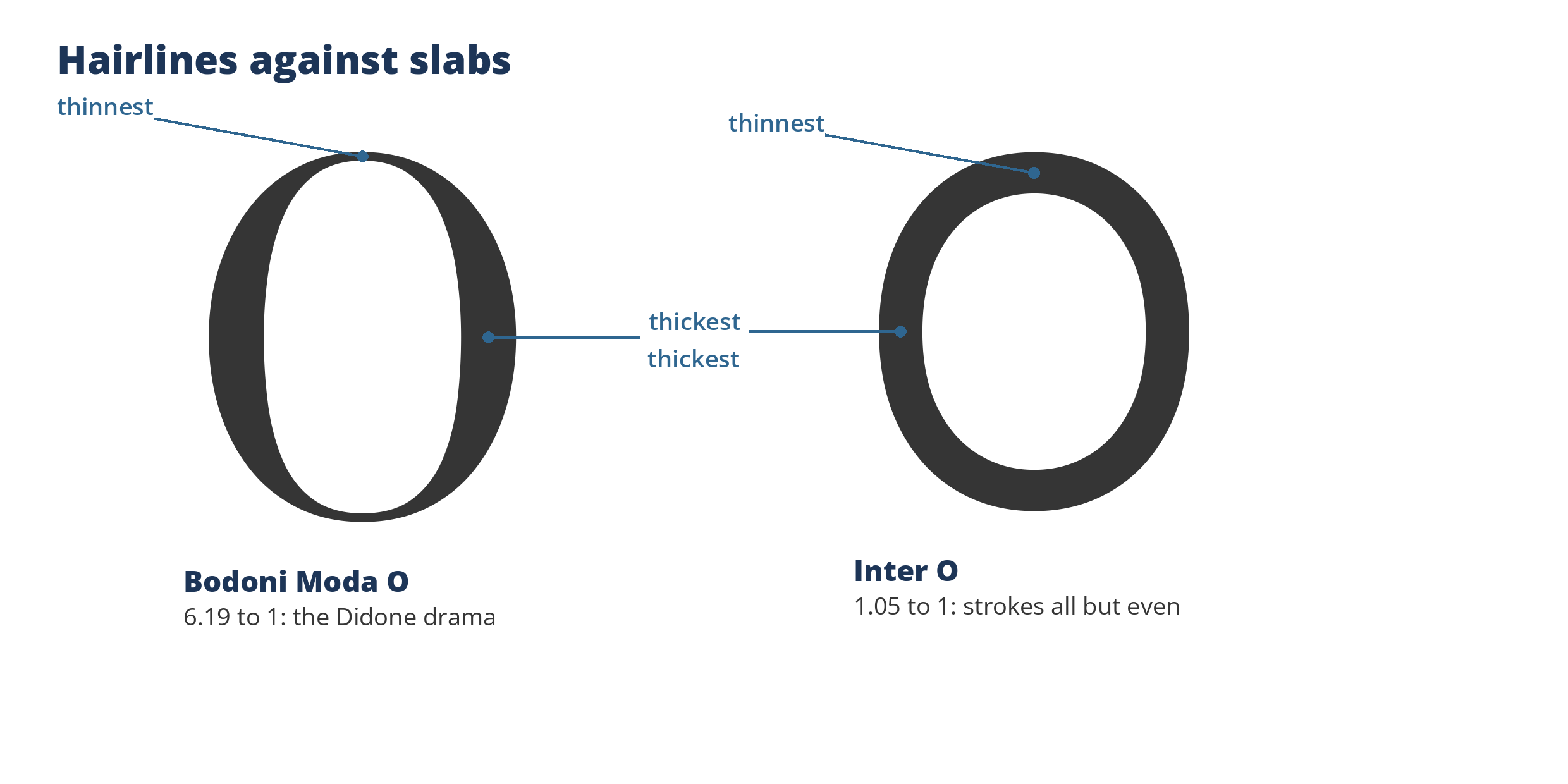
Probed on the rings themselves at this size: Bodoni Moda’s stem measures 87 pixels against a 14 pixel hairline, the ratio in the text.
Contrast is the ratio between a font’s thickest and thinnest strokes. We take the capital O, walk around its outline stopping at 240 points, and at each stop measure the stroke width square to the curve, so the diagonal thins that older horizontal-and-vertical scans missed are counted. Divide a large reading by a small one and you have the ratio. Bodoni Moda’s O measures 6.19, the high drama of the Didone style, hairlines against slabs. Inter’s measures 1.05, strokes all but even from start to finish.
Why it matters: contrast is temperament, and it is also a durability warning. High contrast is elegance at display sizes and fragility at text sizes, where the hairlines can drop out entirely on screen or in cheap printing. Low contrast is the workhorse profile, unfashionable and readable almost anywhere. Details: Contrast: the thickest stroke divided by the thinnest.
X-height: how tall the small letters stand
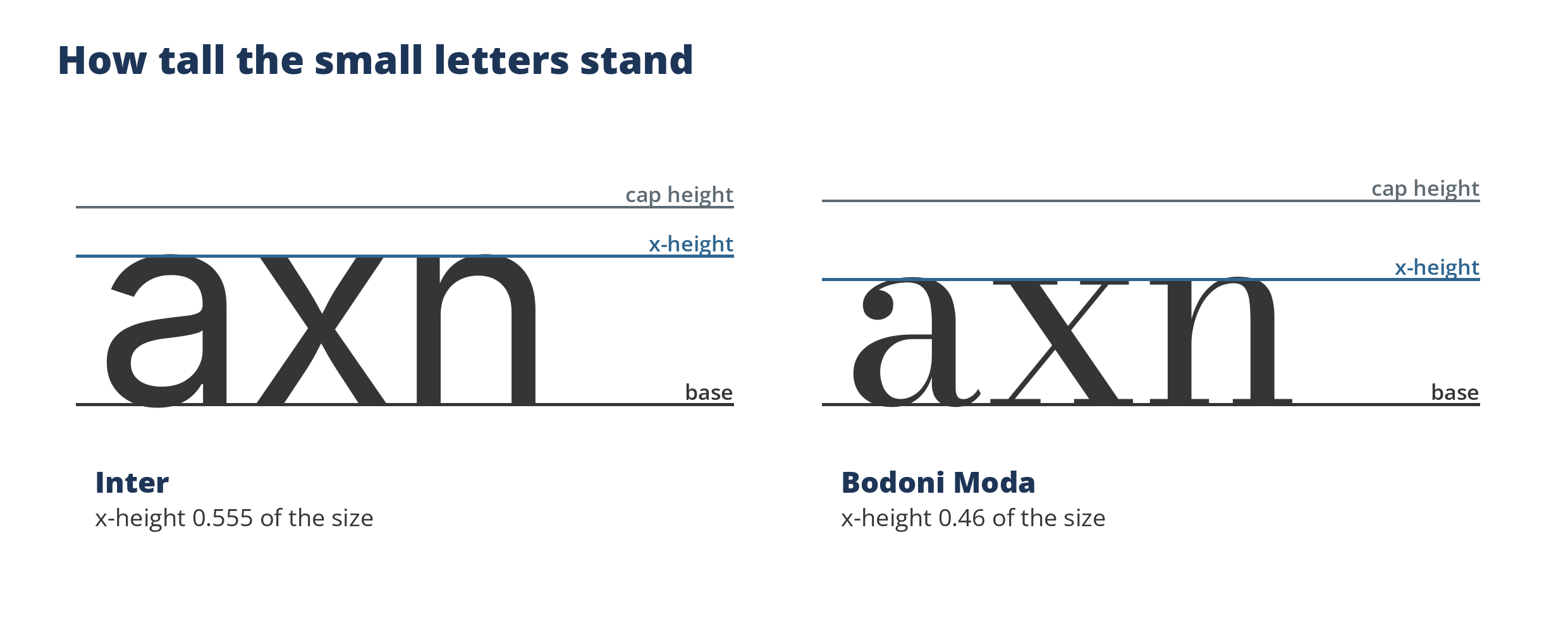
Same size, same guides, drawn from the letters themselves. Bodoni Moda’s lowercase stands visibly shorter against its own cap height.
X-height is the height of the lowercase body, the part shared by x, a, e, n, and o, as a share of the font’s size. We measure those five letters and take the median, so one swashy outlier cannot drag the number around. Inter’s five center on 0.555. Bodoni Moda’s center on 0.46.
Why it matters: x-height decides how big a font reads, more than the nominal size does. Most of any text is lowercase bodies, so a font with a large x-height looks larger, and usually reads more easily at small sizes, than a font whose lowercase is petite next to its capitals. It is the single best explanation for the side-by-side puzzle at the top of this page. Details: X-height: how tall the small letters are. Its vertical neighbours follow directly below, and the whole set of lines gets the full treatment in Font anatomy, measured.
Cap height: how tall the capitals stand
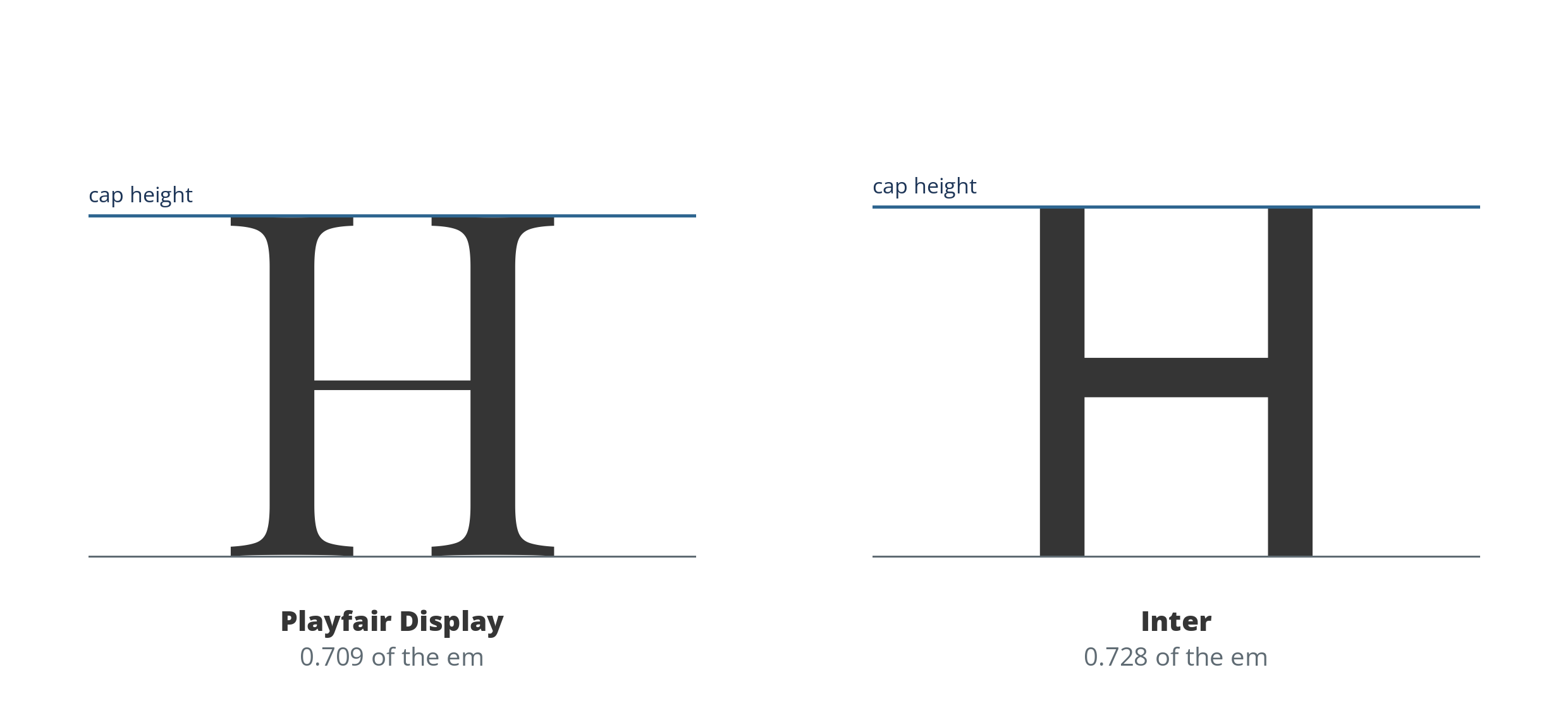
The line across the top of the H. Cap height is read off the flat capitals, the letters whose tops define it.
Cap height is the height of the flat-topped capitals, H, E and T, as a share of the font’s size, read off the H itself rather than the value the file declares. Playfair Display’s capitals stand at 0.709 of the em; Inter’s at 0.728. Set against the x-height it gives the font’s vertical proportion: how much of the line is capital drama and how much is lowercase body.
Why it matters: cap height is presence. All-caps settings, initials, and headlines borrow their authority from it, and the cap-to-x ratio is a large part of why one face reads as formal and another as friendly at the same size. It is also one of the rounds in Higher or Lower, where the difference is visible at a glance once you know to look at the tops of the letters.
Ascender height: how high the rising strokes climb
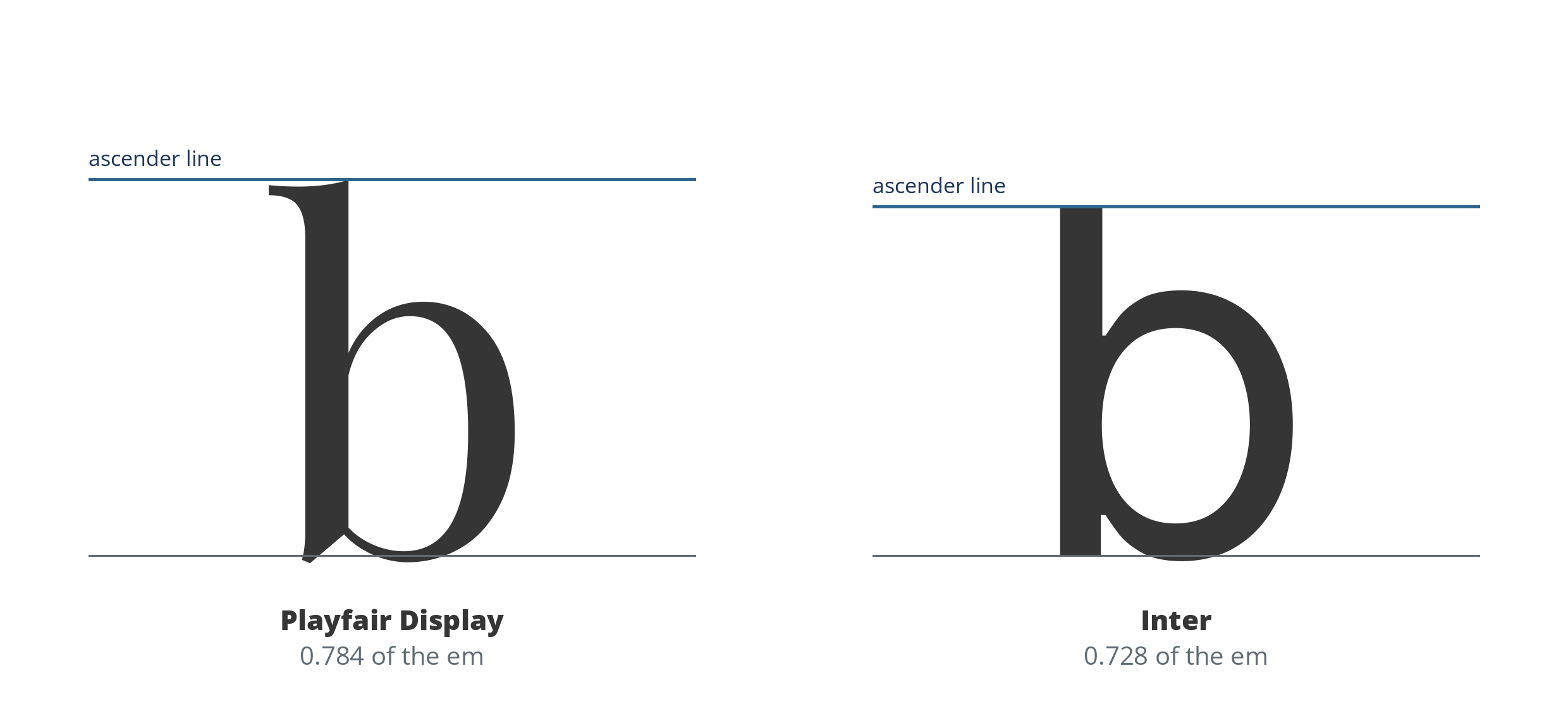
The top of the b. Playfair Display’s rising strokes climb past its capitals; Inter’s stop exactly at cap height.
Ascender height is where the rising strokes of b, d, h and l stop, again as a share of the font’s size and read off the letters. The two profiles above are the classic pair of choices: Playfair Display’s ascenders climb to 0.784, clear above its cap height, leaving room for accents over capitals; Inter’s stop at 0.728, exactly its cap height, one shared ceiling for everything that rises. A font also carries declared ascender figures in its metrics tables, and those often sit higher still, because they budget room for accented capitals; Font anatomy, measured follows what happens when the declared sets disagree.
Why it matters: ascender height is headroom. It decides whether tall lowercase letters and accented capitals breathe or crowd the line above, and together with the descender it sets the tightest line spacing a face can survive.
Serif: whether the strokes end in feet
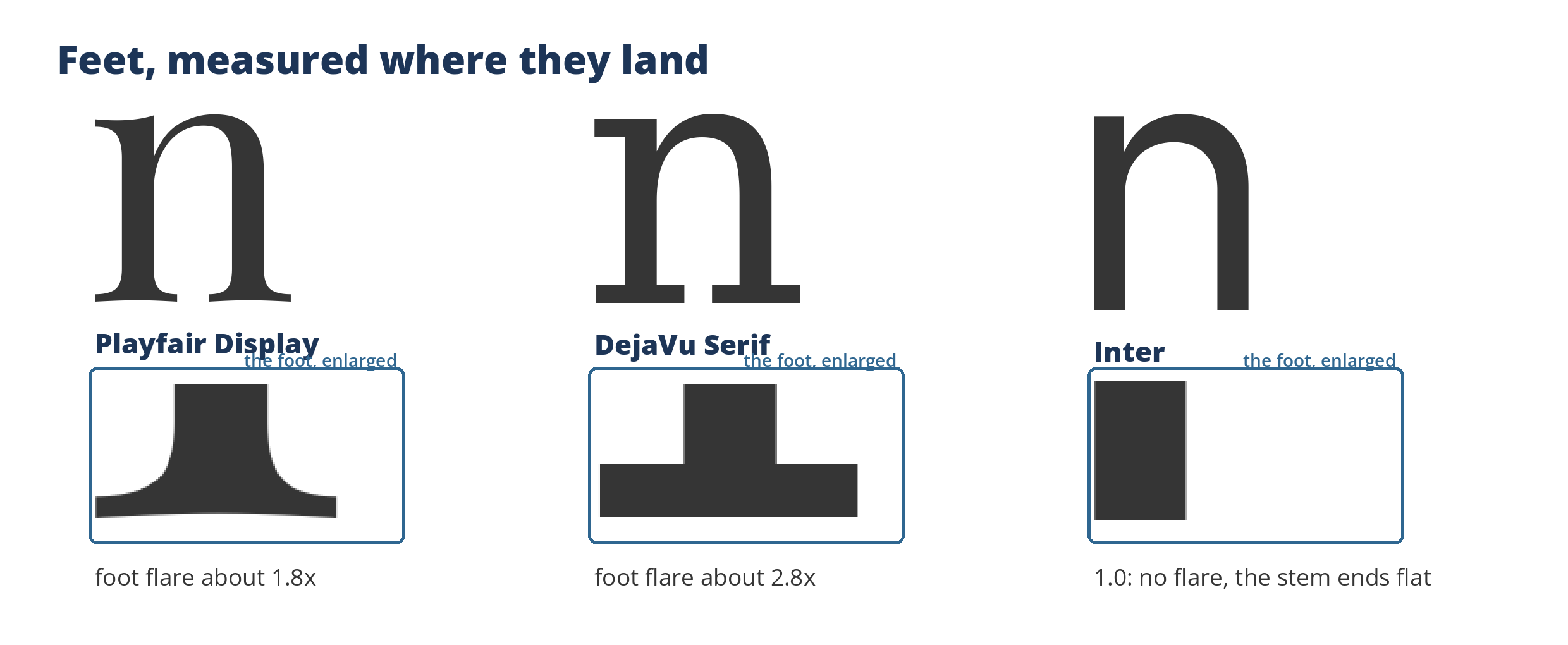
The feet, enlarged. Serif is not a style label here; it is a width ratio read off the stem where it lands.
Serif is the oldest sorting question in type: do the strokes end in feet, or do they stop clean? We answer it from the outlines, because the declared answer in a font’s own classification fields is missing or wrong across much of the free-font world. We render the lowercase n, measure its left stem’s width at every height from the baseline to the x-height, and compare the width in the bottom tenth against the width at mid-stem, a ratio we call foot flare. Playfair Display’s stem widens to about 1.8 times its middle width at the foot. DejaVu Serif’s widens to about 2.8 times. Every sans on our sixteen-font validation panel measured exactly 1.0, no widening at all, and the detector called all sixteen correctly.
Why it matters: serif against sans is the first filter readers reach for, and a measured verdict extends it to the whole catalog, including fonts whose metadata says nothing. The same reading audits the declarations: when a font’s family class disagrees with its stems, the stems win. Details: Serif detection: how a machine tells serif from sans.
Stress: the axis of the thinnest strokes
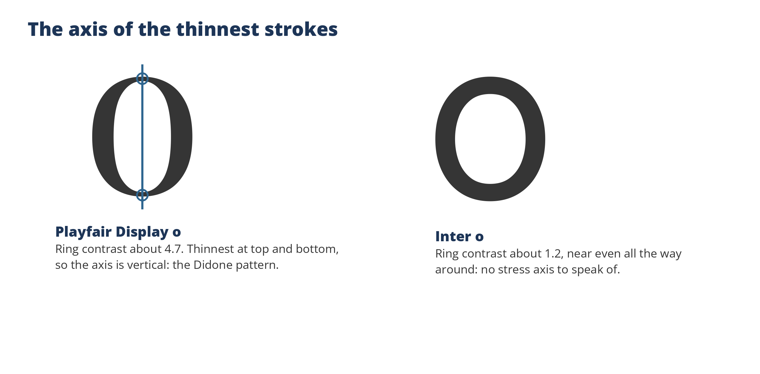
Playfair Display’s thinnest strokes sit at top and bottom, so its stress axis stands vertical. Inter’s ring is near even and offers no axis.
Stress is the direction a font’s strokes run thinnest, the fossil of the broad-nib pen: diagonal in old-style faces, vertical in the Didones. We measure it on the lowercase o, casting rays from the center of the ring and recording the stroke’s thickness at every angle. Two readings come off the ring: the contrast between its thickest and thinnest points, and the axis joining the thin ones. Playfair Display measures a ring contrast of about 4.7 with its thinnest axis at 90 degrees, top and bottom, the Didone pattern certified. Inter measures about 1.2, which lands in the band we report as mild vertical emphasis rather than stress.
Why it matters: stress is an era marker. It separates the modern fashion serif from the transitional text face when weight and contrast alone cannot tell them apart, and it gives similar-font rankings one more axis to agree on. It also carries an honest limit: the diagonal stress of old-style faces does not live in the o, so the ring cannot certify it, and we do not claim it does. Details: Stress: the axis of a font’s thinnest strokes.
Aperture: how open the letters stay
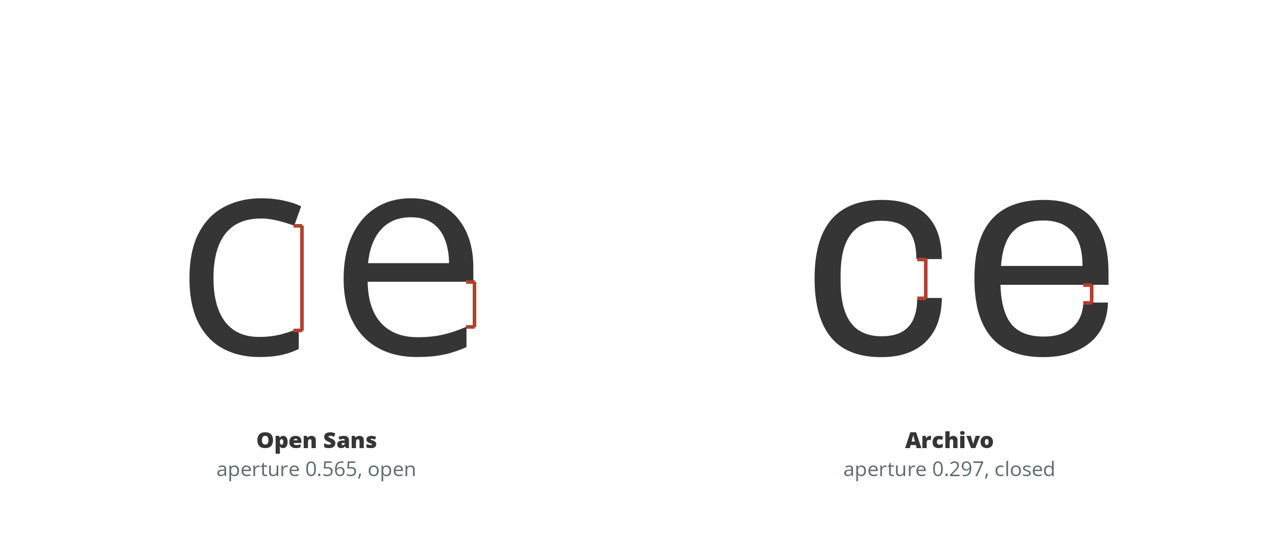
The red brackets sit on the throats the measurement reads: the narrowest gap in each letter, as a share of its height.
Aperture is the openness of the letters that nearly close: c, e, and a. We render the c and the e, scan the channels through them, and record the narrowest opening in each as a share of the letter’s height; the average of the two is the reading, sorted into open, moderate, and closed. Open Sans measures 0.565, its gaps wide enough to survive any rendering. Archivo measures 0.297, the only closed face in the fourteen text faces measured for the easiest fonts to read, measured, where the full set is tabled and the measurement is playable in the browser.
Why it matters: aperture is the small-size survival trait. When text shrinks, the gaps are the first thing rendering erases, and a closed c becomes an o, a closed e a solid block. It is the youngest reading in this set, added when the readability work needed a number for something designers had only pointed at, and it plays as a round in Higher or Lower with its own specimen word, because the letters it judges have to be on the table.
How font.io uses the numbers
Every font page on font.io carries the core measurements in a compact strip, and the same numbers work as search facets, so a reader can ask the catalog a question in measurements instead of names: low contrast, large x-height, condensed. The structural readings ride along: a serif verdict and a stress band, read off the same stems and rings, so the catalog can be sorted by structure even where a font’s metadata is silent. The vertical numbers sit behind Font anatomy, measured, and aperture behind the readability work. The figures come from the outlines, never from the font’s self-reported metadata, because labels are marketing as often as they are description. The measuring method behind them was validated across 1,849 fonts while we built it, including the awkward cases, and where a font honestly cannot be measured, an inline face whose stem is a decoration, a symbol font with no real O, a design with no lowercase at all, we flag the gap or leave the number out rather than publish a figure that describes the wrong thing.
Choosing and pairing with the numbers
The measurements turn font choice from pure taste into taste with a checklist:
- Small text, screens, captions, forms: start with x-height, and check aperture, how open the gaps in c and e stay before they close into o shapes. A large x-height and low contrast will still be standing at 12 pixels when a delicate face has dissolved, and an open aperture keeps the letters distinct when they get there. Both numbers, measured across fourteen familiar text faces, are in the easiest fonts to read, measured.
- Headlines and display: contrast is your dial. High contrast reads as fashion and ceremony; low contrast reads as news and machinery. Weight then sets how loudly it speaks.
- Pairing two fonts: match x-height first. Fonts whose lowercase bodies stand at similar heights look the same size on the page even when their styles differ, so a serif text face and a sans for headings can share a page without one looking like it shrank.
- Flexible layouts: look at the ranges, not single styles. A family that spans condensed to extended widths and thin to black weights gives you room when the layout tightens or loosens, which is the practical reason superfamilies exist.
- Emphasis: check the slant and the letterforms together. A companion italic that leans around 8 to 12 degrees will read as a true partner voice, not a tipped-over roman.
None of this replaces looking at the type. It explains what you are looking at, which, after five centuries of judging by eye alone, turns out to be most of the battle.