· guides, reference
The easiest fonts to read, measured
There is no easiest font to read, and reader studies keep proving it. What a font offers instead is measurable: how tall its lowercase letters stand, and how open the gaps in c and e stay before they close into o shapes. We measured fourteen text faces on both counts. The results separate the classic reading fonts from the rest.
No single answer, and the studies agree
The largest recent reading study, run with 352 participants across 16 fonts and summarized by the Nielsen Norman Group in Best Font for Online Reading: No Single Answer , found exactly what its title says. Garamond produced the fastest average reading speed, yet it was the fastest font for fewer than half of the readers who saw it. Franklin Gothic was most often a reader’s personal fastest while posting a middling average. Between a reader’s best and worst font, speeds differed by about a third.
Two conclusions survive that study. Font choice genuinely matters; a bad match costs real speed. And the winner is personal, varying reader by reader in ways no average captures. What can be compared objectively, font file against font file, is the drawing: the shapes a reader’s eyes have to work with. Two properties of the drawing do most of the work, and both can be measured.
The two measurements that matter most
The first is x-height, the height of a lowercase x relative to the font’s em, covered in font anatomy, measured . At the same nominal size, a font with a tall x-height sets its lowercase letters, which are most of any text, visibly larger. Readers experience this as a font that reads bigger than its point size.
The second is aperture: how open the gap is in letters whose counter nearly closes, chiefly c and e. A wide aperture keeps c clearly distinct from o and keeps the channel under the e’s crossbar open. A narrow one lets both letters fill in at small sizes, in cheap print, or on a dim screen, which is where reading actually gets hard. Type designers have argued about aperture for decades under the banner of the humanist sans, drawn open, against the grotesque, drawn tight. Measuring it is newer. The plate below shows the extremes in this set.
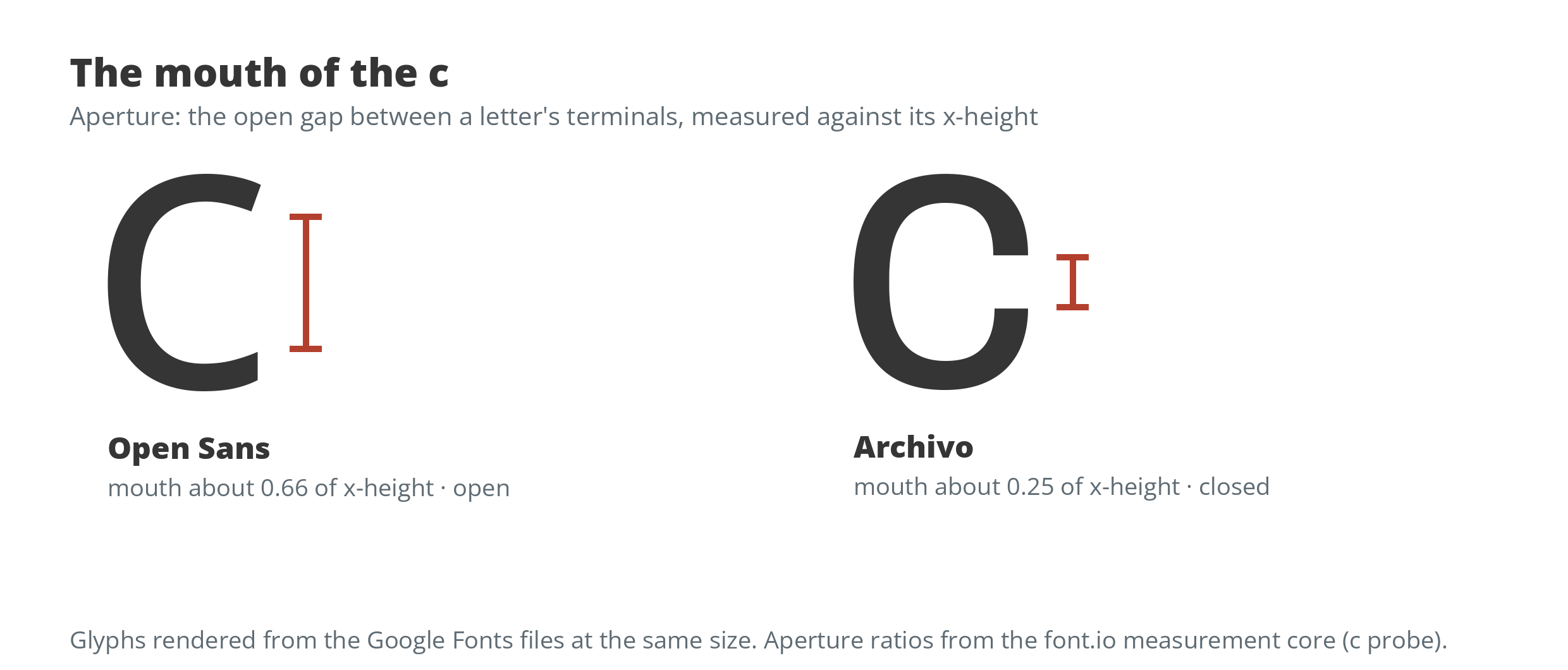
The measurement is playable. Pick any of the fourteen faces and the widget below measures its c and e live, from the font file itself; overlay a second face on the c to compare mouths directly, then drag the sentence down to caption size and watch which faces hold their openings and which fill in.
Aperture, measured live in your browser from the font file itself: the narrowest opening in c and e, as a share of the letters' height. Open is 0.45 and above; closed is 0.32 and below.
A closed c can pass for an o at a glance, and a narrow e fills in like a solid block. An open one keeps its gap, so the eye never has to guess.
Fourteen familiar faces, measured
Each face was measured from its Regular weight as published on Google Fonts. X-height and aperture are ratios of the em and of the x-height respectively; width is the average advance of the lowercase alphabet as a share of the em; contrast compares the thickest and thinnest strokes of the letter o. The full measurement set sits behind the font metrics hub.
| Font | Kind | X-height | Aperture | Class | Width | Contrast |
|---|---|---|---|---|---|---|
| Open Sans | Sans | 0.550 | 0.565 | Open | 0.522 | 1.21 |
| PT Sans | Sans | 0.510 | 0.545 | Open | 0.481 | 1.20 |
| Source Sans 3 | Sans | 0.500 | 0.528 | Open | 0.475 | 1.18 |
| Merriweather | Serif | 0.573 | 0.520 | Open | 0.559 | 2.29 |
| Fira Sans | Sans | 0.543 | 0.516 | Open | 0.508 | 1.29 |
| Lato | Sans | 0.515 | 0.504 | Open | 0.495 | 1.18 |
| Spectral | Serif | 0.460 | 0.493 | Open | 0.502 | 2.08 |
| Source Serif 4 | Serif | 0.508 | 0.473 | Open | 0.551 | 1.92 |
| Libre Franklin | Sans | 0.545 | 0.414 | Moderate | 0.529 | 1.37 |
| IBM Plex Sans | Sans | 0.530 | 0.395 | Moderate | 0.505 | 1.19 |
| Roboto | Sans | 0.538 | 0.370 | Moderate | 0.499 | 1.17 |
| Work Sans | Sans | 0.515 | 0.360 | Moderate | 0.548 | 1.12 |
| Inter | Sans | 0.555 | 0.358 | Moderate | 0.536 | 1.05 |
| Archivo | Sans | 0.545 | 0.297 | Closed | 0.496 | 1.20 |
The top of the table is the screen-reading humanist canon: Open Sans, PT Sans, Source Sans 3, Fira Sans, and Lato, the faces a generation of readability advice has recommended on instinct. The measurements say the instinct was tracking something real. All three serifs in the set also measure open; serifs sort by contrast, not by aperture. Archivo, a Helvetica-tradition grotesque with vertical-cut terminals, is the only closed face of the fourteen, and it is not close: its c opens about a quarter of its x-height, against about two thirds for Open Sans.
There is no total score to compute from these columns, and higher is not simply better. Each number has a comfortable band rather than a winner’s direction. X-height helps until it crowds the ascenders that distinguish b from h. Contrast is elegance in a headline and a liability at caption size, where the thin strokes are the first to disappear. Width is a space budget, not a virtue. So the columns work as a filter, not a ladder: name the job first, then let the two numbers that govern that job rule faces out. Choosing for a situation, below, runs the table that way.
Aperture is not x-height in disguise
It would be tidy if the two numbers moved together. They do not. Merriweather carries the largest x-height in the set and a middling aperture. Source Sans 3 pairs one of the smallest x-heights with the third-highest aperture. Inter stands tall and still measures moderate, its openings pinched by its tight, uniform drawing. A font can look big and read closed, or look modest and read open, which is why both numbers earn their place.
The measure also reads the drawing rather than the reputation. Roboto’s e probe comes back more open than its c probe, because its e genuinely is open, ending in a diagonal-cut terminal, while its c is as closed as its grotesque pedigree predicts. A single score per letter, averaged, keeps that kind of honesty visible instead of smoothing it away.
Choosing for a situation
For long documents on screen, any face from the open half of the table serves well at an adequate size, and size and line spacing will matter more than the choice among them. For small text, interface labels, captions, and forms, aperture starts to bite: prefer an open face with a tall x-height, Open Sans or Source Sans 3, over a closed one, because the gaps are the first thing small rendering erases. For print books, the measured serifs are all open, and the traditional preference for serifs in long print reading meets no objection from the numbers. For readers with low vision, the strongest lever is size itself, then spacing; an open aperture helps at the margin, and a closed face at a small size is the one combination to avoid. Two columns govern the remaining common jobs. When space is the constraint, in tables, labels, and dashboards, width decides: PT Sans and Source Sans 3 set the most words per line in this set, while Merriweather and Work Sans spend the most room. When the text will sit small or render on a poor screen, contrast is the warning light: the serifs carry two to three times the stroke contrast of the sans faces, which is presence at reading sizes and fragility at tiny ones, so keep high-contrast faces at sizes where their thin strokes survive.
Dyslexia fonts: what the evidence says
Dyslexia deserves its own paragraph because the claims around it are louder than the evidence. The British Dyslexia Association’s style guide recommends plain, evenly spaced sans-serif faces and generous letter and line spacing. Specialist fonts go further and reshape the letters themselves: OpenDyslexic , free, weights the bottoms of letters and enlarges their openings, and Dyslexie , a commercial design, does similar work. Controlled studies have not found the advantage the reshaping promises. A 2018 study of Dyslexie with school-age readers (Kuster and co-authors) found no reading benefit over a standard face once spacing was accounted for, and earlier work by Rello and Baeza-Yates reached the same result for OpenDyslexic. What consistently helps in the studies is spacing and size, which are settings any document can apply to any font. Readers who prefer a specialist font should use one; preference is real even where measured advantage is not. But no font, specialist or otherwise, has earned the title of best for dyslexia.
 OpenDyslexicFree. Weighted letter bottoms and enlarged openings, drawn to make letters harder to confuse or flip.Visit site
 DyslexieCommercial. A typeface designed specifically for readers with dyslexia, licensed per user.Visit site
The honest limits
These are Regular weights only. Bold strokes eat into the openings, so the ranking at bold is unmeasured and probably tighter. The measurements describe drawings, not readers; nothing here tests a single person’s reading, and the reader studies say the person is half the equation. Read the table as what it is: the first font.io measurement of a property designers have praised and blamed for a century, finally with numbers attached.