· metrics
Stress: the axis of a font's thinnest strokes
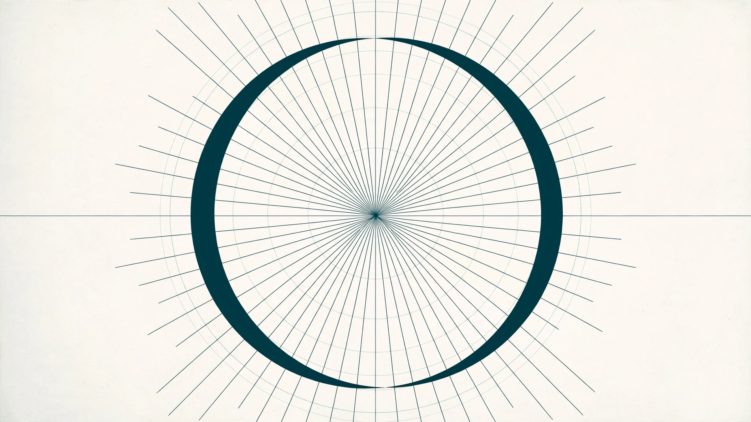
Stress is the axis along which a font’s strokes run thinnest, the fossil of the broad-nib pen. font.io measures it on the lowercase o: the ratio between the ring’s thickest and thinnest points, and the angle of the line joining the thin ones. It certifies the Didone pattern exactly, and says so when it cannot say more.
What is stress?
Draw an o with a broad-nib pen held at a fixed angle, the way a scribe’s hand holds it, and the stroke cannot stay even: it swells where the nib travels across its width and pinches where it travels along it. The two thinnest points of the ring end up opposite each other, on an axis tilted like the nib. That axis is the font’s stress, and for most of type history it was diagonal, because hands are diagonal. Around 1800 the fashionable faces, the Didones, rotated the axis upright: hairlines at top and bottom, full-thickness walls at the sides, stress gone vertical and contrast pushed to an extreme. The vocabulary of classification still runs on the distinction. Calling a serif old style or modern is, in large part, a claim about where its thin points sit and how thin they get.
It is also, historically, a judgment call made by eye. The question behind this measurement is whether a machine can read stress off a font file the way it reads weight off a stem, and how far that reading can honestly go.
What do we actually measure?
Render the lowercase o at 1000 pixels per em. From the center of its ink, cast rays in every direction, one degree apart, and measure the ring’s thickness along each ray, from the counter’s edge to the outer edge. The result is a thickness profile: 360 numbers that rise over the side walls and fall over the arcs. Two readings come off it. The ring contrast is the thickest point divided by the thinnest. The axis is the orientation of the line through the two opposed thinnest points: 90 degrees means the thin points sit at top and bottom, the vertical stress of a Didone.
One number is never published naked. Ring contrast ships in bands: above a clear-stress line set well above the range where ordinary faces cluster, the verdict is clear stress; below it sits a mild vertical emphasis band, a real signal that is not classification-grade stress; below that, no clear stress. The bands exist because the panel taught us where the noise lives, as the failure section below explains. Pick a font and read its ring:
A fact the chart makes visible: every font on the panel, serif and sans alike, puts its thinnest points at top and bottom, within a few degrees of vertical. Vertical is Latin’s default tilt. That is why the classifying work is done by the contrast bands and the axis together, not by the axis alone.
What does the measurement certify?
The Didone pattern, precisely. Playfair Display’s ring measures contrast of about 4.7 with its thinnest axis at 90 degrees. Bodoni Moda measures about 5.3 at 89 degrees. Where stress is strongest, the sensor is exact to within a degree, and the two exemplars sit far above the clear-stress line with nothing near them.
The transitional serifs certify something narrower, and the post says it plainly: clear stress on a vertical axis. Merriweather measures ring contrast of about 2.1 with an axis at about 93 degrees; Liberation Serif, the Times class stand-in, measures about 2.3 at 90 degrees. Their rings are honestly modulated, and their thin points are at top and bottom like everyone else’s. Whatever diagonal character the Times class carries does not live in its o.
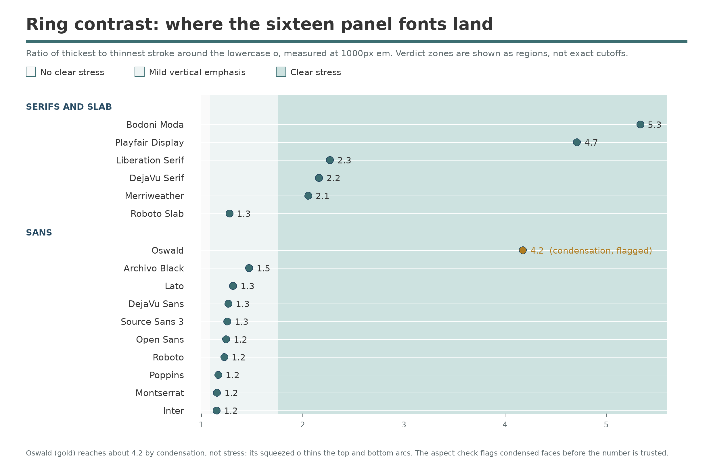
All sixteen panel fonts against the shipped bands. The serif group separates cleanly; the sans group clusters in the mild band, with one flagged exception.
Where does it fail?
The prototype’s first decision rule scored 5 of 16 against expectations written before the run, and the failures are the most useful part of the work. They were failures of the rule and of two expectations, not of the sensor.
Mild emphasis is everywhere. An ordinary sans o is built with its verticals a little heavier than its horizontals, so Roboto measures ring contrast of about 1.2, Open Sans about 1.3, Lato about 1.3, and heavy Archivo Black just under 1.5. The prototype’s first clear-stress line sat inside that noise band and called every one of them stressed. The line now sits well above the cluster, and the band below it is reported as mild vertical emphasis, which is what that signal actually is.
Condensation fakes the whole pattern. Oswald, a condensed sans, measures ring contrast of about 4.2, deep in Didone territory, because squeezing the o thins its top and bottom arcs to 33.8 pixels while diagonal rays cut long paths through its narrow side walls, up to 147.5 pixels. The geometry is real; the interpretation is false. The shipped measurement guards it with the o’s own proportions: a ring much narrower than it is tall gets its verdict flagged as condensation-suspect before the number is trusted.
And one expectation was simply wrong about a font. DejaVu Serif was expected to read as low contrast with no clear stress. It measures about 2.2, clear stress on a vertical axis. The measurement corrected the assumption, which is the outcome a validation panel exists to produce.
The standing limit is the o itself. Diagonal, old-style stress lives in the joins and bowls of a and e, not in the ring of the o, so this measurement cannot evidence it and we do not claim it does. Certifying old style needs a second glyph, and that work has not been done.
What is stress good for?
Era, first of all: ring contrast and axis separate the modern, Didone shelf from transitional text serifs at catalog scale, without trusting declared metadata that the long tail mostly lacks. It is also a ranking feature. Similar fonts feel similar when their stress class matches, so the bands join the measurement vector behind the similar-fonts work alongside serif detection and the measurement set in Font metrics. Pairing logic can use it too: the classic editorial pairing, a vertical-stress display serif over a quiet text face, is only expressible as a rule once stress is a number. And it serves as an attribution check: a revival claiming an early model that measures pure vertical stress at contrast near 5 is telling you its real model is later than its story. Note that this ring contrast is a different instrument from the strand’s contrast, which walks the capital O’s outline; the two numbers are cousins, not duplicates, and each post says which one it means.