· metrics
Serif detection: serif vs sans, by machine
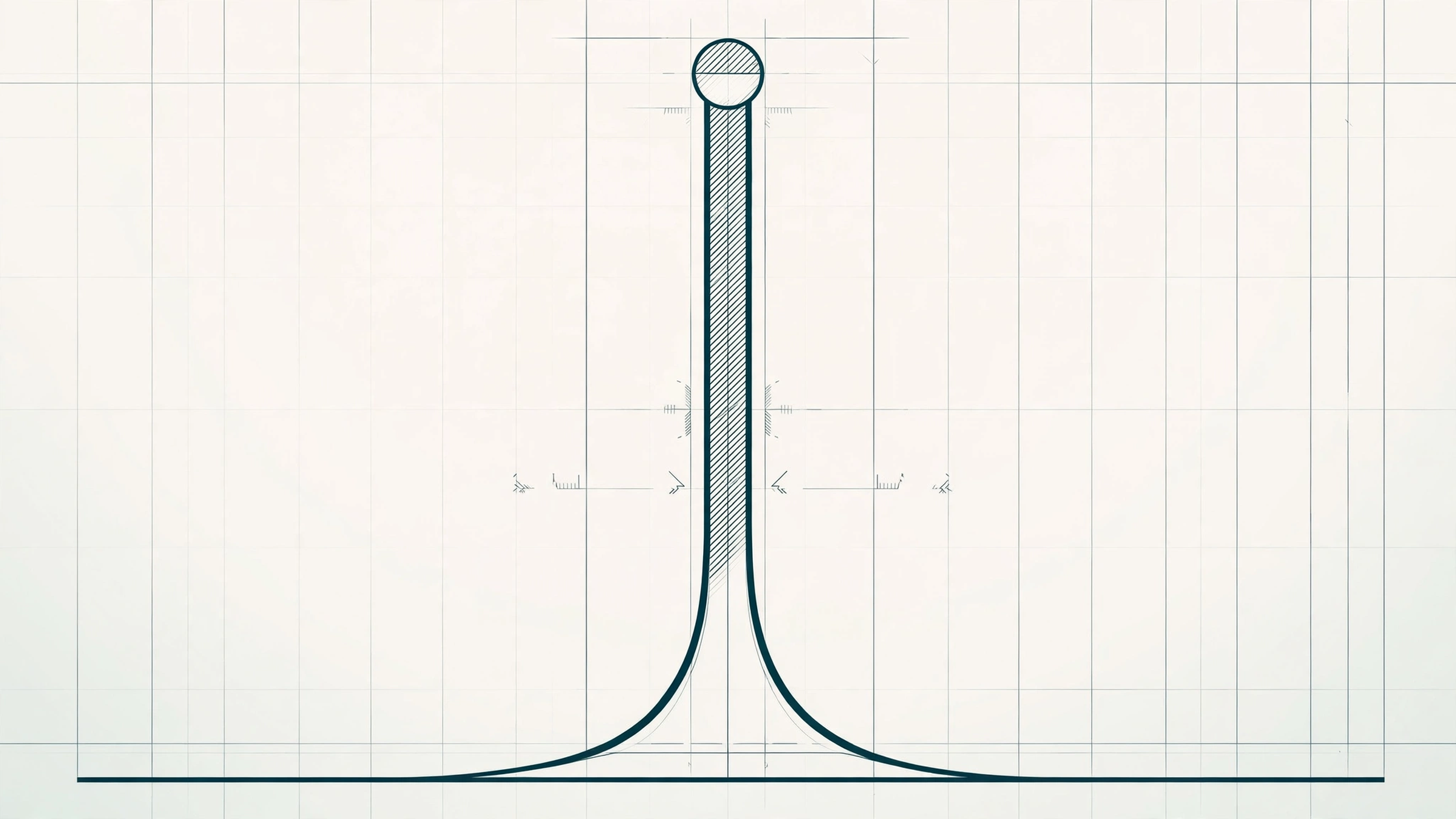
Serif detection is font.io telling serif from sans by measuring the font, not its metadata: we profile the stem of the lowercase n, comparing its width at the baseline against mid-stem. Serif stems flare where the foot meets the baseline; sans stems stay flat. On a sixteen-font panel, the two groups never overlapped.
Why can’t a catalog just know whether a font is a serif?
Serif or sans is the most basic sorting question in type, the first filter most readers reach for. A font file does carry declared answers: the OS/2 table has a family class field, and PANOSE, an older classification system, has a serif style digit. The trouble is the long tail. Across tens of thousands of free fonts, those fields are missing, left at a default, or simply wrong. A font cloned or converted from another file keeps the donor’s declarations. A designer who never touched a classification menu ships whatever the editor filled in. Reading the declaration at catalog scale means repeating those accidents as fact, one font at a time, forever.
The alternative is the one this whole strand runs on: measure the letterforms. Outlines cannot be mislabeled by a menu they never saw. And the serif question has a particularly convenient property. The evidence for a serif is not spread subtly across the whole alphabet; it sits in one structural place, where strokes end. Terminals and feet are where serifs live, so a detector can go straight there. The practical question is which ending, on which letter, gives the cleanest signal. Our answer: the foot of the left stem of the lowercase n, read as a cross-section.
How does the detector read a stem?
Render the lowercase n at 1000 pixels per em, unhinted, in grayscale. Find the left stem by scanning the glyph’s columns for the longest vertical run of ink. Then walk the rows from the baseline up to the x-height, following that stem, and record its width at every height. That record is the stem profile, and the two families draw different pictures. A sans stem is a corridor of nearly constant width, top to bottom. A serif stem widens at the bottom, where the foot, bracketed or slabbed or a hairline wedge, meets the baseline.
The verdict compresses the profile into one ratio, the foot flare: the mean stem width in the bottom 10 percent of the stem’s height, divided by the mean width at mid-stem. The verdict line is set from the panel, with a wide margin on both sides: clear the line and we call the font a serif; sit at or near a flat 1.0 and we call it a sans; land between the two zones, and the honest answer is ambiguous, and we say so rather than guess. The shape of the flare, whether it arrives as an abrupt step or a gradual widening, is recorded as an observation. It is not part of the verdict, for reasons the limits section below makes clear.
Pick a font and read its profile the way the detector does:
Measured profiles from the validation panel, rendered at 1000px em. The foot zone is the bottom 10 percent of the stem, where a serif lives. The detector's verdict keys on that zone alone.
Does it actually work?
We validated the detector the way the rest of the metrics strand was validated: a panel of real fonts with the expectations written down before the first run. Sixteen fonts, spanning Didone serifs, transitional text serifs, a slab serif, and neo-grotesque, grotesque, humanist, and geometric sans faces. The serif detector scored 16 of 16, with no ambiguous verdicts, and the margin was not close. The six serifs measured foot flares from about 1.6 (Bodoni Moda, whose hairline feet are the subtlest on the panel) up to about 2.8 (DejaVu Serif), with Roboto Slab at about 2.7 and Playfair Display at about 1.8. Every one of the ten sans faces measured exactly 1.0: a stem the same width at its foot as at its middle, the flat profile the method predicts. The verdict threshold sits in empty space between the two groups, with clear air on both sides, which is where a threshold wants to live.
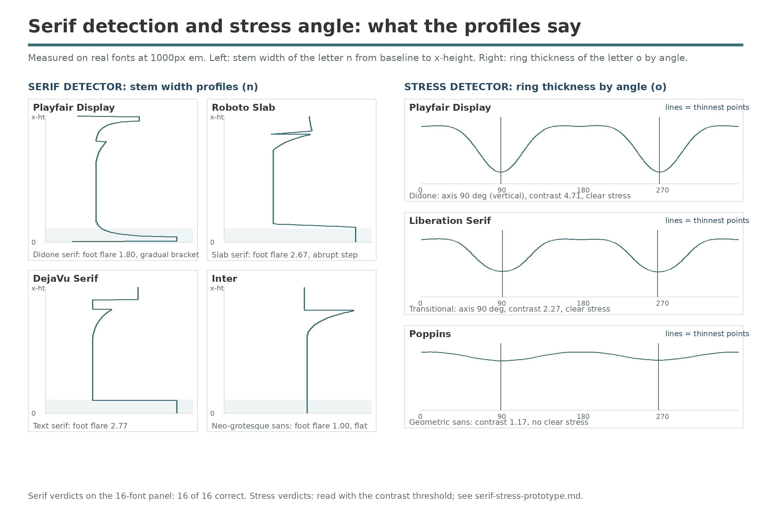
The panel profiles: stem widths on the left, o ring thickness on the right. Serif feet show up as the wide base of each stem profile.
Where does it break?
Three limits, all found by the panel rather than after it. First, the obvious second signal is unusable. Serif stems often widen near the top as well, so we measured a head flare too, and in sans faces the arch shoulder of the n widens the measured run near the top all by itself: Oswald, a sans, posts a head flare of about 1.8, higher than some real serifs. The foot zone is clean because nothing else lives at the baseline. The verdict keys on the foot alone; the head flare survives only as a diagnostic.
Second, flare shape separates only the extremes. Playfair Display’s bracketed foot reads gradual and Bodoni Moda’s unbracketed hairline reads abrupt, as hoped. But the bracketed text serifs also read abrupt, because their brackets complete inside the lowest 3 percent of a tall stem and a coarse shape test cannot see them. Promoting shape into a slab-versus-bracket classifier needs a finer fit over the whole foot quarter; until then it stays an observation.
Third, the detector needs its letter. A font with no lowercase n falls back to the stems of h, l, u, or m, in that order. A caps-only display face returns “not measurable” instead of a guess, the same discipline the strand applies to a symbol font with no real O. And whole design families remain untested edges of the panel: wedge and feetless serifs, Tuscan and inline display faces, and serifs with minimal feet. Widening the panel across those is the standing next step.
What is a measured serif verdict good for?
It turns the most basic filter in type into one that covers the whole catalog, including the large share of fonts whose metadata says nothing at all. It also runs the audit in the other direction: when a font’s declared family class disagrees with its stems, the stems win, and the disagreement itself is a data-quality flag worth surfacing on a catalog of FontSpace’s scale. And as a number, the foot flare joins the measurement vector described in Font metrics, one more axis along which similar fonts can be ranked: two faces with the same weight and width but feet on one and none on the other are not the same recommendation. The companion measurement, which reads the ring of the o instead of the stem of the n, is Stress.