· history, designers
90s Fonts: the freeware designers who gave them away
Before fonts were a business, they were a hobby with a zip file. The story of the 1990s freeware font scene — Larabie, Rakowski, Curtis, Klein, Steffmann — and the one-woman archive that kept it online.
In the mid-1990s, type design stopped being a guild trade. A program called Fontographer put font-making on ordinary PCs, the web gave anyone a distribution channel, and a generation of designers — most of them self-taught, all of them working alone — started making fonts by the hundreds and giving them away in zip files. The commercial industry mostly ignored them. Then their fonts started turning up on album covers, Olympic broadcasts, and the biggest video game logo on earth. These are the designers of the freeware era, and the unlikely infrastructure that kept their work alive.
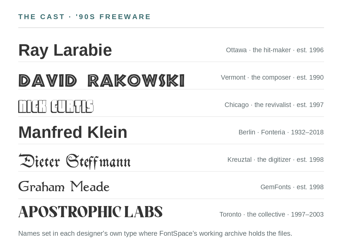
A scene, not an industry
Freeware fonts ran on enthusiasm and other people’s servers. A designer would draw the letters, hint them on a home machine, write a readme, and upload the zip to a personal site or an archive. Downloads cost the designer bandwidth; popularity, perversely, cost real money — more than one designer below went commercial or shut down because the free site got too popular to pay for. What the scene produced in return was an explosion of styles the industry would never have commissioned: revivals of forgotten 19th-century faces, lettering copied from alley-found specimen books, techno alphabets named after suburban streets. The fonts were free. A surprising number of them were also excellent.
Ray Larabie, the hit-maker
Ray Larabie (b. 1970, Ottawa) started releasing freeware in 1996 under the Larabie Fonts name, naming faces after the Mississauga geography around him, and he had a hit-maker’s instinct for the vernacular: highway signage (Blue Highway), techno (Neuropol), and a chunky grotesque called Pricedown that became the Grand Theft Auto wordmark — arguably the most-seen piece of freeware type ever made. His Coolvetica (1999) became the default “free Helvetica” for a generation of bedroom designers, and a modified Neuropol carried the 2006 Winter Olympics. There is even a Metallica story: one early font resembled the band’s logo closely enough that, by Larabie’s own account, the band objected; he retired it, and no lawsuit ever came. In 2001 he turned professional with Typodermic Fonts — the apprenticeship had been public, and it had been free. (His later work includes Superclarendon, bundled with macOS, and the Canada 150 typeface.) Only a handful of fonts sit under his own FontSpace profile; the freeware catalog is scattered across the archives, which is exactly how the era worked.
David Rakowski, the double life
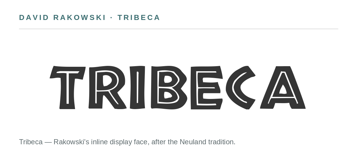
The scene’s most improbable résumé belongs to David Rakowski (b. 1958, St. Albans, Vermont). By day he is the Walter W. Naumburg Professor of Composition at Brandeis, a two-time Pulitzer Prize finalist in music, and the composer of more than a hundred piano études — some written to be played with fists and nose. In the evenings he was one of the very first freeware type designers, reviving ornate 19th-century faces that no commercial foundry would touch: UpperEastSide (1990), Beffle (1991, after Fry’s Ornamented No. 2), Dubiel, Garton. His fonts were downloaded millions of times while his concert music played in recital halls, two audiences that never knew the other existed. His catalog lives on FontSpace today.
Nick Curtis, the revivalist
Nick Curtis (b. 1948, Chicago) likes to date his career to 1962, when — the day before trash pickup — he found a fat green specimen binder from JCS Typographers in an East Dallas alley and carried it home. “His fate was sealed,” as his Identifont biography puts it. The electronic chapter began in 1997, when a friend sold him a copy of Fontographer; Curtis famously drew his fonts in CorelDRAW and built a catalog out of Library of Congress collections, old posters, and specimen books like the one from the alley — hundreds of joyful revivals of Victorian, Deco, and novelty lettering. The work was good enough to license to Agfa-Monotype, Bitstream, and ITC, and the Type Directors Club picked two of his designs among 2001’s best. Nick’s Fonts launched that year; by 2003 the free site had grown too popular and too expensive to run, so he went commercial. He retired in 2013 and donated his rare-book and type collection to the University of Virginia. His full catalog is on FontSpace.

Manfred Klein, the philanthropist
Manfred Klein (b. Berlin 1932, d. 2018) was the scene’s elder statesman — a trained typesetter who had learned from Berthold’s Günter Gerhard Lange and worked as a creative director for Stempel and Monotype. He had a parallel commercial career (FF Spontan, FF Quill) alongside an enormous freeware output under the Fonteria name. The freeware existed because of a business failure: in the ’90s he made 50 fonts for a commercial CD compilation that fell through, so in 2001 he simply gave them away. His license was a philosophy in one paragraph — free for private use, free for charity, and if you used his fonts commercially and profited, you were asked to donate to a charity such as Doctors Without Borders. He kept designing into old age, producing hundreds of fonts, including a shelf of blackletters worthy of his typesetting roots. His collection is on FontSpace.
Dieter Steffmann, the digitizer
Where the others designed, Dieter Steffmann preserved. A trained typesetter from Kreuztal, Germany, he spent 1998–2003 digitizing, completing, and hinting hundreds of historical German typefaces — above all the blackletters — and gave everything away free for any use, commercial included, on the stated principle that type is cultural heritage. He describes his own role modestly: not a designer, but the person who adds the missing letters to public-domain fonts so they can live again as complete, working character sets. The cast of this post is woven through his workshop: in 2000 he revived a script by the young David Rakowski (Adine Kirnberg Script, 1991), and his revivals of Rudolf Koch remain the easiest way to use Koch’s Fraktur faces today. His FontSpace catalog is here, and the backfill of his wider catalog continues.
The lifeboat: Typoasis
None of this survives by accident, and for two decades much of it survived because of one woman’s website. Typoasis, run by Petra Heidorn (who designs as CybaPee Creations), was a German free-font archive that quietly became the era’s infrastructure: when Klein’s and Steffmann’s own sites grew too expensive to run, Heidorn hosted both complete collections, for years, alongside her own fonts. When Typoasis itself closed in July 2017, Luc Devroye — the scene’s tireless chronicler — took over hosting Klein’s archive so it would not vanish.
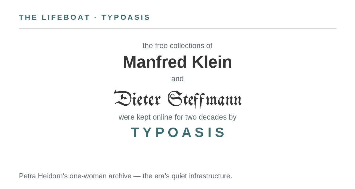
Typoasis’s own afterlife shows what happens to the parts nobody adopts. The domain lapsed, and today typoasis.de is a parked for-sale page whose ads rotate through gambling offers — a ’90s font archive’s address, selling casino traffic. The collections it carried are safe, because they were copied, cataloged, and re-homed. The address is gone. That is the whole history of the freeware era in miniature: the fonts were never the fragile part; the websites were.
The home front
Two more names from the era anchor FontSpace’s own archive. In Toronto, the Apostrophic Labs collective — Frederic Nader, Graham Meade, and friends — ran a friendly, prolific foundry from 1997 to 2003; its complete catalog is preserved on FontSpace under Apostrophic Lab. Meade never stopped: releasing as GemFonts since 1998, he has built one of the largest single-designer catalogs on the platform, hundreds of families of scripts, storybook blackletters, and novelty faces, every one of them free.
The scene’s economics look absurd in retrospect — world-class type, given away, hosted on sites that success bankrupted. But the fonts outlasted every business model around them. They are on FontSpace now, still free, still credited, still being downloaded. The zip files won.
Sources: Luc Devroye’s designer archive at luc.devroye.org (his pages for Larabie, Rakowski, Curtis, Klein, and Steffmann); Nick Curtis biography, Identifont; FontSpace designer profiles as linked. Specimens set from the designers’ own font files.