· designers, history
Rudolf Koch: the writing master behind Kabel, Neuland, and Fraktur
You've seen Rudolf Koch's letters in the Jurassic Park logo and on a thousand beer labels. Here's who he was, which of his fonts — Kabel, Neuland, his Fraktur faces — are worth your time, and where to get them free.
You have read Rudolf Koch’s letters even if you have never heard his name. The carved, chunky capitals of the Jurassic Park logo descend from his Neuland. His geometric sans Kabel has been a working typeface for nearly a century. And the dense blackletter faces that signal “German heritage” on a thousand beer labels trace back to his drawing board in Offenbach. Koch (1876–1934) was the Klingspor foundry’s house designer for almost three decades — and first, last, and always, a calligrapher.

A writing master first
Koch came to type through the hand, not the drawing office. Apprenticed in a metal-goods workshop in Hanau as a teenager, then employed in the Leipzig book trade, he joined the Rudhard’sche Gießerei in Offenbach in 1906 — the foundry that became Gebrüder Klingspor — and stayed for the rest of his life. His conviction, repeated across everything he made, was that a typeface is handwriting disciplined into a system: the pen comes first, and the metal should remember it.
In 1921 he founded the Offenbacher Werkstatt, a workshop community where lettering was taught alongside bookbinding and metalwork, by doing rather than by lecturing. The same year he published Das Schreiben als Kunstfertigkeit — “Writing as a Skill” — the manual that a young Hermann Zapf later credited with sparking his own career in lettering.
The Book of Signs
Koch was also a devout Lutheran who produced religious manuscripts throughout his life. His Das Zeichenbuch collected 493 historical symbols, monograms, and runes, drawn by hand. Reprinted by Dover in 1955 as The Book of Signs, it remains a standard reference — the book designers reach for when they need an old-world mark, and one of the most looked-for things he ever published.
Neuland (and Neuland Inline): carved, not drawn
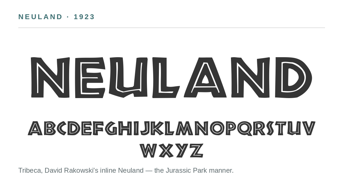
Neuland (1923) is the purest expression of the method. Koch cut the letters directly into metal, size by size, with no preliminary drawings — so every size of the original metal type was, in effect, a slightly different design, a fact no single digital font can reproduce. The result is an all-capitals expressionist face of jagged, chiseled strokes. Klingspor himself is said to have called it unbearably ugly; it sold anyway, and Monotype licensed it in England as Othello.
Its afterlife took a strange turn. Neuland’s rough-hewn look made it visual shorthand for the “primitive” and the exotic — Trader Vic’s, The Lion King promotion, and most famously the Jurassic Park films, which use Neuland Inline, its inline variant. That association has drawn fair criticism, but it is also why Koch’s most experimental face is the one the whole world has seen.
Kabel: the blackletter man’s geometric sans
Four years later Koch produced the opposite pole of his work. Kabel (1927) was Klingspor’s answer to Paul Renner’s Futura, released the same year — a geometric sans from Germany’s most committed blackletter designer. Look closely and the writing master shows through: the far-reaching terminal on the a, the slanted crossbar on the e, the looped g are a calligrapher’s details inside a geometric frame. Kabel has never been out of work since. The best-known digital version, ITC Kabel (1976), inflated its x-height past recognition; Linotype’s Neue Kabel (2016) is the faithful modern revival. It pairs naturally with a warm serif for body text, with Kabel carrying the headlines.
The blackletter craftsman: Koch’s Fraktur
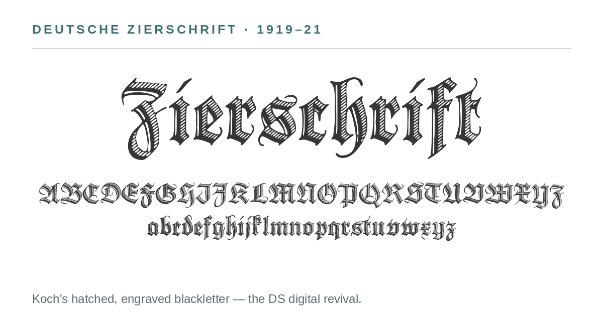
The center of Koch’s output, though, was Fraktur — the dense, angular form of blackletter Germany printed with for centuries — which he championed as a national script. Deutsche Schrift (1908–1921) — also called Koch Fraktur, and sold in England as Oxford — was his great text family. Wilhelm Klingspor-Schrift (1920–1926) is a textura of genuine pen movement; Deutsche Zierschrift (1919–1921) is hatched and engraved, a blackletter that behaves like a woodcut; Maximilian (1914–1917) revives the emperor’s prayer-book hand. Koch wrote nationalist things about German script in his youth, and his faces were used by the regime that came to power the year before his death in April 1934 — the same regime that banned Fraktur outright in 1941. The politics were of their time and place; the letterforms outlasted them.
Prisma and the deco turn
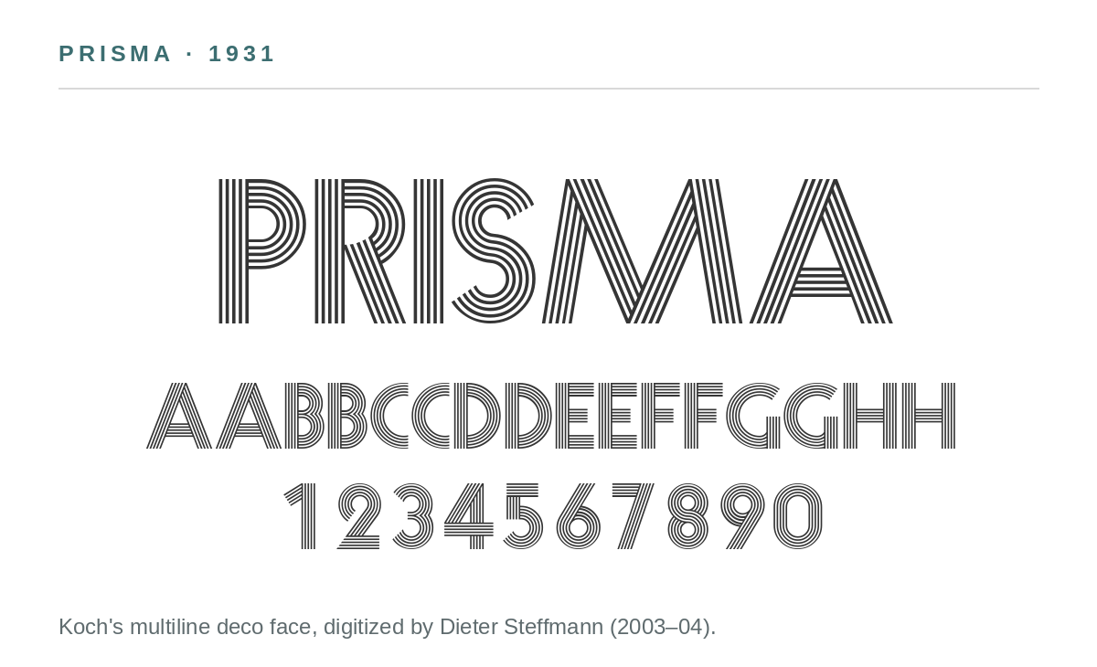
Between the blackletter and the sans sits Koch’s decorative work: Koch Antiqua (1922), a tall, flared roman sold in America as Eve; Zeppelin (1929), an inline companion to Kabel; and Prisma (1931), a multiline art-deco face built from parallel strokes — the Koch design that looks least like handwriting and most like neon waiting to happen.
The revival gang
Metal type dies when the foundry does, and Klingspor’s did. Koch’s faces survive in daily use because people kept reissuing them. The large foundries took the best-known designs — Linotype still sells Neuland and Kabel, and ITC’s Kabel was for decades the version most people knew. The deeper catalog fell to the revivalists. Delbanco in Germany built an entire DS line from Koch — Claudius, the Jessen script, his Fraktur faces. Gerhard Helzel and Ralph Unger redrew several more, and Petra Heidorn’s Koch Memorial project produced Romantha, a careful revival of his Marathon; her Typoasis site also hosted much of the freeware world.
The most prolific of the freeware revivalists was Dieter Steffmann, the pre-digital typesetter from Kreuztal who spent the years around 2000 completing and digitizing public-domain historic faces, then giving them away: Holla (2001); Fette Deutsche Schrift, Deutsche Zierschrift, Maximilian, and five Wallau cuts (2002); the Claudius trio, Missal, and Zeppelin (2003); and Prisma (2003–04). Manfred Klein — another of the era’s great freeware revivalists — digitized Koch too, including an extended Neuland with a lowercase Koch never drew.
Three of Steffmann’s Koch revivals are worth downloading from his FontSpace page: Deutsche Zierschrift, the hatched blackletter suited to certificates and diplomas; Prisma, the deco display face; and Fette Deutsche Schrift, a bold Fraktur for labels and headlines. All three are free. Prisma’s own font file still carries its credit line: Rudolf Koch, Klingspor. That is how type history actually survives — not in museums, but in working fonts with the designer’s name kept on them. font.io’s job is to make sure the name, and the story behind it, stay attached.
Sources: Luc Devroye’s Rudolf Koch page; Rudolf Koch, Wikipedia; PRINT Magazine, “The Man Who Made Kabel”; Fonts In Use — Rudolf Koch.