· glyphs, unicode, measurements
Hidden glyphs: letters that can never be typed
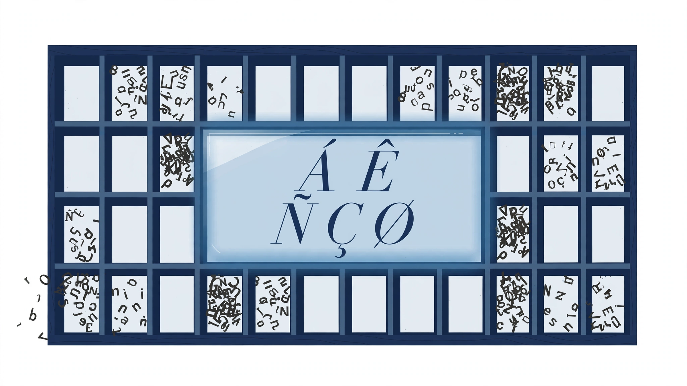
A font file holds drawings, called glyphs, and an address book, called a character map, that says which character summons which drawing. The two counts rarely match. A glyph that no character summons, no OpenType feature calls, and no other glyph contains is hidden: fully drawn, shipped in the file, and impossible to type, paste, or print by any means.
Characters are ideas, glyphs are drawings
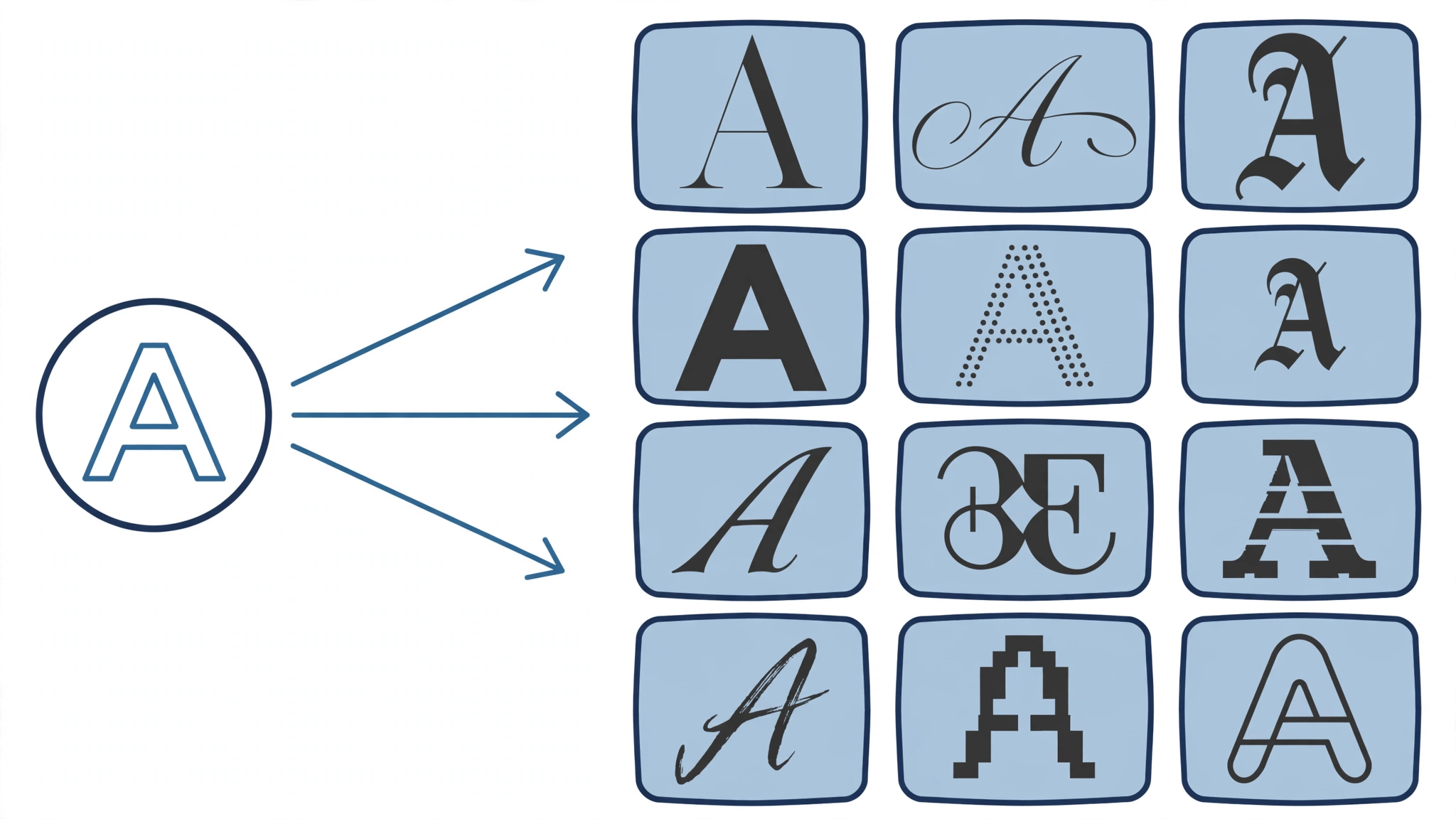
A character is an abstract unit of text. Unicode gives each one a number, U+0041 for the idea of a capital A, and that number is all your documents ever store. A glyph is a specific drawing of a character inside one font: U+0041 in a Bodoni is a different glyph from U+0041 in a typewriter face, and a single font may hold several glyphs for the same character, a plain A, a swash A for headlines, a small-cap A, each waiting for a different instruction.
The relationship runs both ways. Three characters, f, f, and i, can collapse into one glyph, the ffi ligature. One character can be drawn by dozens of glyphs across a variable font’s weights. And glyph number zero in every font is special: it is called .notdef, the drawing, usually an empty box, that appears when a character has no glyph at all. Readers meet it as tofu, the blank rectangle standing where a letter should be. Tofu is the symptom on screen; .notdef is the glyph inside the file that produces it.
If you want the background on how characters got their numbers, the Unicode post tells that story. The point here is narrower: text files store characters, fonts store glyphs, and a table inside the font connects the two. Everything in this post lives in the gaps of that table.
Three doors lead to a glyph
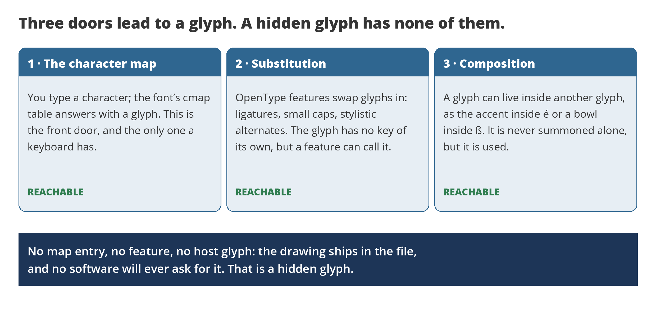
Software has exactly three ways to reach a glyph, and it is worth naming them, because a hidden glyph is simply one that fails all three tests.
The first door is the character map, the cmap table. You type a character, the operating system looks the character’s number up in the cmap, and the table answers with a glyph. This is the only door a keyboard has.
The second door is substitution. An unencoded glyph, one with no character of its own, is not necessarily hidden: OpenType features can call it. Ligatures, stylistic alternates, swash forms, and small caps all live behind this door. The glyph cannot be typed directly, but the right feature in the right application summons it, which is how most alternate letters in a modern font are reached.
The third door is composition. A glyph can exist as a part of other glyphs: the acute accent drawn once and reused inside á, é, í, ó, and ú, or a bowl shared by a family of letters. Such a glyph is never summoned alone, but it is used constantly.
A hidden glyph has no cmap entry, no feature that outputs it, and no host glyph that contains it. Nothing in any program will ever request it. It is not copy protection and not a secret; it is cargo, artwork carried in the file that the addressing system forgot.
What we found in 11,407 fonts
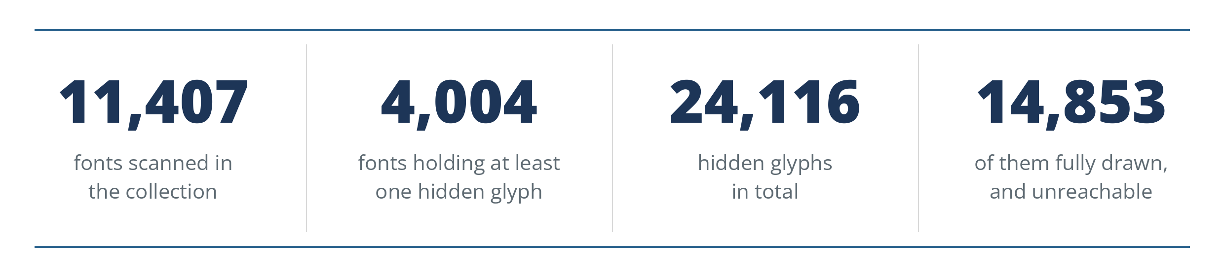
To find out how common this is, we scanned a collection of 1990s font CDs, 11,407 font files in all, and tested every glyph in every font against the three doors. About a third of the fonts hold at least one glyph that fails all three tests. Most hold only a few; the totals run past twenty four thousand hidden glyphs, and roughly fifteen thousand of them are genuinely drawn artwork rather than empty slots.
The empty slots matter to the counting, because a naive scan overstates the phenomenon. Some converted fonts pad their glyph lists with blank placeholders that were never drawings at all, and four files in the collection are corrupt, claiming tens of thousands of glyphs their own index tables say do not exist. We counted a glyph as hidden treasure only when it has real outlines and no path to it. The corpus also skews old, and honest reporting needs that said: these are pre-OpenType files, with almost no substitution features, so the second door barely exists here. In this collection, a glyph the map forgot was usually lost for good.
Bodoni Recut: a complete alphabet behind glass
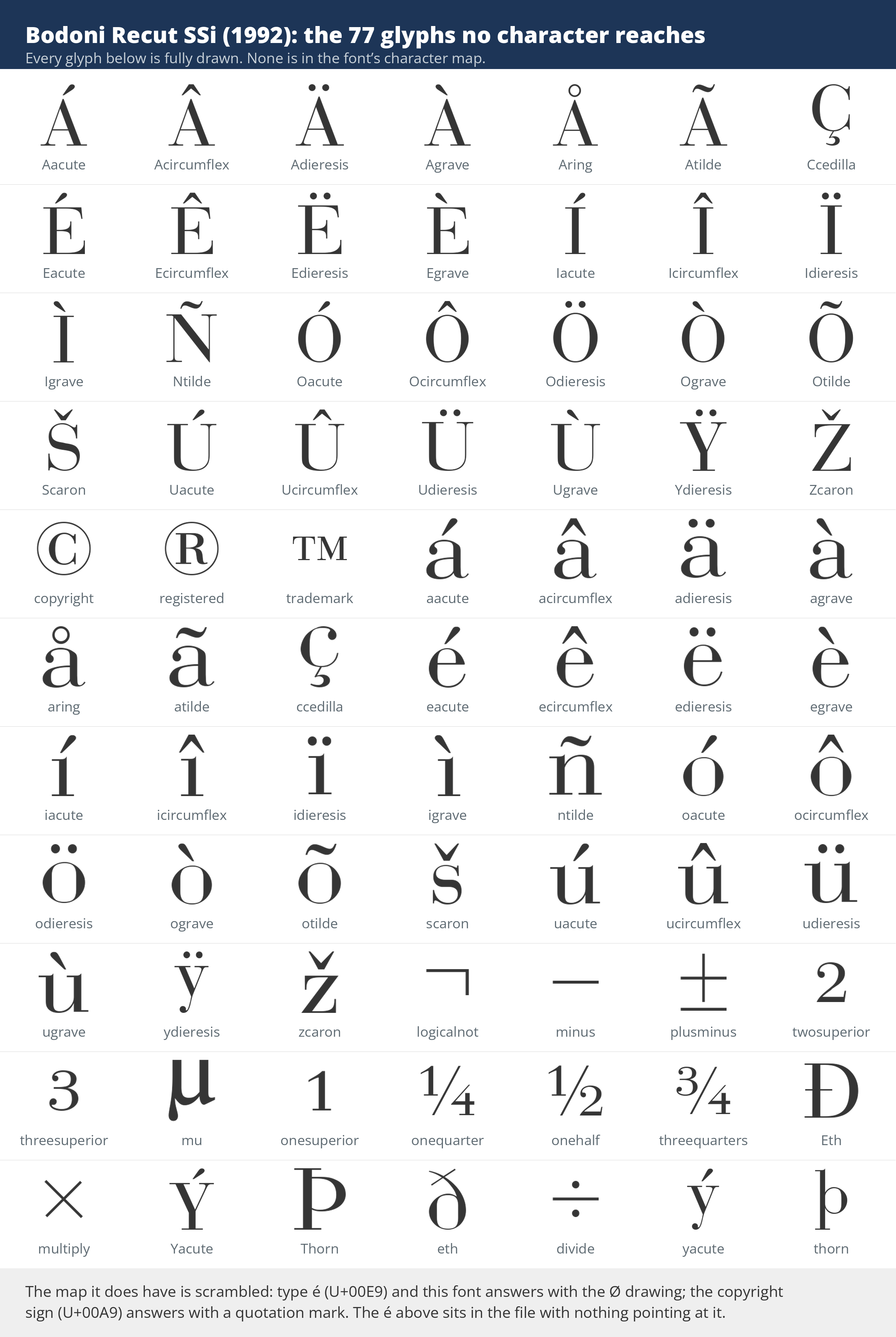
The flagship case is Bodoni Recut SSi, a 1992 Southern Software disc font. The file holds 231 glyphs. Its character map reaches 151 of them. Of the remaining 80, one is the mandatory .notdef box, two are standard control glyphs, and 77 are fully drawn glyphs nobody could ever type: the complete accented Latin set in both cases, Á through Ž and á through ž, plus the copyright, registered, and trademark marks, the common fractions, Eth, Thorn, the multiplication and division signs. In file terms it is a generous font, a full European character set drawn in a handsome high-contrast Bodoni. In use, none of it existed.
The map it does have makes the story worse, because it is scrambled. The conversion that built this file appears to have assigned characters by walking the source font’s glyph order instead of matching names to numbers, so the slots land wrong: ask the font for é, U+00E9, and it answers with the glyph drawn as Ø. Ask for the copyright sign and it answers with a quotation mark. The real é sits a little further down the glyph list with nothing pointing at it. The same pattern, 55 to 77 drawn glyphs orphaned per face, runs through the whole 1992 SSi line in the collection: Baskerville, Caslon, Century Schoolbook, and their siblings all shipped with their accented letters locked out.
How does a whole product line ship like this? The likely story is a conversion pipeline, not carelessness about drawing. These faces began life in an era when a typesetter could reach an unencoded glyph by picking it by name from a palette, so carrying the full drawing set in the file was normal even when the encoding covered only part of it. Convert that file with a tool that rebuilds the character map by position, and the drawings survive while their addresses are shuffled or dropped. The letters were never removed. They were just never given a way in.
Hidden glyphs are still being made
Modern fonts rarely repeat the Bodoni accident, because modern tools build the map from Unicode values rather than positions. But hidden glyphs still ship, for quieter reasons. A designer draws alternates and never wires them to a feature. A font exports with its working glyphs included, spare letters and half-finished experiments sitting unencoded beside the finished set. Dingbat and ornament fonts carry extra drawings their maker meant to map later. None of these drawings can be reached by a user, and most designers never learn they shipped them, because everything that is mapped works exactly as expected. A hidden glyph breaks nothing. That is why it survives.
You can check a font you own in a minute. Compare two numbers: how many glyphs the file holds, and how many characters its map covers. A small difference is normal, the control glyphs, a few components, the .notdef. A large one deserves a look. Font editors show every glyph and mark the ones with no character attached; Wakamai Fondue reports a font’s unencoded glyphs in the browser. On this site, the Font Subsetter shows the character side of the ledger, every character a font can actually produce, which is the set that matters for shipping a font to the web. Our font coverage post covers the neighboring question, whether a font holds the characters your text needs. And the mirror failure, a map whose addresses answer with the wrong drawings entirely, has its own story in the character map lies.
The lesson the Bodoni file teaches is the one this whole site is built on. A font is not its character set, and a glyph count is not a promise. Between the drawings a designer made and the characters a user can reach stands a small table of numbers, and whatever falls out of that table might as well never have been drawn. The 77 letters in that 1992 file were drawn by someone, carefully, in a beautiful design. For thirty years they have been sitting in the dark, waiting for an address that never came.