· guides, reference, unicode
How to check whether a font covers your text
A font covers your text only if it contains a glyph for every character in it, and the only way to know is to test your actual words. Paste a name, a price, and a paragraph into the font, set them large, and look for empty boxes or letters that suddenly change style.
The five-minute check
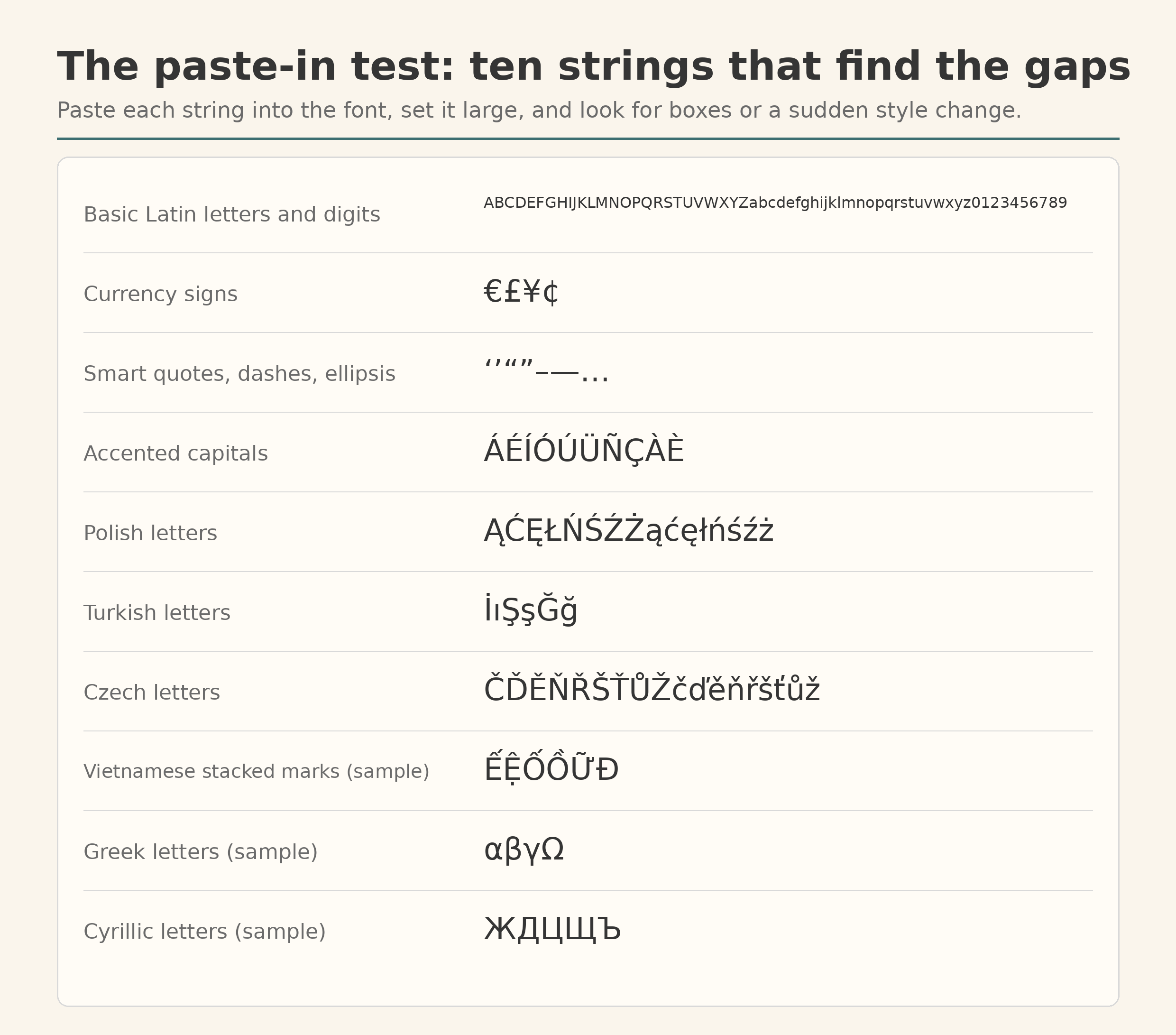
You need one document, your candidate font, and the words the project will really print. Projects fail on names and prices, so test those first: the longest name on the guest list, the price with its currency sign, one full sentence with quotation marks.
- Paste the text into a document and set it in the font, large. Fifty points or more: gaps hide at reading size.
- Read it slowly, letter by letter. You are looking for two things: an empty box where a letter should be, and a letter that quietly changes design mid-word.
- Then paste the ten test strings from the card above. They concentrate the characters people lose: accented capitals, the Polish and Turkish letters, Czech carons, Vietnamese letters with two marks stacked on one vowel.
- Check the exact file you will ship, in the weight you will use. Coverage is a property of a file, not of a family name.
If typing the strings is awkward, a tool can read the file instead. Wakamai Fondue runs in the browser and reports the characters and features it finds inside a font file, the same evidence gathered from the other direction.
What a missing letter looks like
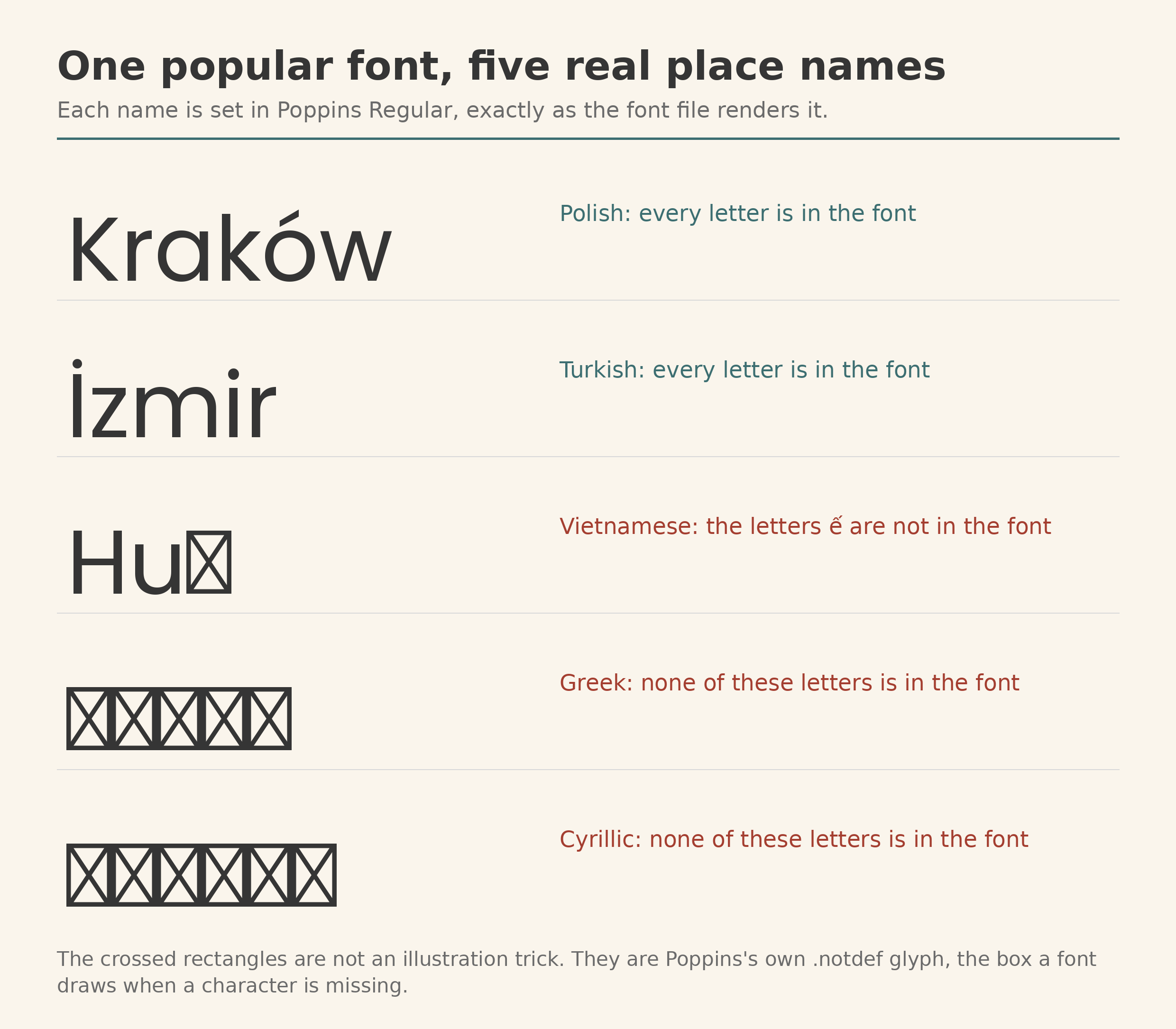
A font that lacks a character answers in one of two ways. It can draw its .notdef glyph, the character every font keeps for exactly this emergency, usually an empty or crossed rectangle. Typographers call the result tofu, after the pale block it resembles. Or the software can borrow the letter from a different font, which keeps the text readable and quietly breaks the design, leaving one word set in two typefaces, visible only if you look closely.
Poppins, one of the most used free fonts in the world, shows both ends of the scale. Set the place names above and Kraków and İzmir come through complete, accents and dotted capital I intact. Huế loses its last letter to a box, because Poppins holds the Đ of Vietnamese but not its double-marked vowels. The Greek and Cyrillic names are boxes from end to end. None of this makes Poppins a bad font. It makes it a Latin font, and the failure arrives only when the text stops being Latin.
Text pasted from a fancy lettering generator fails the same way, for a different reason: those letters are genuine Unicode characters from a mathematical block that almost no text font draws, so they box out in font after font. We took that trick apart in fonts that are not fonts.
We counted: sixteen popular fonts against ten test sets
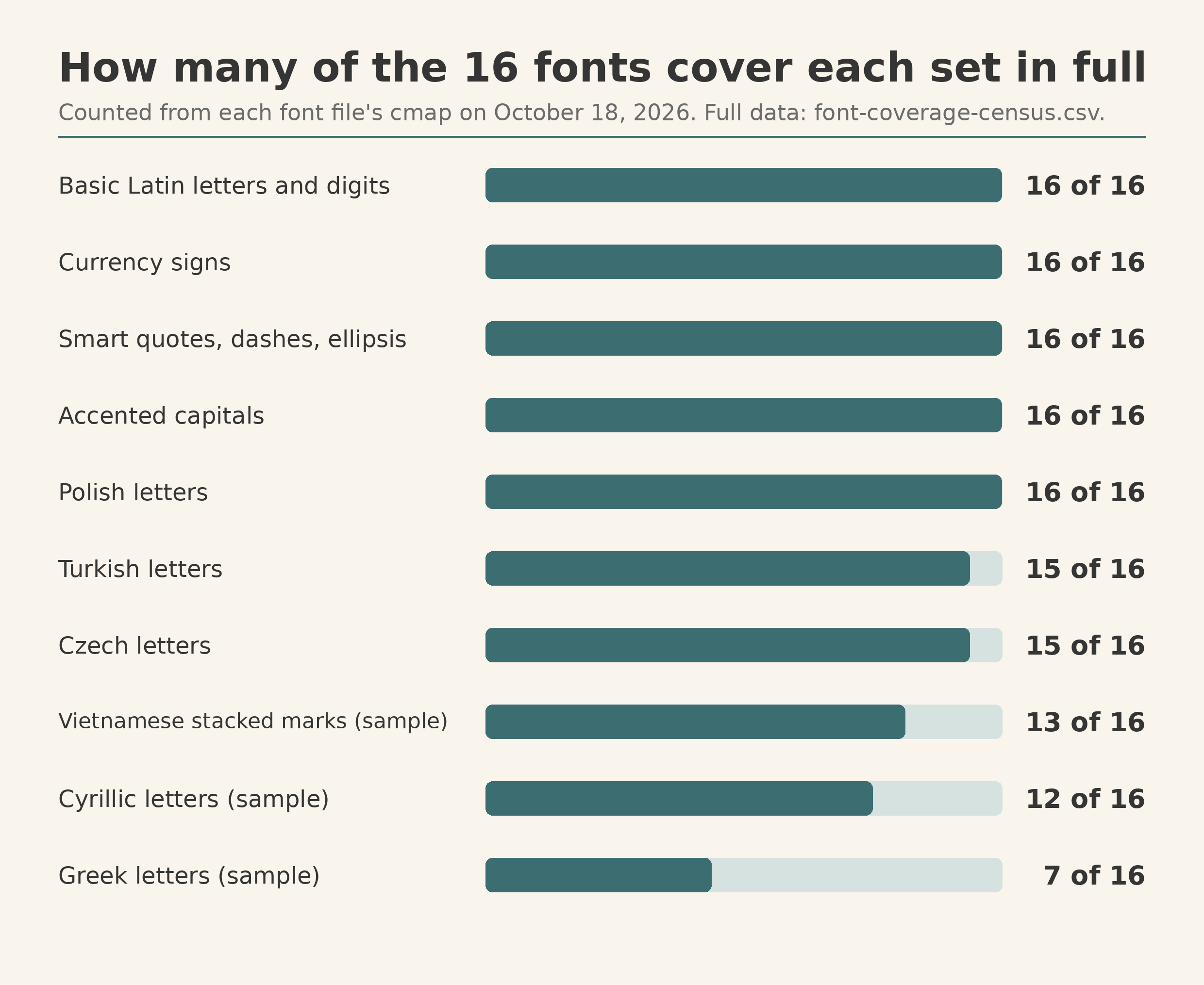
To see how common the gaps are, we read the files themselves. On October 18, 2026, we took the Regular style of fifteen popular Google Fonts families, plus DejaVu Sans as a control, and used fontTools to test each file’s character map against 138 characters in ten sets: basic Latin, currency signs, smart quotes and dashes, accented capitals, and the Polish, Turkish, Czech, Vietnamese, Greek, and Cyrillic sets. A character counted only if the file maps it to a real glyph. The full results are a download: font-coverage-census.csv, or the same data as JSON.
The everyday sets are safe in this company. All sixteen fonts hold every currency sign, every smart quote and dash, every accented capital, and every letter of the Polish test set, upper and lower case. The gaps open at the edges. Only seven of the sixteen complete the four-character Greek sample, and five well-known fonts, Montserrat among them, carry the Ω but not the lowercase α, β, and γ. Four fonts have none of the Cyrillic sample. Vietnamese stacking, the strictest test on the card, defeats Poppins and Bebas Neue, which keep the Đ and miss every double-marked vowel.
Seven fonts pass all ten sets: Open Sans, Roboto, Inter, Comfortaa, Roboto Slab, Source Sans 3, and the DejaVu Sans control. The nine that stop somewhere:
| Font | Sets passed, of 10 | Characters, of 138 | Where it stops |
|---|---|---|---|
| Montserrat | 9 | 135 | Greek lowercase |
| Playfair Display | 9 | 135 | Greek lowercase |
| Merriweather | 9 | 135 | Greek lowercase |
| Pacifico | 9 | 135 | Greek lowercase |
| Oswald | 9 | 134 | the Greek sample |
| Dancing Script | 8 | 129 | the Greek and Cyrillic samples |
| Bebas Neue | 7 | 125 | Vietnamese stacked vowels, Cyrillic |
| Poppins | 7 | 124 | Vietnamese stacked vowels, Greek, Cyrillic |
| Lato | 5 | 104 | Turkish, Czech, Vietnamese, Greek, Cyrillic |
Lato deserves its own sentence. Its name is the Polish word for summer, and it is the only font here that fails the Central European sets, because the Regular file served today is a lean build of 275 glyphs. The family is bigger than the file. Files are what render.
Why a font can claim a language and still miss your name
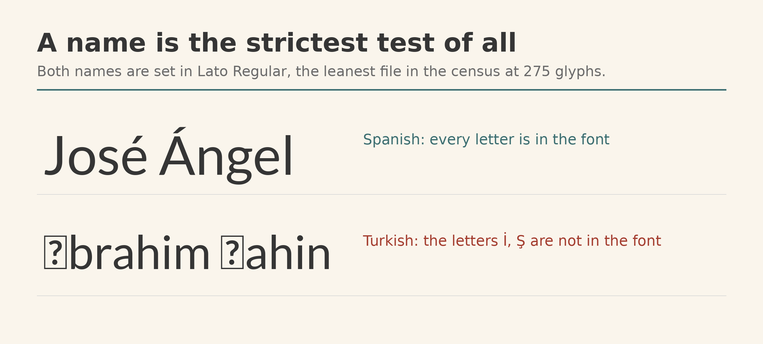
Language support is a claim about a repertoire, and repertoires are counted loosely. A font advertised for a language may hold the letters of ordinary prose and still miss the capital that starts a name, because names concentrate the rarest letters of a language into a few characters, capitals first. Turkish makes the point hardest: the dotted capital İ and its dotless partner ı are separate letters, and a font can carry one and not the other. In the census, Lato keeps the ı and drops the İ, so the Spanish name above survives and the Turkish one loses its first letter twice over.
Vietnamese raises the bar again. Its vowels stack two marks at once, a circumflex and a tone, and those combinations live in the file as their own precomposed characters. A font can hold the base vowels, the marks, and even the Đ, and still have nothing to draw for Ố. That is why the test strings lead with the hardest characters instead of the alphabet: a font that passes the stacked vowels will pass the rest of Vietnamese prose, and a font that fails them fails exactly where a name or a headline will notice.
This page tests your text. Judging a font’s language claim itself is a longer job with four levels, from coverage counts with the missing characters named to the letterforms and shaping behavior a repertoire cannot show. That full test is laid out in how to know if a font really supports a language.
The same check runs on every font uploaded here
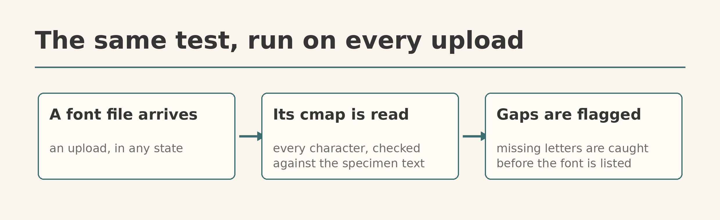
This is not only a reader’s trick. Every font uploaded to FontSpace goes through moderation, and coverage is one of the things checked there: a script reads the file’s character map and tests the specimen text against it before anyone writes a description or builds a preview image, because demo fonts routinely ship without digits or punctuation, and a preview that silently borrows letters from another font would lie about the file. Gaps get flagged in the font’s description instead of being discovered by the first person who downloads it.
Your browser, working alone, cannot do this. A web page gets no list of what a font contains, which is why sites that probe your system fonts resort to measuring rendered text instead, the trick we took apart in detecting installed fonts. Reading the file settles the question in one step. Until every download page does it for you, the paste test above is the same five minutes, spent before the project depends on the answer.