· guides, reference, unicode
How to know if a font really supports a language
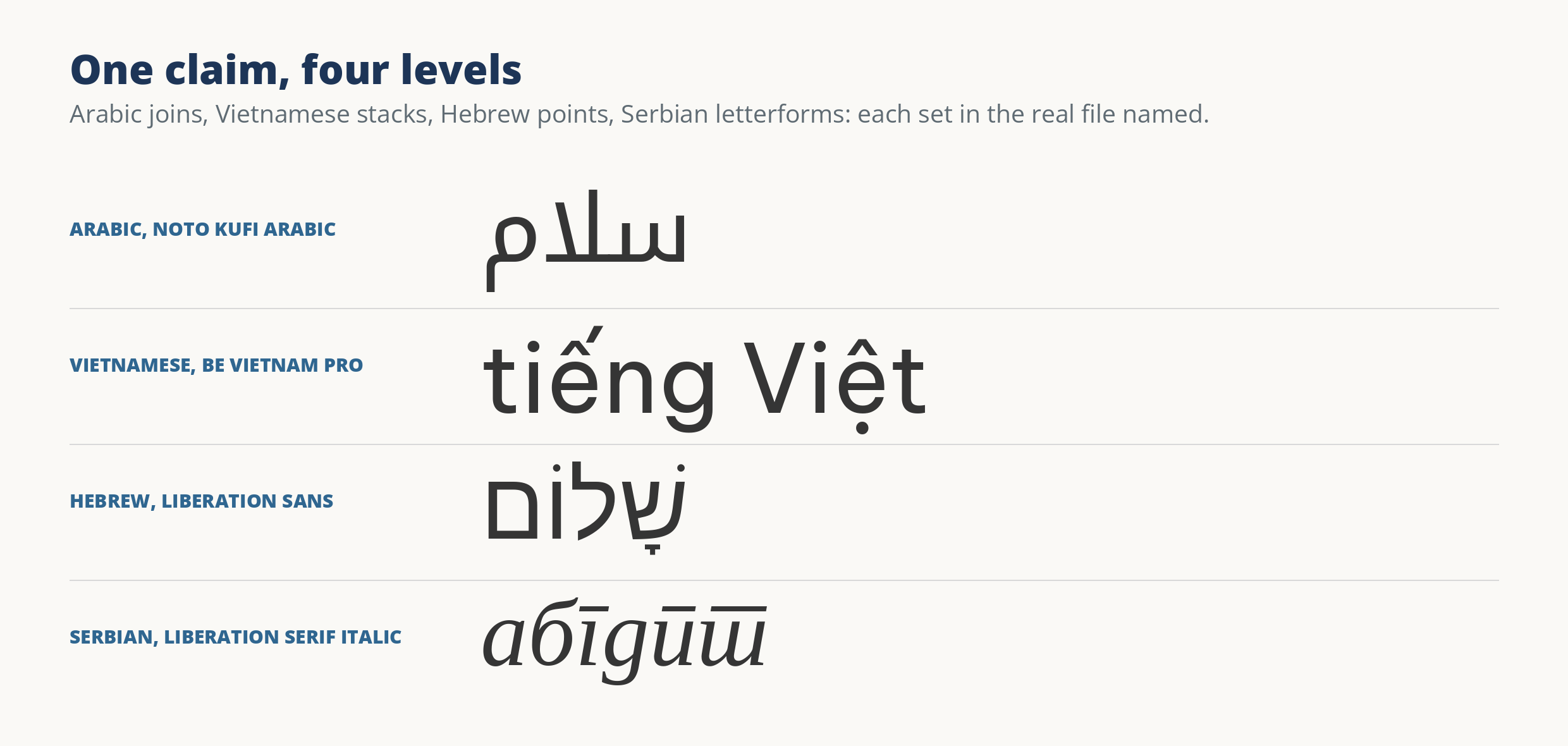
A font that “supports Serbian” can hold every Serbian letter and still print it in Russian letterforms, and a font can claim Greek while holding almost none of it. Language support fails at four levels: coverage, correct repertoire, correct forms, and shaping behavior. Here is how to test each level against the file itself.
Our earlier guide, how to check whether a font covers your text, runs the companion test from the other side: it pastes your actual words into a font and looks for gaps. That answers “will my text survive.” This page answers “is the claim on the tin true,” the question to settle before choosing a font for a language you may not read.
Level 1: the characters are there, and the missing ones have names
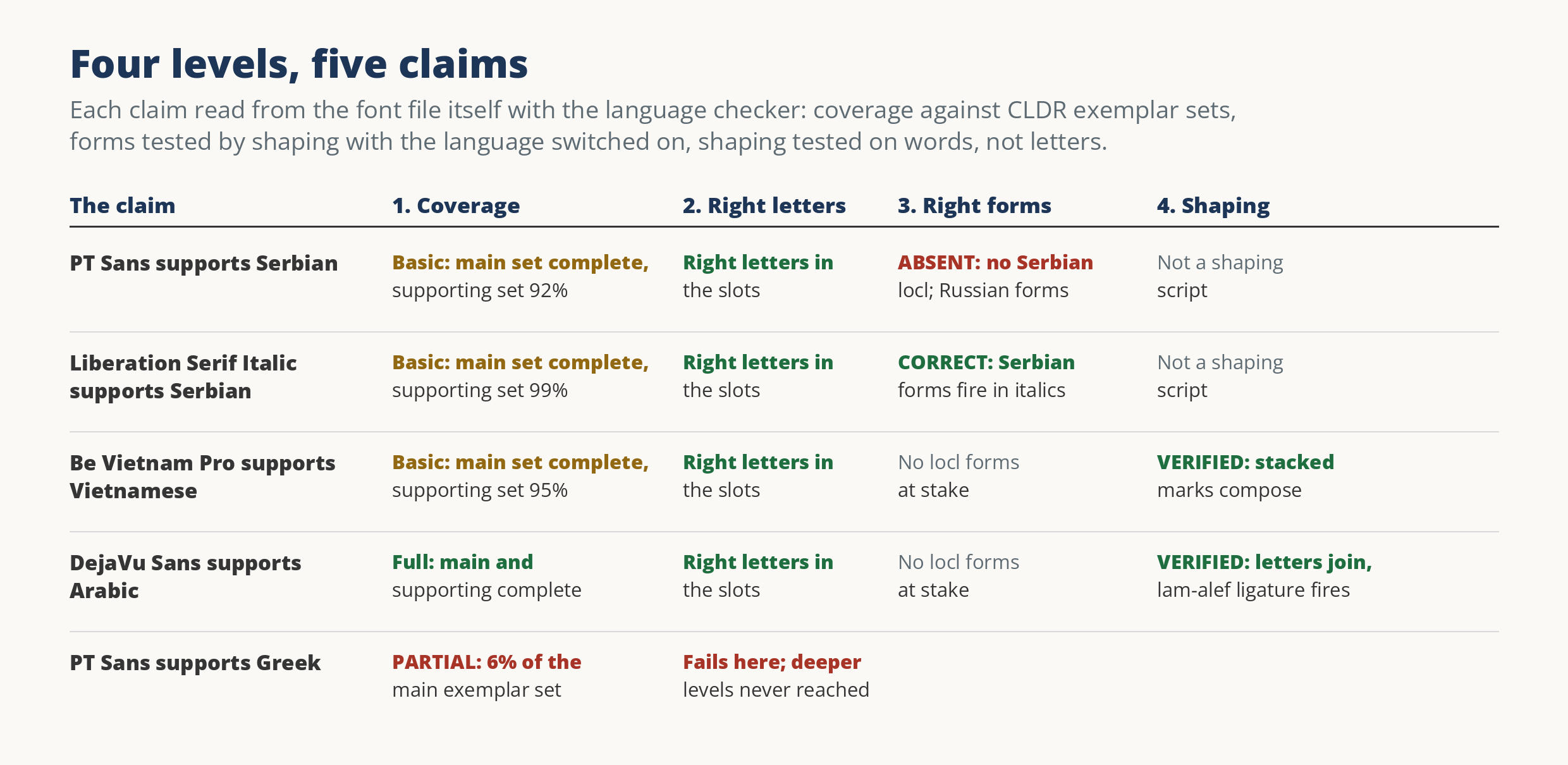
Coverage is a count against a standard list. The reference lists are the exemplar character sets published with Unicode’s CLDR data: the characters a language is normally written with, sorted into a main set and supporting sets (auxiliary letters, punctuation, numbers). A font earns the top tier, full, at 99 percent or better on both the main set and the supporting sets. Basic means the main set is at least 95 percent complete. Below that, support is partial.
The count alone is not the evidence. The misses have to be named, because a percentage cannot tell you whether the gap sits in letters nobody types or in the hyphen. PT Sans covers the Serbian main set completely. Its supporting set reads 92 percent, and the named misses are five Cyrillic vowels carrying a circumflex, used to mark stress in Serbian reference works, plus the Unicode hyphen. That is an honest basic. The same file’s Greek tells the opposite story: 6 percent of the main exemplar set. The Greek letters are simply not in the font, whatever its metadata says; more on that metadata below.
Level 2: the slots hold the right drawings
A character map is a list of promises: this codepoint, that glyph. Nothing in the list describes what the glyph looks like. Before Unicode was universal, hack fonts exploited exactly that gap, parking one script’s drawings in another script’s slots so that text typed on the wrong keyboard still looked right on screen. A damaged subset can do the same thing by accident. Either way, a coverage count over such a file reports complete support for letters that are not in the file.
So the second level inspects the drawings themselves: does the glyph sitting in each slot match the character the slot names? Our detector compares each core letter’s shape against its expected form and flags the mismatches, the story told in full in the character map lies. A flag is evidence, not a verdict: stencil and pictorial fonts trip it innocently, and a human makes the final call. But a language verdict inherits the flag: a font whose Latin slots hold other drawings has not earned its Latin claims, however complete its coverage count looks.
Level 3: the right national forms
Some languages share an alphabet and differ in letterforms. Serbian and Russian are both written in Cyrillic, codepoint for codepoint the same letters, but Serbian italic draws б, г, д, п, and т in its own shapes, and a Serbian reader sees Russian italic forms the way an English reader would see a German blackletter a: legible, and plainly foreign. Fonts deliver the national forms through an OpenType feature called locl, which swaps glyphs when the text’s language is set. The test is mechanical: shape the probe letters with the language switched on and switched off, and see whether the glyphs change.
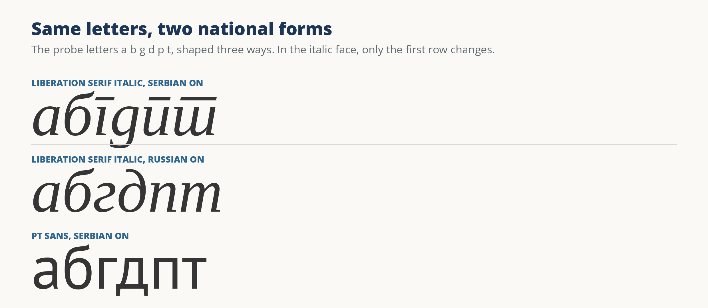
The Liberation faces show both answers inside one family. Their upright styles carry no locl for Serbian at all, so Serbian is set in Russian forms: forms absent. Their italics carry the Serbian entry, and the probe letters change shape on cue: forms correct. PT Sans is subtler, and more common. It carries a working locl feature, with entries for Bashkir, Chuvash, Moldavian, and Romanian; its Romanian forms test correct. For Serbian there is no entry, in PT Sans or in its sibling PT Serif Caption, which carries the identical list. Serbian text in PT Sans is complete, correctly encoded, and set in Russian letterforms. A locl entry can also exist and change nothing when probed, which the checker records as inert: presence in a feature list is not evidence, only the swap is.
Level 4: the script behaves
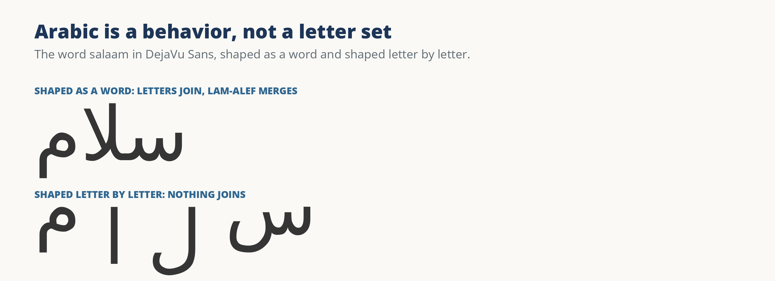
For some scripts, letters are the easy part. Arabic letters change shape according to their neighbors and join into a continuous word, and the combination lam-alef is obliged to merge into a single ligature. A font can hold every Arabic codepoint and still draw the letters standing apart, which is not Arabic typography. The test shapes a whole word and compares it with the same letters shaped one by one: in DejaVu Sans the word joins, the positional forms fire, and the lam-alef ligature appears, so its Arabic shaping verifies, and Noto Kufi Arabic, a specialist, passes the same test.
Vietnamese behaves differently: its vowels carry two marks at once, and text arrives both ready-made and as base letters followed by combining marks. The test types a stacked word in its decomposed form and requires the marks to land on their base and compose to the same glyphs as the ready-made characters. Be Vietnam Pro passes. Its Vietnamese tier is still basic rather than full: its main set is complete, the supporting set reads 95 percent, and the named misses are hyphens and prime marks. What stands between this font and a “full” verdict is punctuation, not letters. Hebrew is tested on its vowel points, the niqqud, which must shape without gaps when they are present; Liberation Sans passes. Chinese, Japanese, and Korean get coverage only, with a caveat: their exemplar sets are common-character lists, so a tier describes the common set, never the whole script; their regional letterform differences are read comparatively at level 3.
Declared versus measured
Every font also carries its own claims, and they are the least reliable evidence on this page. A font’s OS/2 table holds bits announcing its scripts, and foundry copy announces the rest. The bits are set loosely and survive subsetting that strips their glyphs. PT Sans declares Greek; measured, it holds 6 percent of the Greek main set. DejaVu Sans declares Thai; measured, no Thai verdict gets past the coverage floor. Neither font is lying in any interesting way. The bits are a statement of intent left over from some earlier state of the file. So the checker keeps two columns, what the font declares and what it measures, printed side by side and never merged. When they disagree, believe the measured one.
When a download page says a font supports your language, ask four questions of the file, not the page. Are the characters there, with the misses named? Do the slots hold the right drawings? Do the national forms exist, and do they actually fire? And if the script is a behavior, does it behave? A font that answers all four has earned the claim. Anything less has earned a more careful sentence.