· essay
The fonts that are not fonts
Here is a strange place to start: with our own keyword research. Building this site’s tools, we measured the searches around fonts, and the largest one is not close. “Font generator” is searched about 2.2 million times a month in the United States (Semrush, October 2026), roughly twenty-four times the next term in its cluster. Almost none of those searchers wants a font. The top results are text generators: LingoJam and its many cousins, which take the sentence you type and hand it back in bold, script, circled, or double-struck lettering to paste into an Instagram bio or a TikTok name. LingoJam alone draws millions of visits a month by traffic estimators’ counts. These tools contain no font files, nothing to download, nothing to install. The most popular font product in the world is not a font.
The trick: styling that lives in the characters
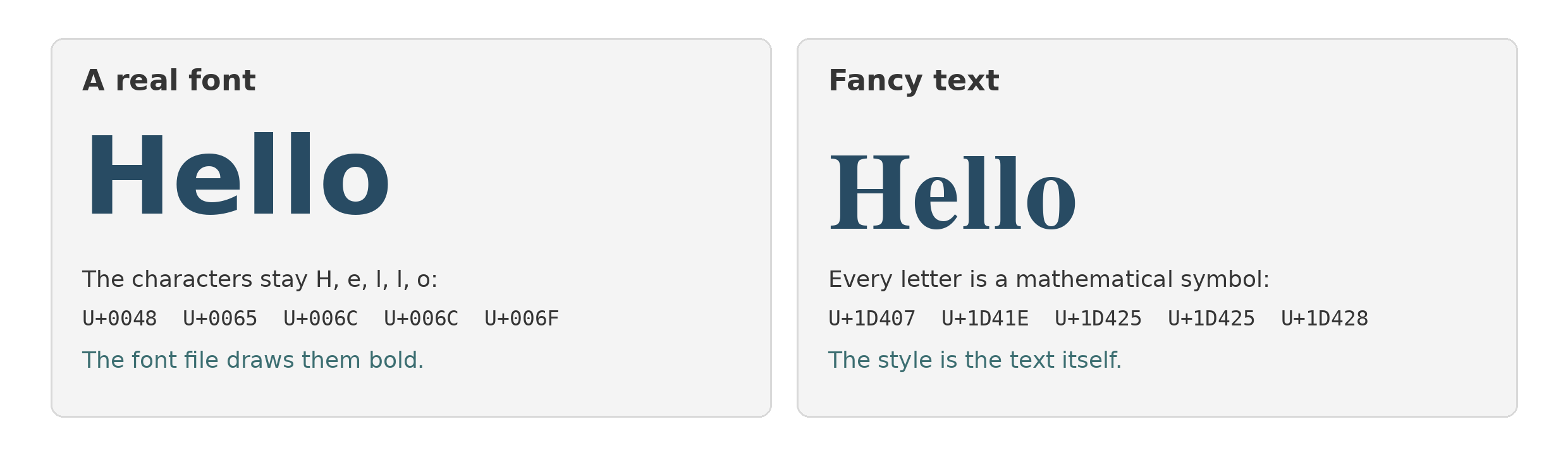
A font and a piece of fancy text solve the same problem from opposite ends. A font is a file that changes how characters are drawn: the text underneath stays ordinary, and the styling exists only where the file is installed. That is useless in an Instagram bio, because a bio is a string of characters stored by the platform. There is nowhere to put a font file, and Instagram offers no font choice for bios and captions at all.
So the generators move the styling into the only thing they control: the characters themselves. Unicode, the master character catalog every device shares, happens to contain ready-made styled alphabets, encoded for mathematics, where a bold or italic letter can mean something different from a plain one. The generator swaps each of your letters for its mathematical lookalike. Your H stops being H (U+0048) and becomes MATHEMATICAL BOLD CAPITAL H (U+1D407). The sentence looks styled in any app, on any phone, because the style is no longer a rendering choice. It is the text. If you want to see the swap happen, FontSpace’s unicode analyzer shows the true name and codepoint of every character in any text you paste, fancy or plain.
The swap draws on a few Unicode neighborhoods: the Mathematical Alphanumeric Symbols (bold, italic, script, Fraktur, double-struck, monospace), circled and parenthesized letters, fullwidth forms, and combining marks stacked for strikethrough and glitch effects. LingoJam says the quiet part itself, in its own explainer: these alphabets are different text characters, not fonts as such. The catalog is also small and oddly shaped. The mathematical blocks cover the Latin alphabet, Greek, and digits. There is no bold mathematical é, no script ł. Accented letters simply fall out of the trick and come back plain, and most punctuation was never encoded in styled form at all, which is why fancy text so often reads as gorgeous letters trailing ordinary commas and periods.
How it climbed
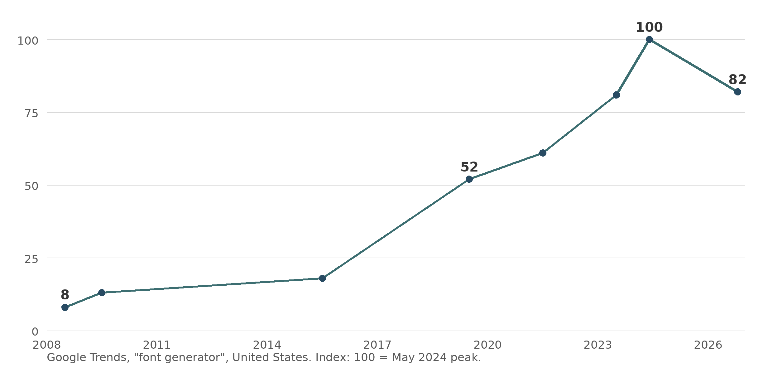
This is not a fad spike. Google Trends data for “font generator” in the US forms a long, steady staircase: an index of 8 in 2008, 18 in 2015, 52 in 2019, 81 in 2023, a peak of 100 in May 2024, and 82 in the most recent month. The steep section tracks the years when the social profile became the average person’s public identity: a name, a bio, a grid, all set in type the platform chose, with exactly one expressive lever available to anyone willing to paste. By 2020 the behavior was mainstream enough for consumer magazines to be walking readers through it. The demand it answers is real and old: people want their name to look like something. What changed is where they are allowed to want it.
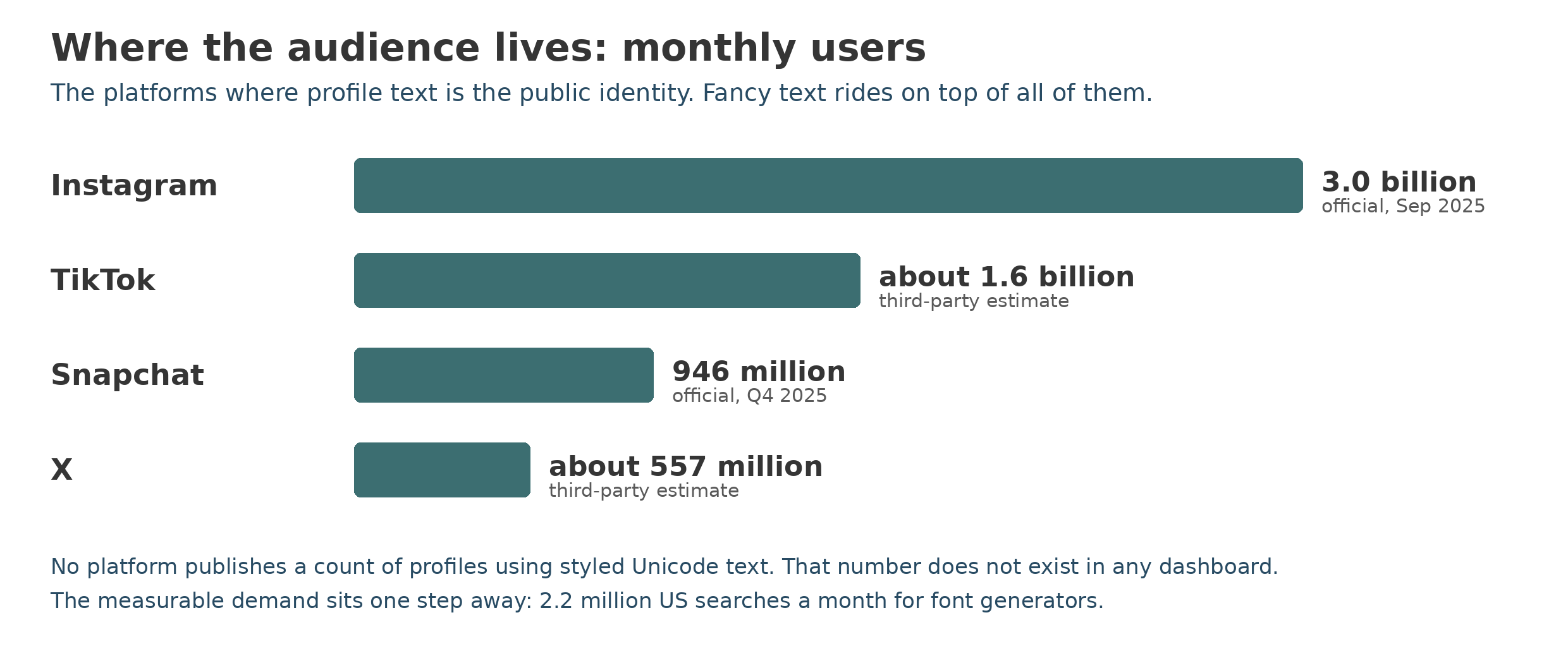
Scale is the multiplier. The fields this text lives in belong to the largest audiences ever assembled: Instagram reports 3 billion monthly users, TikTok is estimated around 1.6 billion, Snapchat reports 946 million, and X is estimated near 557 million. How many of those profiles are actually written in fancy text, nobody counts. No platform publishes the number, and the kind of public stream that once let outsiders tally character use, the stream that powered the beloved Emojitracker from 2013, was shut off when X locked its API in 2023. The demand side is the only window left: the generator sites’ traffic and the search volume above.
Allowed almost everywhere, fenced exactly where it counts
Ask whether the platforms block this and the answer has a precise shape. In the field that matters most, the username, fancy text is barred everywhere, not by anti-font policies but by character rules: Instagram, TikTok, X, YouTube, Discord, Reddit, and Telegram all restrict handles to plain letters, numbers, and a few punctuation marks, in Discord’s and Telegram’s cases by published rule. Facebook and LinkedIn go further on identity: their real-name policies leave no room for styled profile names at all. One layer down, in display names, bios, captions, and posts, the text is broadly tolerated, and that tolerance is where the whole phenomenon lives. The glitchy end of the practice, names stacked with combining marks until they smear across lines, reportedly gets trimmed in the name fields of several platforms, though no platform publishes a policy saying so. The settlement the industry reached without ever announcing one: your permanent handle stays machine-readable, and you may decorate the frame around it. The decorating kit is wider than styled letters, too: kaomoji , the text faces assembled from punctuation and kana, and symbol collections circulate by exactly the same physics, as copyable strings rather than files.
The costs are mechanical, and they fall on other people
Because the styling is in the characters, every system that reads text as text meets a stranger. Search is the clearest case, and the answer to the natural question is no: it does not get normalized away. Search engines and in-app search index what is actually there, different codepoints, so a bio written in mathematical bold does not match a plain-text search for the words it displays. A name styled this way is, to the platform’s own search, a different name. Fancy hashtags fare worse: a styled tag is a different string from the plain tag, links to nothing, and aggregates with nobody. The decoration quietly opts you out of being found, which is a steep price for the one field people style in order to be noticed.
Screen readers pay the same bill in a harsher currency. Assistive technology reads codepoints, and a mathematical letter’s name is its description, so a styled sentence can be announced symbol by symbol, “mathematical bold small h” and onward, or skipped as unreadable, leaving silence where a name should be. The Unicode Consortium’s own guidance cuts the same way: it expressly recommends that these characters not be used as a substitute for styling, because they were encoded so that mathematical notation could carry meaning in the style itself. And the exclusion at the base of the whole system deserves naming: the trick exists for Latin and Greek letters and digits, full stop. There are no mathematical styled forms for Cyrillic, Arabic, Hebrew, Chinese, or Devanagari text, and there cannot be a quick fix, because the characters were never a styling layer to extend. A large share of the world’s writers is locked out of the world’s most popular font tool by design.
What it means for actual fonts
| A font file | Fancy text | |
|---|---|---|
| What changes | How the same characters are drawn | The characters themselves |
| Travels by copy and paste | No | Yes |
| Works in a bio or username field | No | Bios yes, usernames no |
| Found by search | Yes | No, it is a different string |
| Read by screen readers | Normally | Symbol names, or silence |
| Letters covered | Whatever the font holds | Latin, Greek, digits |
That is the honest summary of the largest font phenomenon of the decade: it is a workaround, ingenious and costly, for platforms that give hundreds of millions of people a public name and no say in how it looks. The desire underneath it is the same one that built the font industry. When you do get to choose a real typeface, for a real release, the craft questions come back, starting with whether the name you want is already taken. That one, at least, has a tool now: the Font Name Checker. The fonts that are not fonts needed no one’s permission. Real ones repay a little care.