· history
Archaic font formats: FNT, Speedo, Type 3
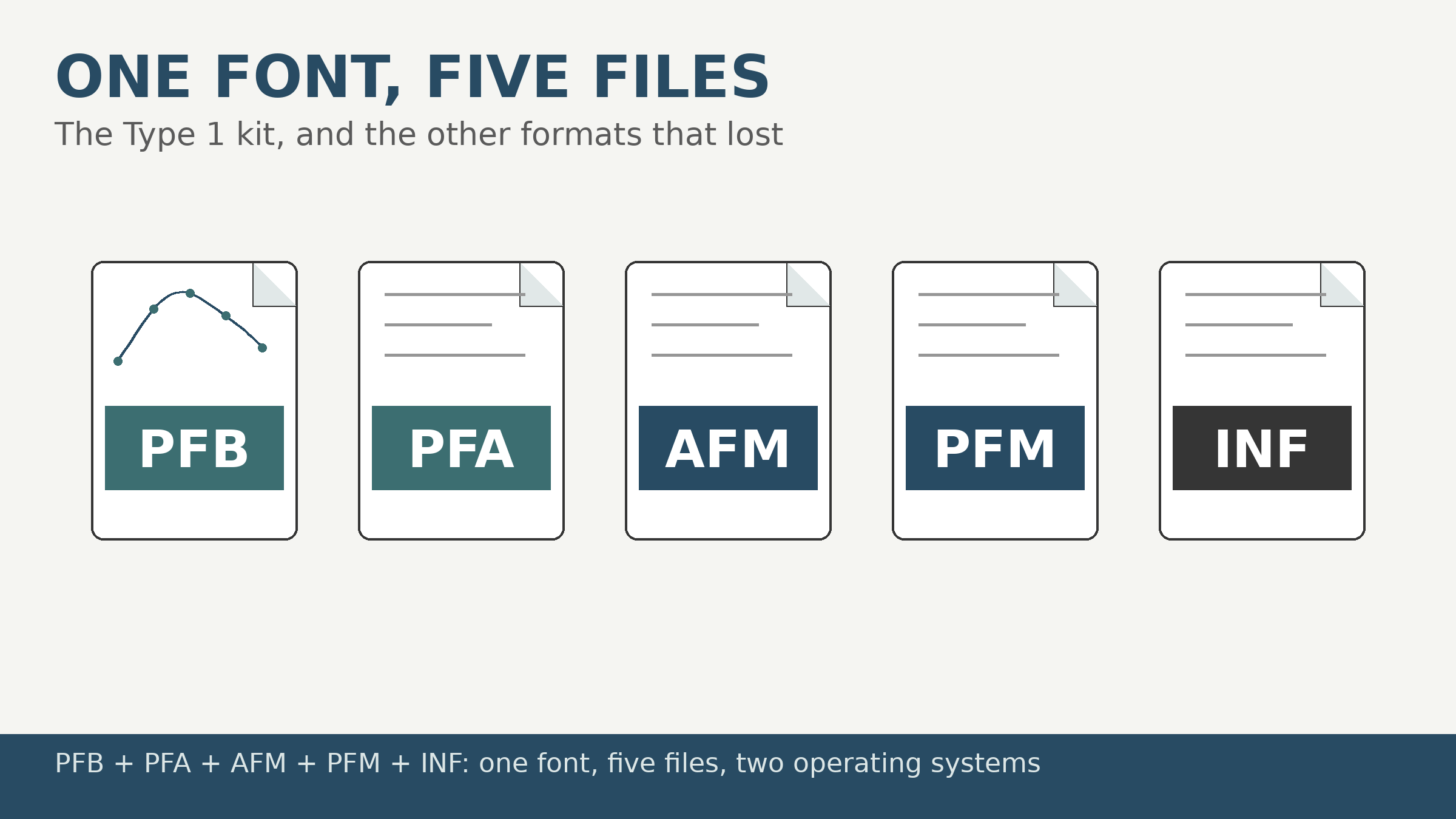
An archaic font format is any of the file formats fonts lived in before OpenType unified them: bitmap strikes in FNT files, PostScript Type 1 fonts split across as many as five companion files (PFB, PFA, AFM, PFM, INF), and proprietary outline formats like Bitstream Speedo, HP Intellifont, and URW’s Nimbus Q. Collectors still meet all of them in 1990s archives, and each explains a design decision inside the fonts you use now.
What is an FNT file?
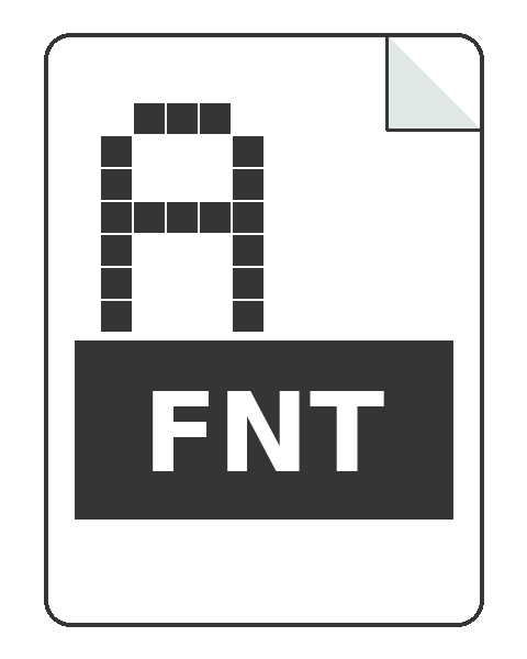
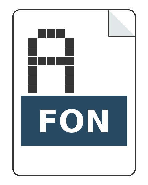 Pixels, at one size, full stop. The FNT format is Windows’ bitmap font format from the 2.x and 3.x era: a header, a character table, and a literal bitmap for every glyph in the strike. One FNT file is one typeface at one size in one weight, drawn by hand at that size because there was no outline to scale. Related strikes were bundled into a FON library file, which is how Windows shipped its system faces (the MS Sans Serif and Courier of early Windows are FON residents). Software of the era shipped FNTs as samples and screen fonts: FontMonger, the converter that built the freeware era, bundled strikes named Prospec, Prospec Bold, and Ticker so buyers had something to open on day one.
Nothing about FNT scales, and that was its death and its legacy. The death: TrueType’s outlines made per-size bitmaps absurd. The legacy: hand-tuned bitmap strikes never actually left. They live on inside modern fonts as embedded bitmap tables, and in color emoji fonts the strike is the entire design, which is why your emoji is a font and arrives as pre-rendered pictures at fixed sizes, FNT’s direct descendants.
Why did a Type 1 font need five files?
Because two operating systems and a typesetting industry each wanted the data their own way. A working PostScript Type 1 font on a 1990s PC was a kit:
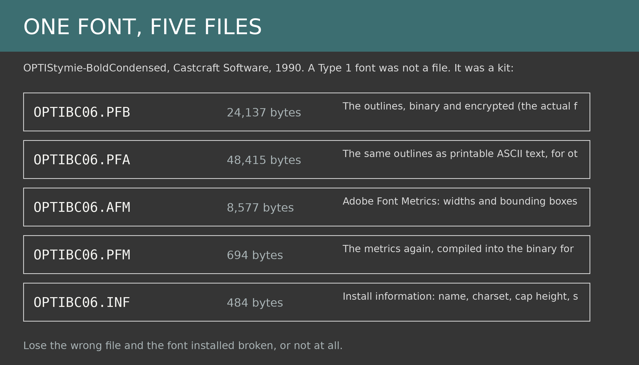
 PFB, the outlines, binary and encrypted. This is the font itself.
 PFA, the same outlines as printable ASCII, for systems that wanted their PostScript readable.
 AFM, Adobe Font Metrics, a plain-text ledger of every character’s width and bounding box, plus kerning pairs, in a format Adobe specified separately (the AFM spec is its own document, versioned like the files it describes: the Castcraft specimens are AFM 2.0). Layout software that could not read the encrypted outlines could still set type from the AFM.
 PFM, the metrics again, compiled into the small binary form Windows’ font machinery actually consumed.
 INF, a pocket metadata file: name, character set, cap height, serif or not, the answers an installer needed before installing anything.
Lose the PFM and Windows refused or mangled the install; lose the AFM and your layout program spaced the font blind. The specimen above is one font from the Castcraft OPTI library, a 1990s CD of phototype-era faces digitized as Type 1, its 125 fonts shipped in this multi-file form with DOS-shortened names. The same box holds Castcraft’s later OpenType conversions of its own library, one file per font. Between the two halves of that CD you can watch the industry change its mind. Adobe ended Type 1 support across its applications in 2023, and the five-file font became a fossil on schedule. Its data model did not die: the AFM’s width ledger is the direct ancestor of the metrics tables inside every OpenType font now.
What were Speedo, Intellifont, Type 3, and Nimbus Q?
The proprietary also-rans, each owned by somebody’s platform:
 Speedo was Bitstream’s outline format, the Fontware technology inside early-90s font packages for Windows, WordPerfect, and GeoWorks. Bitstream was the era’s great independent foundry, and Speedo was its house format until TrueType won the platform war; Bitstream pivoted to TrueType technology and Speedo files became orphans on Windows and Mac, though FreeType and X11 still read them, convertible only by tools like FontMonger that bothered to license the format.
Intellifont was Compugraphic’s scalable format, licensed by Hewlett-Packard and built into LaserJet printers from the PCL 5 era on. Its natural habitat was the printer, not the screen: an Intellifont file expected printer firmware to do the rendering. When desktops took over rendering, Intellifont had no home left.
Type 3 was PostScript’s permissive sibling: a Type 3 font could contain arbitrary PostScript procedures, grayscale fills, and effects forbidden to the tightly specified Type 1. It paid for the freedom with no hinting standard and weak support in Adobe’s own font manager, and lived a niche life in special-effects faces before fading with the rest of the PostScript font world.
Nimbus Q was URW’s proprietary format for its clone libraries, the lawful look-alikes of famous faces bundled with drawing programs and early Linux systems. URW’s designs survived the format: the company released its core library openly, and faces most Linux users know as Nimbus and the URW base 35 descend from those files. The format is gone; the outlines are on millions of machines.
Should you convert them, and how?
Yes, and it is easier than the archaeology suggests. FontForge imports PFB with its AFM and exports modern OpenType; FNT strikes convert to bitmap-strike fonts that keep their original pixels honestly (a converted FNT becomes, in modern terms, a pixel font, which is what it always was). Speedo, Intellifont, and Nimbus Q need period converters or FontMonger-class tools, one reason keeping the old software working matters to collectors. What no conversion recovers is intent: the metrics companions, the installer notes, the sample strikes are part of the historical record, and an archive that keeps all five files knows more than one that keeps the TTF alone. Our font file types guide covers the formats that won; this one is the memorial for the rest of the field. The formats that died later, or died by decree rather than by age, get their own accounting in dead and deprecated font formats . One branch of the family grew up outside the industry entirely: the TheDraw fonts of the BBS art scene, typefaces stored as rows of text characters.