· history · Dan X. Solo
The Solotype Catalog that fed freeware
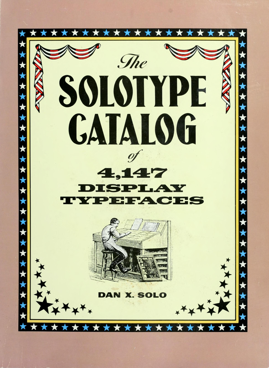
The Solotype Catalog of 4,147 Display Typefaces (Dover, 1992) is a 246-page sales catalog for an Oakland typesetting shop, printed as a paperback. It lists every display face Dan X. Solo’s Solotype Typographers could set, under Solo’s own names for them. Within a few years it had a second life its author never planned: it was the book freeware designers traced the classics from.
What was the Catalog for?
Selling typesetting. Solotype’s customers were art directors and designers who needed an unusual headline face set properly, including with the shop’s optical effects, and the Catalog is the menu: 4,147 faces arranged in 28 categories, from Condensed styles and Victorians through Rustic types, Scripts, and Blackletter to the shop’s specialty, Optical effects, the largest section in the book at pages 203 to 230. Dover’s Pictorial Archive terms are printed in the front: the letters are free for graphics and craft work up to six words per project. Beyond six words, you were expected to hire the shop. The cover carries the same bargain in marketing form: “Typefaces in this book are copyright-free.” (Solo’s writing and arrangement were his copyright; the old faces themselves, mostly 19th and early 20th century designs, were what he was giving away.)
Why do its faces have two names?
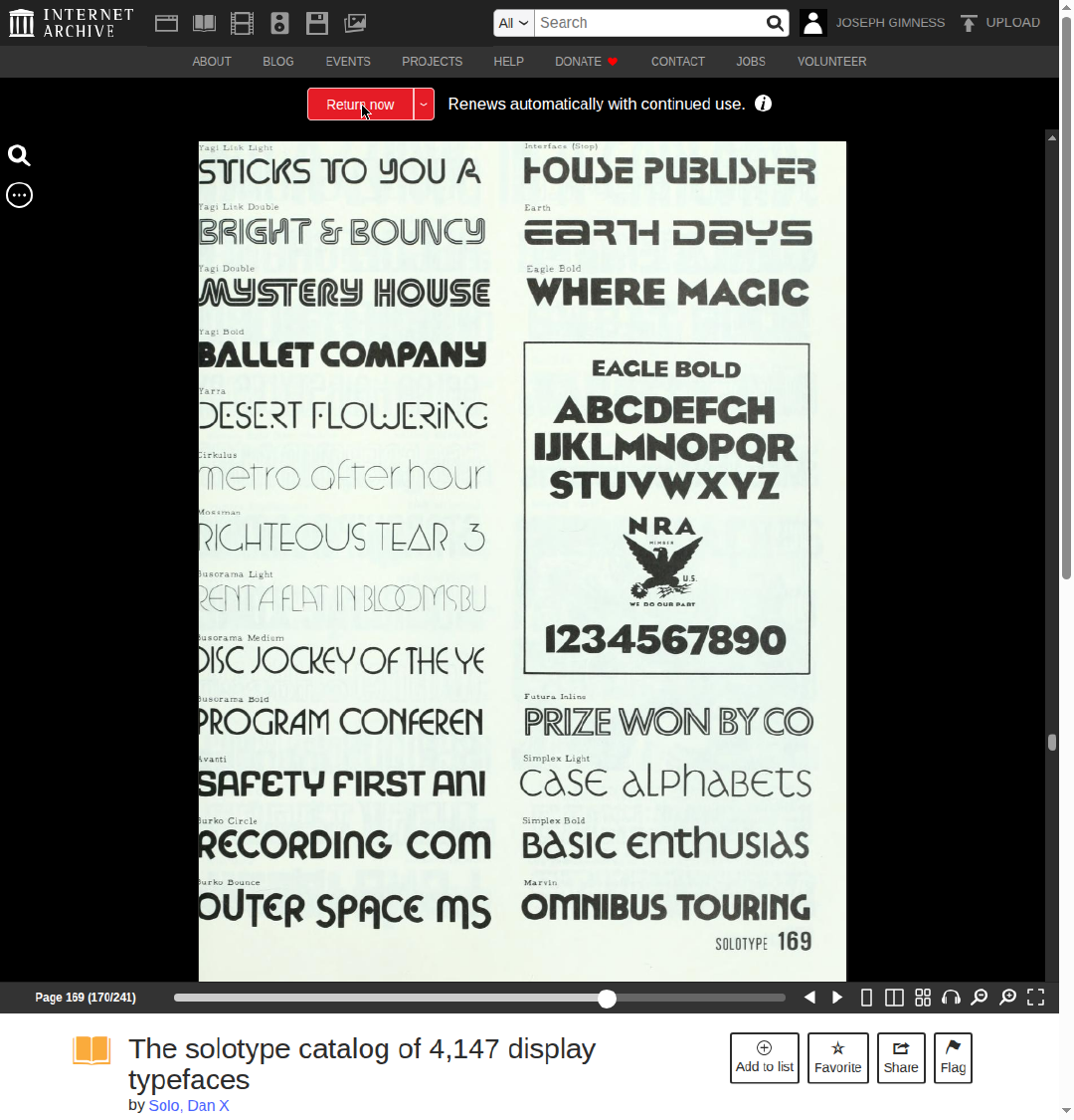
Solo filed faces under descriptive house names of his own coinage, because a working catalog needs names a customer can ask for. When a face had a known original name, he carried it in parentheses, and his index cross-references both directions. Page 169 shows the system at its most consequential: the face is captioned “Interface (Stop)”, Solo’s name first, the original in brackets. The design is Stop, drawn by Aldo Novarese for the Nebiolo foundry in Turin in 1970, the geometric sans of a hundred 1970s logos. In Solo’s shop it was Interface, one more display face you could order by the line.
How did a sales catalog feed freeware?
Because it was complete, cheap, and everywhere. When home computers made font editors affordable in the early 1990s, hobbyist digitizers needed specimens worth tracing, and Solo’s Dover books were the deepest well of historical display faces available for the price of a paperback. They traced the plates, and the names traveled with the drawings. Our Alan Carr story follows one: Carr’s Stop, distributed as freeware from 1993, is a tracing of the Interface plate on page 169, and Carr was one of dozens working the same seam. The wider clone diaspora around Stop alone runs through the Catalog’s alias system: the design also circulated as Logan (Weatherly Systems), Scott (SoftMaker), and Spliny (Opti), each name a small business’s house label for the same 1970 original.
That is why the Catalog still earns its shelf space in a digital library. Font files from the freeware era carry names that appear in no foundry record, because they were never foundry names; they are Solo’s, or a cloner chain’s, labels for older designs. The Catalog, and the volunteer Solopedia project that indexes its 4,147 faces category by category, form the concordance between the two worlds: the name in the file, the face in the book, the original underneath. Solo, who began collecting the stuff in 1942 because nobody else wanted it, would probably have enjoyed that the index outlived the shop. His story is told in Dan X. Solo: the man who cataloged 4,147 typefaces. The concordance itself now lives here too: font.io preserves the Solopedia’s index data, the alphabet book lists, and the OPTI index in the Solotype archive, against the day the volunteer site that carried them is gone.