· designers · Alan Carr
Alan Carr: the freeware designer who digitized Stop
Alan Carr was a freeware type designer who, between about 1992 and 2004, hand-digitized more than a hundred classic display faces in FontMonger and gave them away. He left no website, no interviews, and no biography. The record is the fonts themselves, and his version of Stop, the most copied typeface of its era, preserves the whole freeware supply chain in one small file.
Who was Alan Carr?
Almost nothing is known, and the almost is doing real work in that sentence. Luc Devroye’s type archive, which documents thousands of designers down to their home towns, gives Carr a bare list of fonts and nothing else: about 120 names, made principally between 1992 and 2004, with no place, no dates, and no links to a site of his own. What survives of the man is embedded in his files. Every one carries the same copyright line: “Freeware! from A. Carr. Remember to vote!” The internal identifiers show the fonts were built in FontMonger, the workhorse editor of the early desktop era, at its signature 4096 units per em, with Macintosh encodings that suggest he drew on a Mac.
The output splits cleanly in two. Half is revivals of famous display faces: AdLib, Busorama, Caslon Antique, Charlemagne, Croissant, Hobo, Kabel Book, Lithos, Paintbrush, Paper Clip. The other half is a series of pictorial fonts under his own prefix: Carr Balloons, a kit of comic speech balloons; Carr Electronic Dingbats, a set of circuit-diagram symbols; Carr Government, Carr Keys, Carr Space, Carr Xmas Dingbats. One revival carries a small claim to fame: Devroye notes that his Fletcher-Gothic, an art nouveau face, is the design the TV series Murder, She Wrote made familiar.
Where did the drawings come from?
Carr’s generation of freeware designers worked from paper. The standard library was the output of one man: Dan X. Solo, who began collecting antique type as a teenage printer in 1942, built the Solotype type shop in Oakland on that archive, and from 1974 onward supplied Dover Publications with books of a hundred alphabets at a time. The capstone was The Solotype Catalog of 4,147 Display Typefaces (Dover, 1992), which put Solo’s entire stock between two covers. A hobbyist with FontMonger and that book owned a type library no budget could have bought outright, and Carr’s catalog maps onto Solo’s pages again and again: his Empire, his Busorama, and dozens more are faces Solo printed.
Was his Stop digitized from the Solotype Catalog?
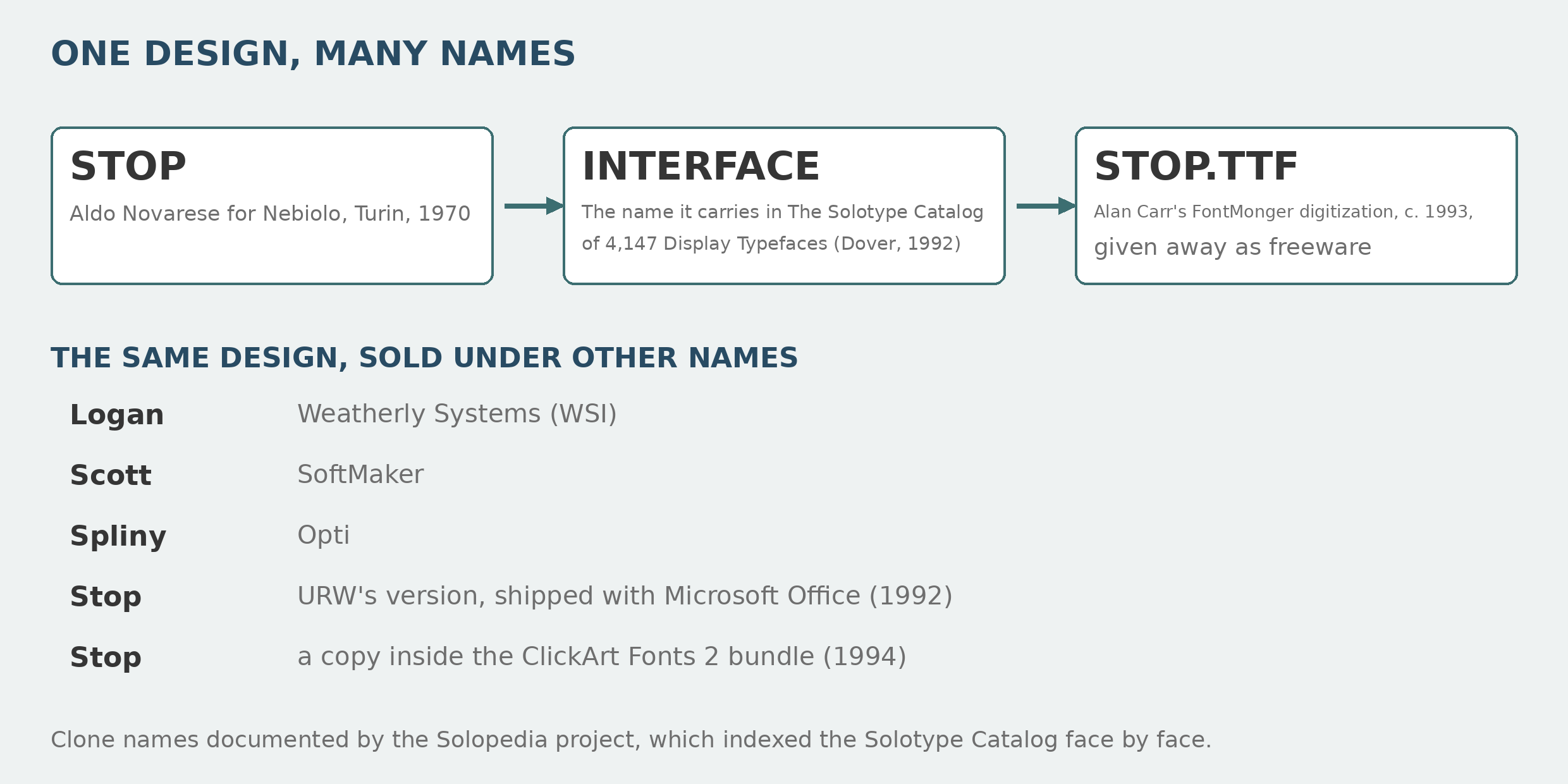
Stop began in Turin. Aldo Novarese designed it for the Nebiolo foundry in 1970: a heavy, futuristic sans whose letters are cut with flat horizontal notches, several of them legible only in the company of their neighbors. It became one of the most copied designs of the phototype era. URW, whose version Microsoft shipped with Office and Publisher, wrote in its own font description that every “Tom, Dick, or Harry” seemed to have copied the design, and that URW had gone back to the earliest version it could find, one credited to a Swiss phototype firm, Fonderia Caratteri Svizzera Walter Fruttiger A.G. (Walter Fruttiger, no relation to Adrian.)
Solo’s catalog is part of that copying chain. The Solopedia project, which has indexed the catalog face by face, records that the design appears in its sans serif section under Solo’s house name Interface, and lists the versions that spread from the same source: Weatherly Systems sold it as Logan, SoftMaker as Scott, Opti as Spliny, and a copy sits inside the ClickArt Fonts 2 bundle of 1994.
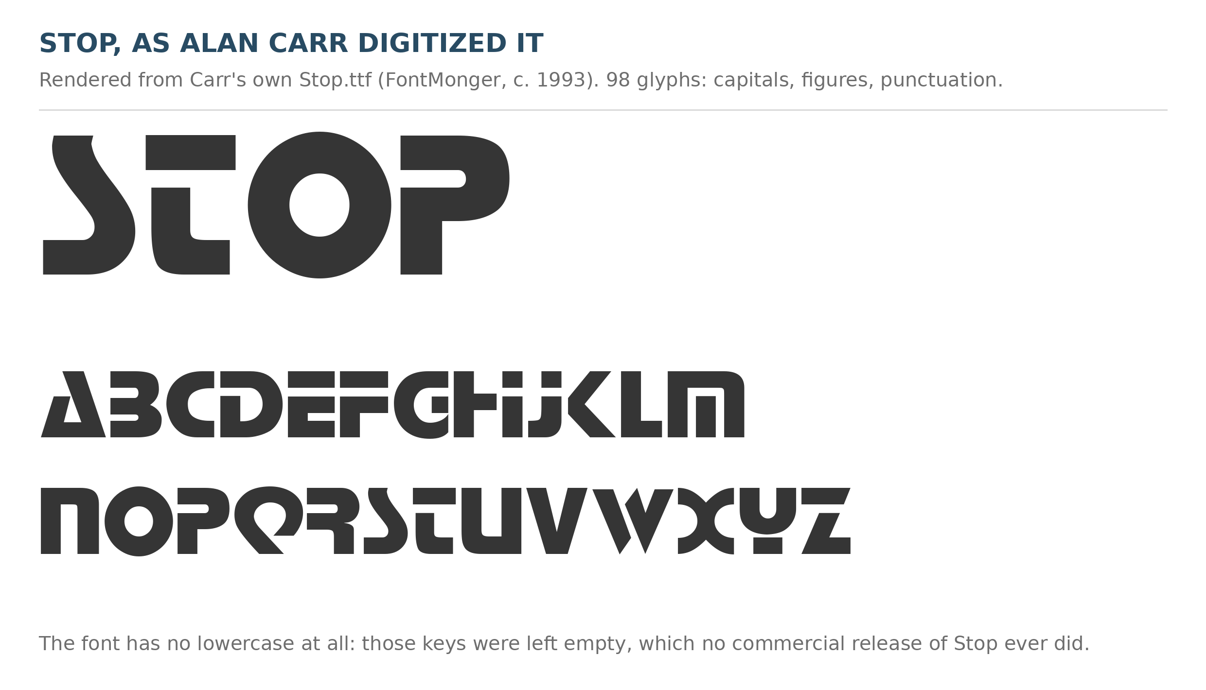
Carr’s own file, examined directly, is a period piece. It holds 98 glyphs: capitals, figures, and punctuation, traced closely enough that every signature form survives, including the S built from two stacked curves and the Q whose tail cuts into the bowl. The lowercase keys are empty. No commercial release of Stop ever shipped without a lowercase; a hobbyist digitizing a display specimen, which was printed in capitals, had nothing to copy them from. The file carries no version number, no source credit, and no mention of Novarese.
So the honest verdict on the Solotype theory is this. The design is verifiably in Solo’s catalog, under the name Interface, in a book published the year Carr’s output begins. His whole catalog tracks Solo’s books. His Stop is a hand-made FontMonger tracing of a printed specimen, not licensed data. No surviving file or readme names the page he worked from, but the catalog is the only printed source that fits his method, his library, and his dates.
Where do his fonts live now?
Scattered, the way freeware always ends up. FontSpace holds 38 of his fonts, the largest surviving set, including his Stop, which has been downloaded nearly eight thousand times there. A small author page persists at dafont, and the mirror sites of the 2000s carry more. His full catalog is on his font.io designer page. The design he traced has outlived every company in this story: readers still write in to say his Stop matches the old WCW wrestling logo, and audio hobbyists have matched the same letters to the Pass Labs logo, give or take the gap in the P.
Carr himself remains a copyright line and a voting joke. That makes him the purest case in this site’s extinct-designer files: a substantial, still-used body of work, and an author who survives only as metadata.