· history, styles
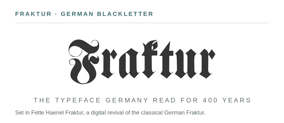
Fraktur: the blackletter typeface Germany read for 400 years
What a fraktur font is, where it sits in the blackletter family, how to read one — the long s, the ß, the shared I and J — and where to get real Fraktur faces free.
Open an old German book — a family Bible, a book of hymns, a grandfather’s school reader — and the pages look like this: dense, black, architectural lettering that a modern reader can barely puzzle out. That lettering is Fraktur. For roughly four hundred years it was not a decorative choice but simply what German print looked like, the default typeface of an entire language. This is what it is, how it got there, and how to read it.
What is a Fraktur font?
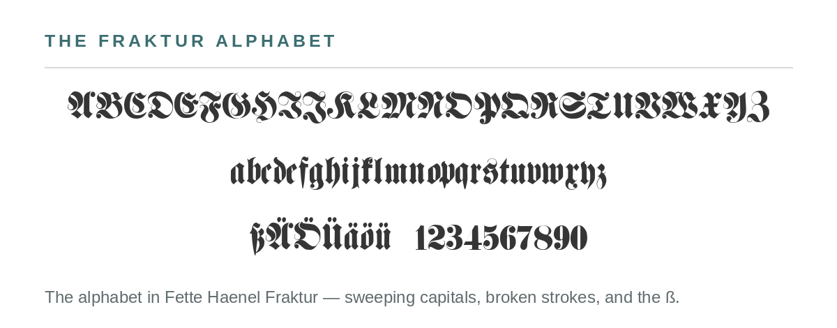
Fraktur is one branch of the blackletter family — the heavy, angular scripts medieval scribes developed across Europe. Its name comes from the Latin fractura, a break or fracture, and it describes how the letters are built: strokes that would curve smoothly in a Roman type are broken into angular segments. The textbook test is the lowercase o: in Fraktur its left side is a straight angular stroke and only the right side rounds off. The capitals, meanwhile, go the other way — big, sweeping, flamboyant curves that make Fraktur capitals some of the most decorative letters in any type style.
The blackletter family
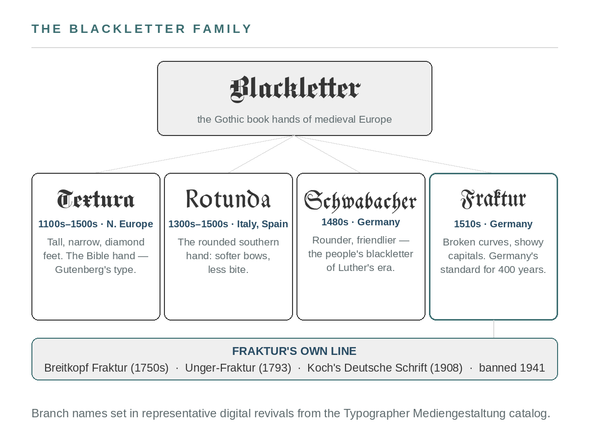
Blackletter is an umbrella, and Fraktur is often wrongly used as the name for all of it. The four main branches grew up in different places and centuries, and once you know them apart you can place almost any “Gothic” lettering you meet:
- Textura (also called Textualis) is the tall, narrow, diamond-footed book hand of northern Europe — Gutenberg’s Bible type, and the style American newspaper nameplates still use. When people say “Old English,” this is usually what they mean.
- Rotunda is the rounded southern branch, from Italy and Spain — same family, softer bows.
- Schwabacher, from the 1480s, is the rounder, friendlier German branch that preceded Fraktur in German printing — the blackletter of Luther’s era.
- Fraktur, from the 1510s, is the branch that won Germany: broken strokes below, theatrical capitals above.
How to read Fraktur
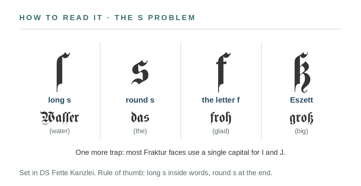
Most of Fraktur is ordinary letters in unfamiliar clothes. The part that genuinely defeats modern readers is the letter s, because Fraktur has two of them. The long s (ſ) looks like an f that lost its crossbar, and it is used everywhere except at the end of a word, where the round s — the one we still use — appears instead. The tell between ſ and a true f is the crossbar: f has a full one, ſ has at most a nub on one side. Add the ß (the Eszett, a sharp s that packs “ss” into one letter), the mandatory ligatures (ch, ck, and tz are printed as single joined forms), and one shared capital doing duty for both I and J, and a page of Fraktur stops looking like a code and starts reading like German — which is all it ever was.
Four hundred years of German print
Fraktur was, in a sense, an emperor’s branding exercise. In the 1510s Maximilian I — the Holy Roman Emperor who understood publicity better than any ruler of his century — commissioned a new typeface for his prestige printing projects. The Nuremberg form-cutter Hieronymus Andreae designed it, and the Augsburg printer Johann Schönsperger established it in Maximilian’s Prayer Book (1513) and the illustrated poem Theuerdank (1517). Within decades it had pushed Schwabacher and Textura aside in German lands, and it kept the job, refined along the way by generations of punchcutters — most famously Johann Gottlob Immanuel Breitkopf in the 1700s, whose Breitkopf Fraktur became the classical form.
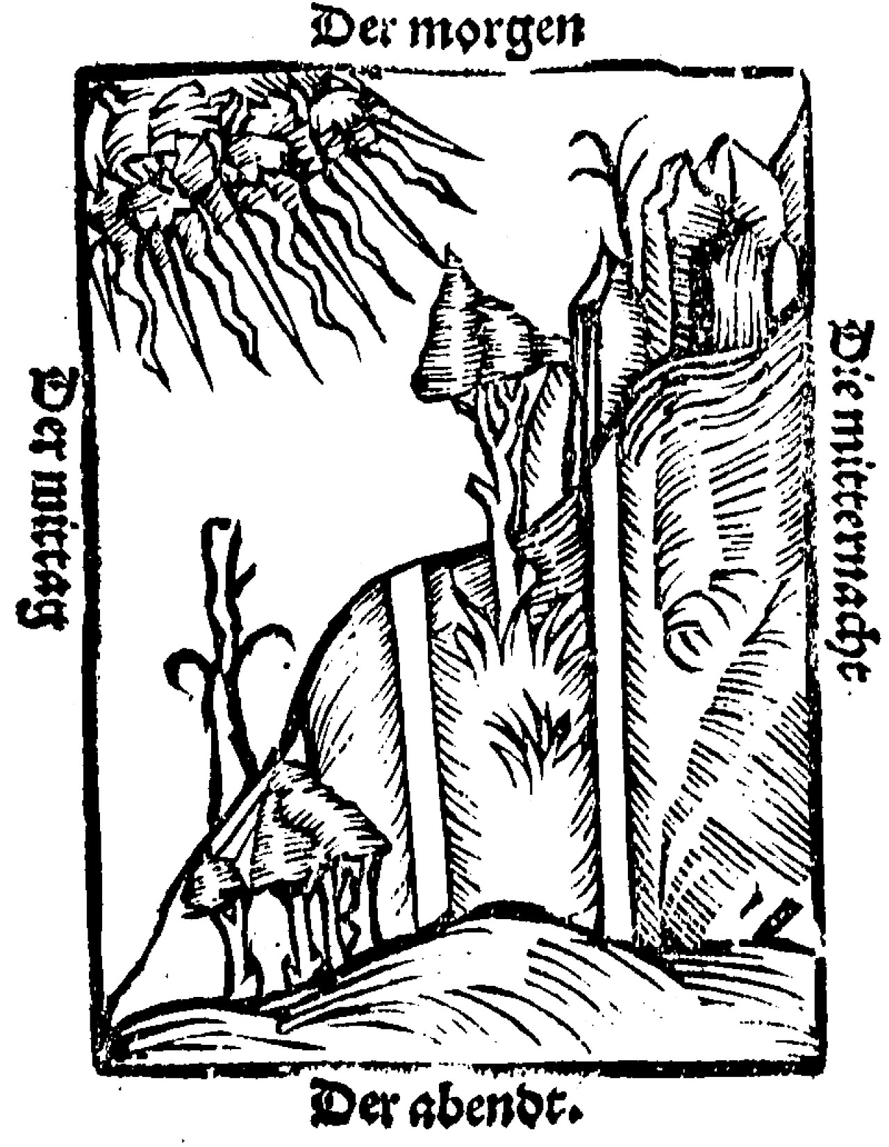
A woodcut from Ein nützlich Bergbüchlin (1527), a mining handbook — the labels around it (“Der morgen”, “Der abendt”) are lettered in Fraktur from its first generation. Public domain, via Wikimedia Commons.
The end came suddenly, and strangely. Through the 19th century Germany had argued with itself in the “Antiqua–Fraktur dispute” over whether the nation should print in its own blackletter or join the rest of Europe in Roman type. Fraktur’s nationalist associations made it an official favorite of the Nazi regime — until January 1941, when the same regime banned it by decree, absurdly denouncing Fraktur as “Jewish letters.” The practical reason was simpler: the peoples of occupied Europe could not read it, and an empire cannot run on a typeface its subjects can’t decipher. After the war, a Germany rejoining the world switched to Roman type for good, and Fraktur’s 400-year run as everyday print was over.
Fraktur today
What survived is Fraktur the display face — the style you reach for when the lettering itself should say old, German, formal, or heavy. It never left certificates and diplomas. It is the lettering of brewery labels and Christmas-market signage, of heavy-metal logos and tattoo flash, of the Frankfurter Allgemeine Zeitung’s nameplate (the American newspaper nameplates, the New York Times included, are actually Textura — the branches matter). And in the Unicode era it has a second life as mathematical alphanumeric symbols — the 𝔣𝔯𝔞𝔨𝔱𝔲𝔯 characters people paste into profiles and posts — though those are symbol characters borrowed from the style, not a real Fraktur typeface.
Free Fraktur fonts
The punchcutters’ work survived the same way Rudolf Koch’s did: revivalists digitized it. Dieter Steffmann, the typesetter who rebuilt half the German blackletter catalog around 2000, digitized dozens of Fraktur faces — classical text Frakturs, the bold Fette Haenel Fraktur this page’s specimens are set in, Kanzlei chancery hands, Walbaum-Fraktur — and gave them away. His FontSpace page is the place to start: the fonts are free, and the original designers and foundries stay credited in the files, which is how a 500-year-old style keeps its names attached.
Sources: Fraktur, Wikipedia; Blackletter, Wikipedia; The Morgan Library — Theuerdank; specimen fonts from the Typographer Mediengestaltung revival catalog.