· history, reference
Bitmap, converted, or costume: three kinds of pixel font, and how to tell them apart
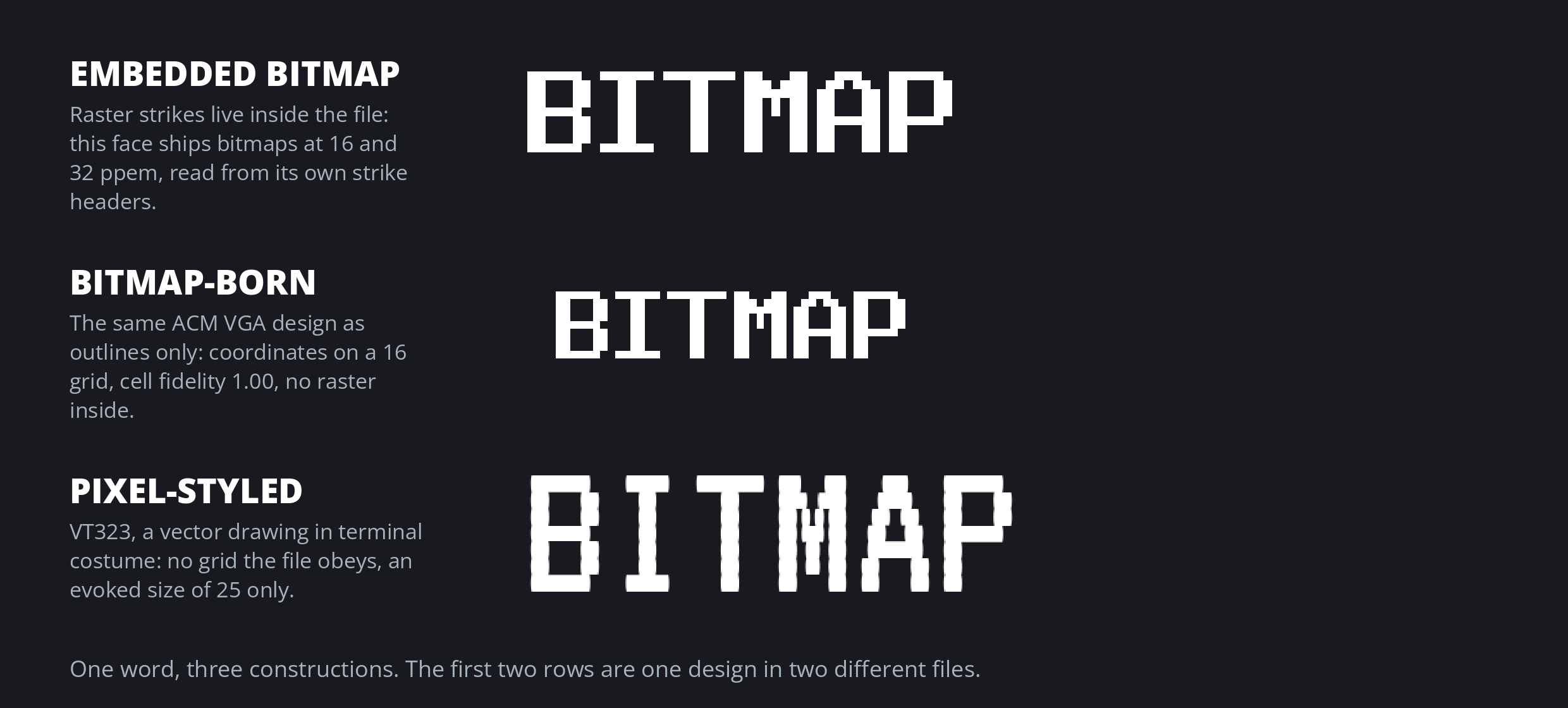
Every pixel font is built one of three ways. Some files carry the actual raster inside them, some are outlines traced from a raster that no longer ships, and some are ordinary vector drawings wearing a pixel costume. The three look alike on a shelf. Inside the file, they are completely different objects.
Three constructions
The first pixel fonts were rasters outright: BDF and PCF on Unix, .FON on Windows, character-generator ROMs soldered into early machines, most of it museum formats now. Our dead font formats inventory keeps BDF and PCF in its legacy-lingering row, and the archaic font formats post covers the FNT and FON kit. But the raster did not die. It moved inside outline files.
An embedded-bitmap font carries the raster in strike tables: EBDT and EBLC in TrueType files, CBDT and CBLC behind color emoji, sbix on the Apple side. The strike headers declare the exact pixel sizes shipped, and a renderer uses the raster verbatim at those sizes and the outlines everywhere else. Noto Color Emoji is the pure case: one 109 ppem CBDT strike and no outlines at all. Lucida Console is the quiet case: ordinary text outlines, but strikes at 5, 6, 7, and 8 ppem, and the strikes settle it. The class is documentary: presence settles it, whatever the outlines look like.
A bitmap-born font is outlines traced from a historical bitmap: the AlmightyGuru game font conversions, the restoration program at font.lol rebuilding TheDraw faces. The coordinates are the raster, traced. Glyphs decompose into whole cells at an era-plausible grid, edges run axis-aligned or in staircases, advances are whole cells, and there is no overshoot: a bitmap O is exactly as tall as its H, because a grid has no room for overshoot.
A pixel-styled font is a vector-native drawing in retro costume: it evokes a grid it does not obey. Quantization is partial, diagonals are drawn rather than stepped, terminals taper, and overshoot comes back. Press Start 2P and VT323 are the familiar names here, with a complication saved for below. The fourth reading, vector-native, is the null case: ordinary outlines with no grid signal at all.
The size it wants
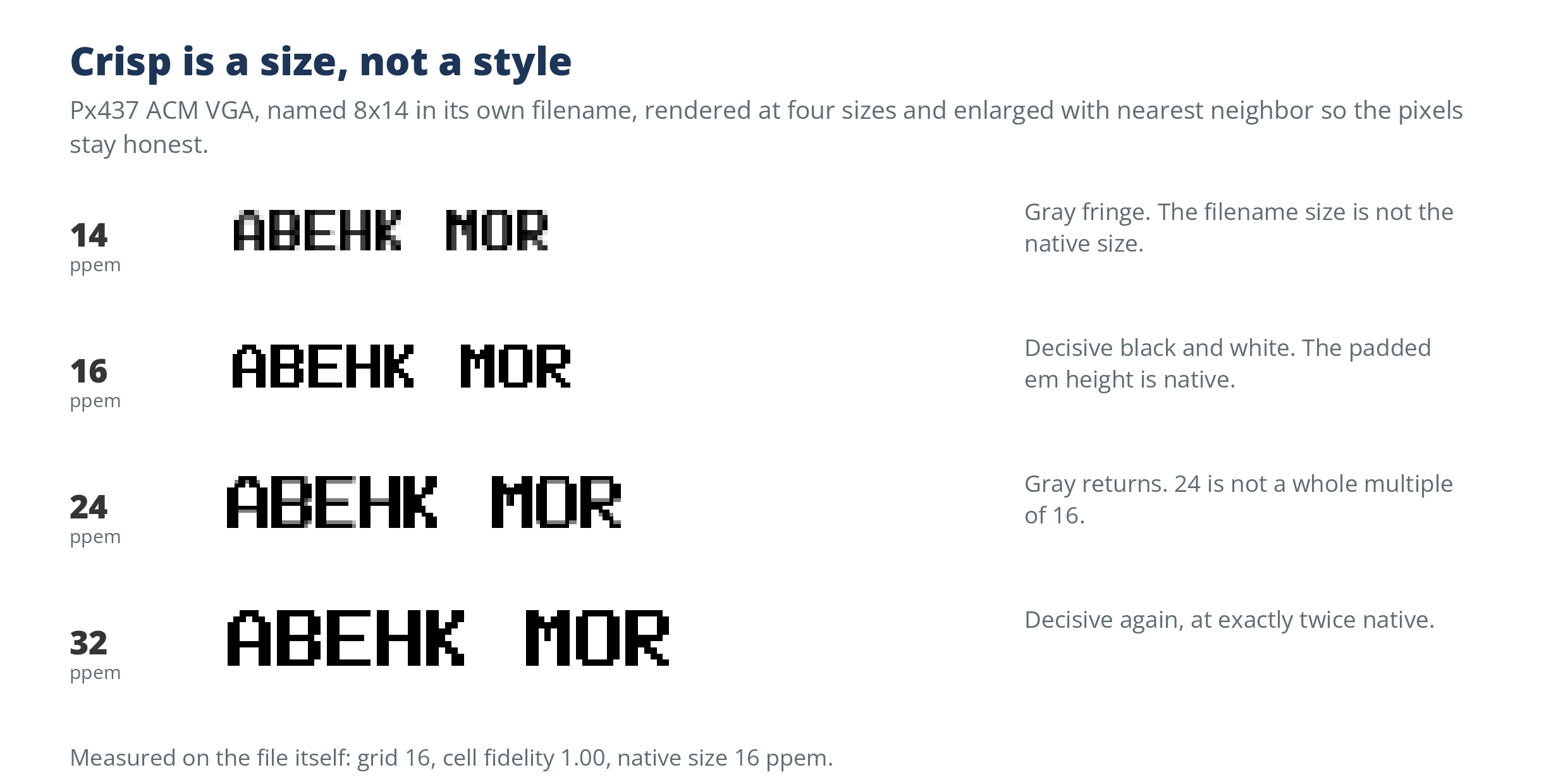
Bitmap constructions are size-specific in a way outline fonts are not. The honest unit is ppem, pixels per em. An embedded font’s native sizes are its strike list. A bitmap-born font’s native size is its grid height: at that ppem each design cell maps to exactly one device pixel, and the crisp set is the whole multiples of it. Sizes in between are the blur zone, where cells land on fractions of pixels and edges go gray. A pixel-styled font has no native size at all. The detector records an evoked size instead, the coarse grid its coordinates come closest to obeying, and keeps it separate: cosmetic, advisory, never merged with a real native size.
The calibration found a trap inside this rule. The ACM VGA face in the plate is named 8x14 in its own filename, but its measured native size is 16, the padded em height, and the padded value is the truthful crisp size. It was not alone: in 45 of 137 declared Px files the grid height read the padded em (14 becoming 16, 19 becoming 20), all born and fidelity-clean, corroborated by the strike headers of the matching embedded files and by the renders.
Reading the grid
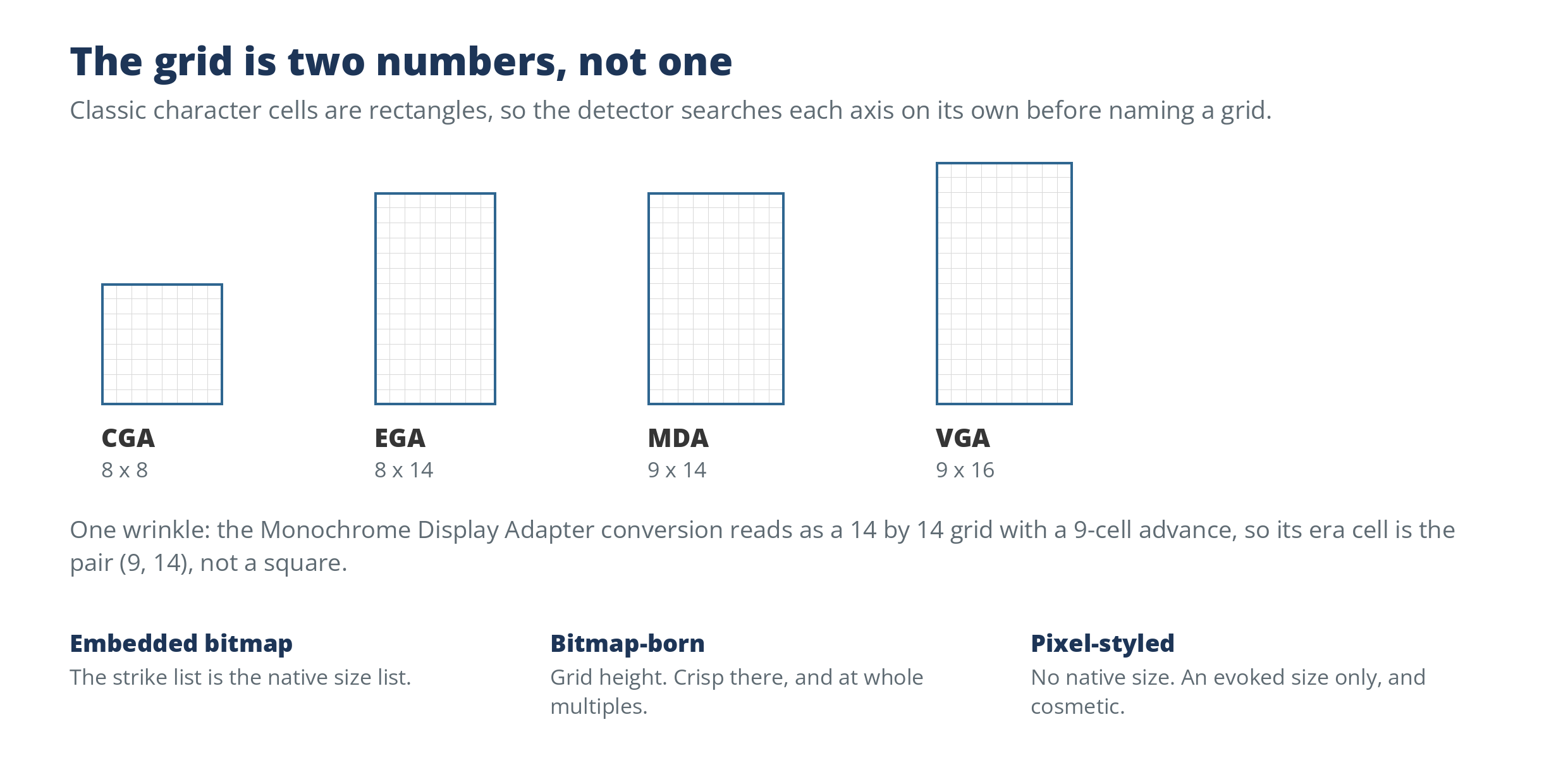
The detector searches for the grid one axis at a time, because classic character cells are rectangles: CGA cells are 8 by 8, EGA 8 by 14, MDA 9 by 14, VGA 9 by 16. Three witnesses have to agree at one consistent grid for the bitmap-born verdict: the outline coordinates quantize onto it, the advances quantize onto it in whole cells, and the ink rendered unhinted at that grid’s ppem comes out decisive, every pixel full or empty. That last share is the cell fidelity, a measured number rather than a vibe.
Era plausibility is a witness, not a gate. Micro 5 sits on an 11 by 11 grid no historical machine used, and it reads bitmap-born with the era flag off: a modern grid-built face is still grid-built. The Monochrome Display Adapter conversion reverses it: it reads as a 14 by 14 grid with a 9-cell advance, so its era cell is the pair (9, 14), recovered from the advance, not the square.
The honest middle
The detector was calibrated against the Ultimate Oldschool PC Font Pack, one conversion library issued in several flavors of the same faces. The embedded flavor was unanimous: all 361 Mx files read embedded-bitmap. The outline flavor split: 288 of 361 Px files read bitmap-born, 73 read pixel-styled, with no errors. The 73 are the interesting ones. Fifty-six are the half-width files, whose x coordinates are halved, so at native size a cell is a fraction of a pixel and fidelity falls to around 0.4. The other 17 are exotic machines (Cordata, DG One, HP 150, Master 512, Rainbow 100, Wang, Zenith) whose grids read an octave off and render crisp at twice the read size. These are middle cases, not mistakes: the fidelity gate is a square-pixel gate, and anything built on fractional pixels fails it while every other witness saturates.
The aspect-corrected flavor is the named limitation. Only 4 of its 283 files read bitmap-born as built, because the correction stretches one axis onto a fractional lattice. Offline, as analysis only, 117 of 117 declared files reach fidelity of 0.95 or better on their declared grid under a single-axis rational rescale. The thresholds were not retuned to absorb any of this. Until an aspect-aware pass is built, the under-read is printed rather than hidden.
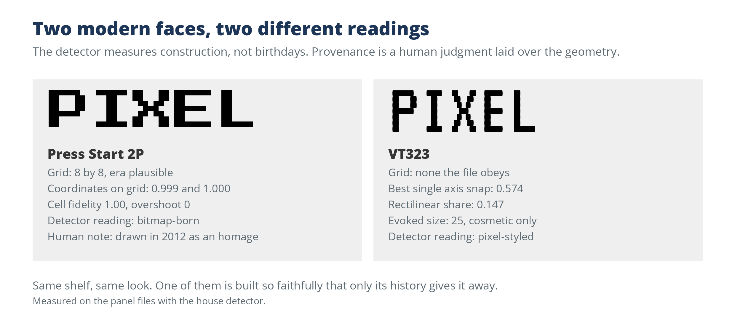
Press Start 2P is why the governance matters. It was drawn in 2012 as an homage, and every construction witness saturates: an 8 by 8 grid, coordinates on grid at 0.999 and 1.000, cell fidelity 1.00, zero overshoot. The detector reads it bitmap-born, and on construction it is. VT323 reads pixel-styled on a snap signal alone, 0.574 of its y coordinates on one fine grid, with its wobble drawn rather than built. So the rule stands in two parts: construction is measured from the file; provenance, whether a historical bitmap ever existed, is judged by a person. Grid-tool fonts sit on the same line: cell-faithful, and new.
What this means at intake
One honest caveat for pipeline builders. Bitmap-only files, the .otb flavor, classify perfectly in the detector’s pre-pass: all 361 read embedded-bitmap with their strike sizes. But the full measurement path raises, on every one of 61 sampled files, because a later stage tries to render them at arbitrary pixel sizes and the imaging library refuses. Intake has to call the pre-pass directly, or catch the failure and keep the pre-pass result. An unguarded pipeline loses exactly the fonts it most needs to identify. The 296 .FON files sit outside the contract entirely: not one opened, and no FNT reader has been built.
The naming follows the construction. On a catalog, embedded-bitmap and bitmap-born fonts earn the Bitmap tag; pixel-styled fonts earn Pixel only, never Bitmap; vector-native fonts earn neither. Bitmap is a construction term. Pixel is a look. A font can wear the look without the construction, and the file knows the difference even when the shelf does not.