· history
Bizarre font uses: fonts that think and bite back
A font is a file full of instructions for drawing letters, and every program on your machine agrees to load and run it without asking questions. Most fonts use that trust to do their one job. These are the ones that did something else with it: a font that contains a working language model, a font that is a complete video game, fonts that draw charts and maps from typed numbers, fonts that hide a second message inside the letterforms, fonts built as weapons against the software that parses them, and fonts designed, on purpose, to stop machines (or people) from reading what they say.
Can a font run a program?
Yes, and one now runs a language model. llama.ttf, by Søren Fuglede Jørgensen, is a 60 MB font file that contains a 15-million-parameter language model (a small Llama architecture transformer trained on the TinyStories dataset) and the inference engine that runs it, compiled to WebAssembly and stored inside the font. The trick is a feature of HarfBuzz, the shaping engine inside Chrome, Firefox, and most open-source software: its experimental Wasm shaper lets a font carry a small program that the shaper executes while shaping text. Special marker characters in the text trigger fake “ligatures” that initialize the model, and the model’s generated words come back as shaped glyphs. Any application that shapes text with a Wasm-enabled HarfBuzz build can therefore generate text from the font itself, with no AI feature in the app and everything running locally. You can, in the author’s words, chat with your font.
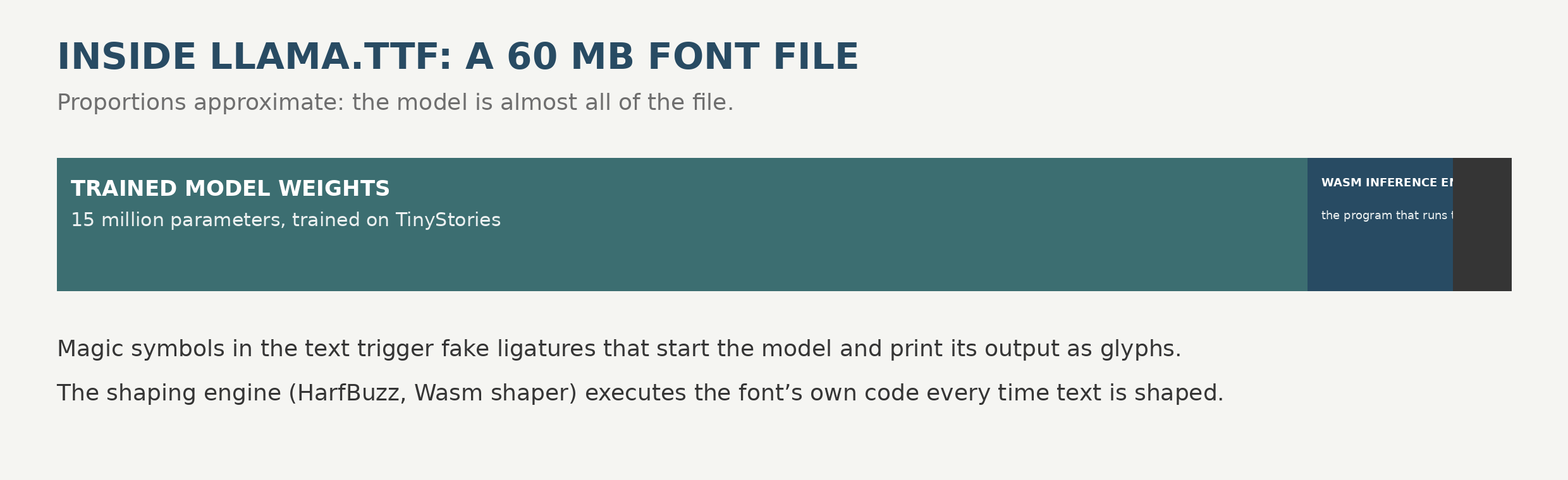
The catch is the shaper: stock HarfBuzz builds mostly ship without the Wasm shaper enabled, so llama.ttf is a rigorous proof of concept rather than a product. It already has descendants and company. translate.ttf embeds a small transformer that renders English text as German. HarfBuzz’s own example collection includes a calculator font and an “inception” font that contains another font. And Fuglede credits the inspiration to a developer known as Erk, whose presentation on programmable fonts with HarfBuzz-Wasm mapped the territory first.
The idea is older than WebAssembly, too. In 1990, Erik van Blokland and Just van Rossum of LettError released FF Beowolf, a font whose PostScript code randomizes its own letterforms every time it prints, so no two printouts of the same document are identical. It is now in MoMA’s collection. A font was already a program; it just took thirty years for the programs to get interesting.
Can a font be a video game?
Completely, and without any program at all. Fontemon, by Michael Mulet of Code Relay, is a Pokémon-style monster-catching game enclosed in fontemon.otf: no JavaScript, no HTML, all font. It plays in a word processor, an image editor, or a code editor, anywhere the font is installed.
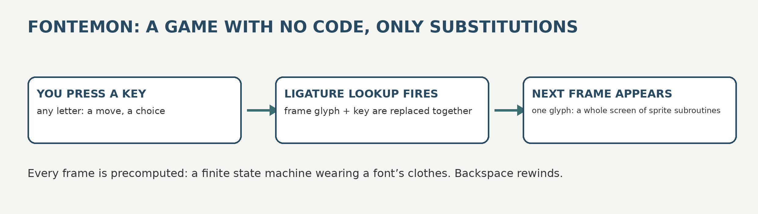
The mechanism is pure OpenType, pushed past its design limits. Every frame of the game is a single enormous glyph whose picture is assembled from sprite subroutines in the font’s Type 2 charstrings, with shades of gray faked by drawing shapes smaller than a pixel so the renderer averages them. Chained ligature substitutions are the game logic: the current frame glyph plus the key you press get replaced by the next frame glyph, so the typed string itself is the save file, and backspace rewinds time. Nothing is calculated during play; every frame and every branch is precomputed and baked into the font, a finite state machine, or as Mulet puts it, a choose-your-own-adventure novel wearing a font’s clothes. His technical write-up is a small masterpiece of abusing a specification politely.
Can a font do your charts and maps?
For a working designer, this is the most useful shelf in the cabinet. FF Chartwell, by Travis Kochel (2011, then FontFont), turns typed numbers into live charts: type 10+13+37+40, turn on discretionary ligatures, and the string becomes a bar, pie, line, radar, ring, or rose chart. The numbers stay as editable text underneath, so updating the chart means editing the figures. Kochel’s own summary is the honest one: the letters and figures are not intended to be displayed at all; they are placeholders for chart parts, swapped in by ligature rules.
The same trick generalizes. Stately gives each US state its own glyph shaped like the state; stack all fifty glyphs on top of each other and you get a complete, colorable map of the country out of a text box. The Climate Crisis Font, built for the Finnish newspaper Helsingin Sanomat, ties its variable weight axis to Arctic sea-ice data: set the font to 1979 and the letters are thick with ice, slide toward the projected 2050 and they melt thin. The data is not illustrated by the font; it is encoded in it.
Can a font hide a second text?
Yes, invisibly. FontCode, from a Columbia University team (presented at SIGGRAPH 2018), encodes a hidden machine-readable message in tiny perturbations of ordinary letterforms: a slightly wider curve here, a fractionally taller stem there. To a reader the text looks normal (the team demonstrated it in common faces like Times and Helvetica). To a camera or scanner running their decoder, each glyph also carries bits, and the message survives printing, photographing, and re-scanning. It is steganography where the carrier is the alphabet itself, proposed for document authentication and tamper evidence: change the text and the hidden message breaks.
The everyday version of the same idea is sitting in plain sight: barcode fonts. Type ordinary text in a barcode font and every character comes out as part of a scannable code, meaningless to you, perfectly legible to the machine at the register. Fonts have been quietly writing for two audiences, human and machine, for decades. FontCode just made the human audience unable to see the machine’s copy.
Can a font attack your computer?
This is the section where the jokes stop, and the verified record is more specific than the legend. First, the headline: no self-propagating font virus has ever existed. Fonts do not replicate. Every documented case is an exploit-bearing font file delivered by something else (a document, a web page, a preview pane), crafted to corrupt the software that parses it. The font is not the malware; it is the lockpick.
The reason fonts made such good lockpicks is architectural. In the Windows NT4 era, font parsing was moved into the Windows kernel for speed, so a bug in font parsing was a bug in ring 0, the most privileged layer of the operating system. Duqu, the 2011 information-stealing malware related to Stuxnet, arrived as a Word document carrying a crafted TrueType font that exploited CVE-2011-3402, a bounds-check failure in win32k.sys font handling, and got kernel-mode code execution (Microsoft bulletin MS11-087, patched December 2011). The Adobe Type 1 interpreter had the same problem in miniature: ATMFD.DLL, Adobe-derived CharString code, also lived in the kernel, and Google Project Zero’s Mateusz Jurczyk found 15 bugs in it in 2015 alone. As late as March 2020, Microsoft’s advisory ADV200006 warned of two remote code execution flaws in the Adobe Type Manager Library handling crafted Type 1 fonts, triggerable by opening a document or merely viewing it in the Explorer Preview pane, and reported limited targeted attacks, mostly against Windows 7. The patches arrived that April as CVE-2020-0938 and CVE-2020-1020.
The industry’s answer was to move the target. Windows 10 parses fonts in fontdrvhost.exe, a sandboxed user-mode process, and ATMFD is absent entirely from Windows 10 version 1709 onward; enterprises also gained a policy to block untrusted fonts. The bug class is not dead (FreeType, the open-source parser under Chrome and Android, had an exploited zero-day in 2020 and another vulnerability added to CISA’s known-exploited list in 2025), but on a modern patched system the risk from a font file is low rather than the kernel-roulette it once was.
And one favorite story belongs in the opposite column: the 2017 “HoeflerText font wasn’t found” scam involved no font exploit at all. A fake browser prompt claimed a font was missing and offered a download; the download was an ordinary malicious executable. The font was the costume, not the weapon, which is usually the truth of it.
Can a font refuse to be read?
Deliberately, yes. ZXX, by Sang Mun (2013), is a typeface built to defeat optical character recognition while staying readable to people. Mun had served as an intelligence contractor working with the NSA during his Korean military service, and after the Snowden disclosures he designed six styles: two legible ones, and Camo, False, Noise, and Xed, which respectively camouflage the letters, hide the real character inside a larger decoy, bury the text in static, or strike every letter through. He named it for the Library of Congress language code ZXX, meaning “no linguistic content.” Mun was candid that it was as much advocacy as tool (it can only protect text sent as an image, and a human reader defeats it instantly), and the project’s own site is long gone to domain squatters; the fonts survive in a community mirror on GitHub, which is why font.io keeps mirrors of things like this.
The gentler version aims at human readers instead. Sans Forgetica (RMIT University, 2018) is back-slanted with gaps punched through its letters, engineered around the “desirable difficulty” theory: make reading slightly harder and the brain, forced to work, remembers more. It was a lovely story and it was tested properly, which is where it ends: a 2020 study in the journal Memory with 882 participants found no memory benefit at all. The font still works as a demonstration, just of something else: a claim about reading, typeset in the thing itself.
Two near-namesakes round out the shelf, and they are not the same project. Redacted replaces every letterform with a wireframe bar, for mockups that need the shape of text with none of the content. Redaction, by Jeremy Mickel with Forest Young and Wally Krantz, mimics the look of redacted government documents, black bars and all, with tamper-evident details designed so altered versions show. One hides text by abstraction; the other wears concealment as a style with a conscience.
And the merely unusual
A rapid shelf, to close. Gilbert, an early OpenType-SVG color font built in rainbow stripes as a tribute to rainbow flag designer Gilbert Baker. Ecofont, which punches tiny holes in its letterforms so printed pages use less ink, invisible at text sizes. Decovar, a variable font with fifteen axes that exists mostly to prove how far parametric letterforms can bend before they stop being letters.
The thread through all of it is the definition these projects keep breaking. A font is not a picture of an alphabet. It is a program-shaped container that every application on earth agrees to run, holding drawings, data, logic, secrets, and occasionally malware, behind an interface designed in the age of metal. The bizarre uses are not abuses of the format. They are what the format always allowed, noticed late.